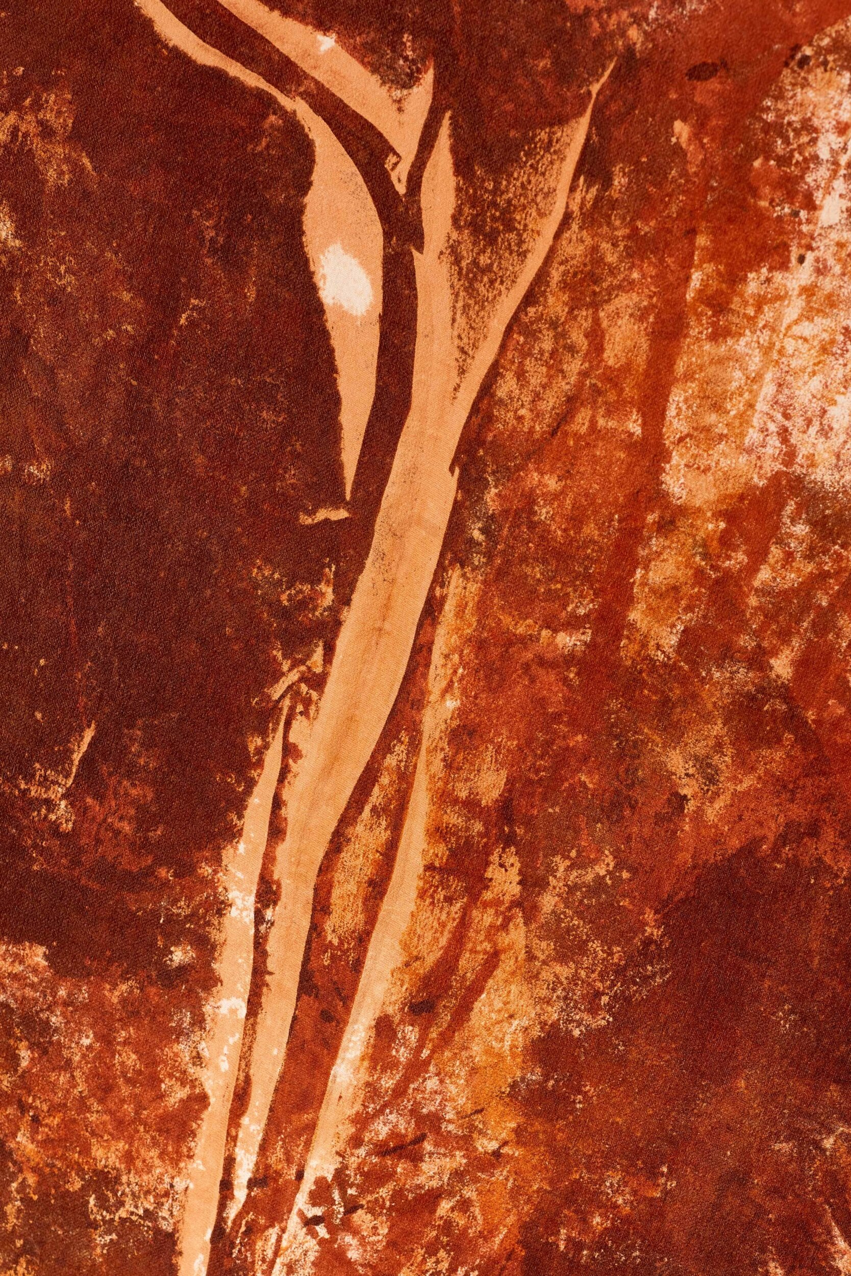
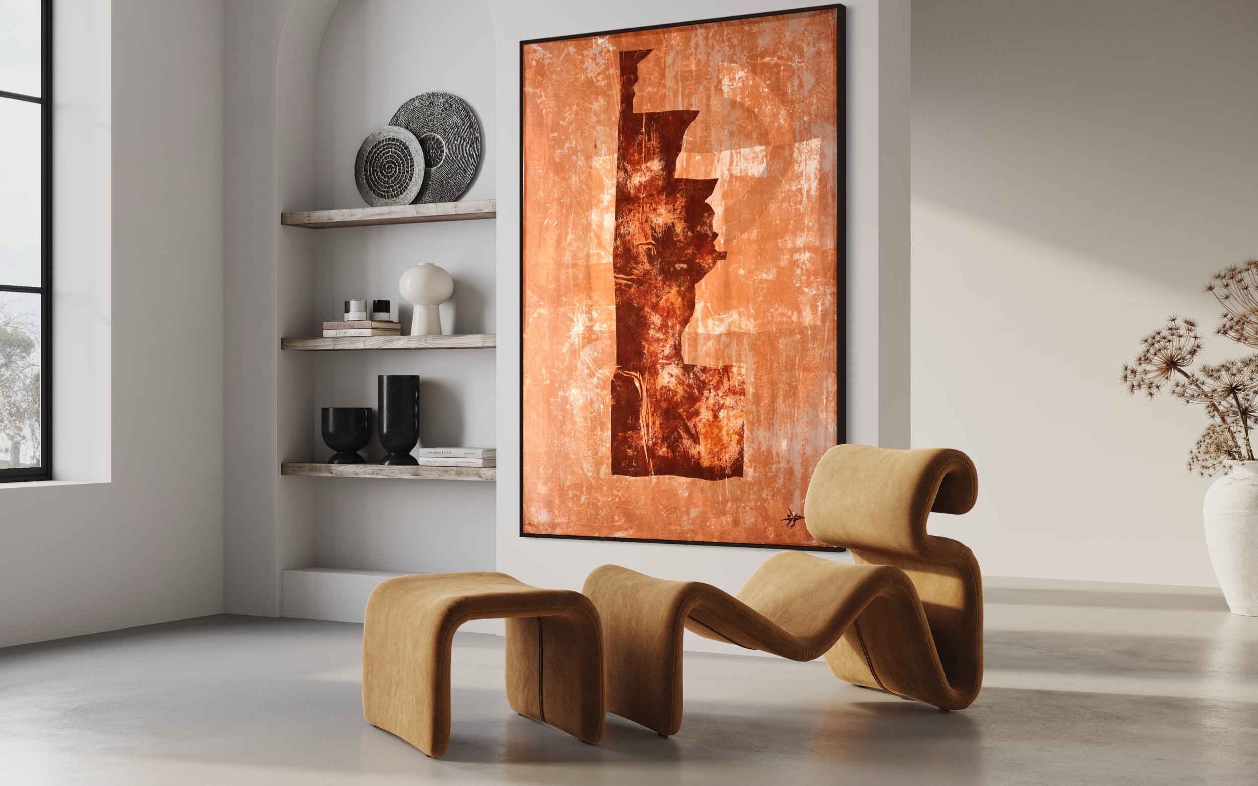
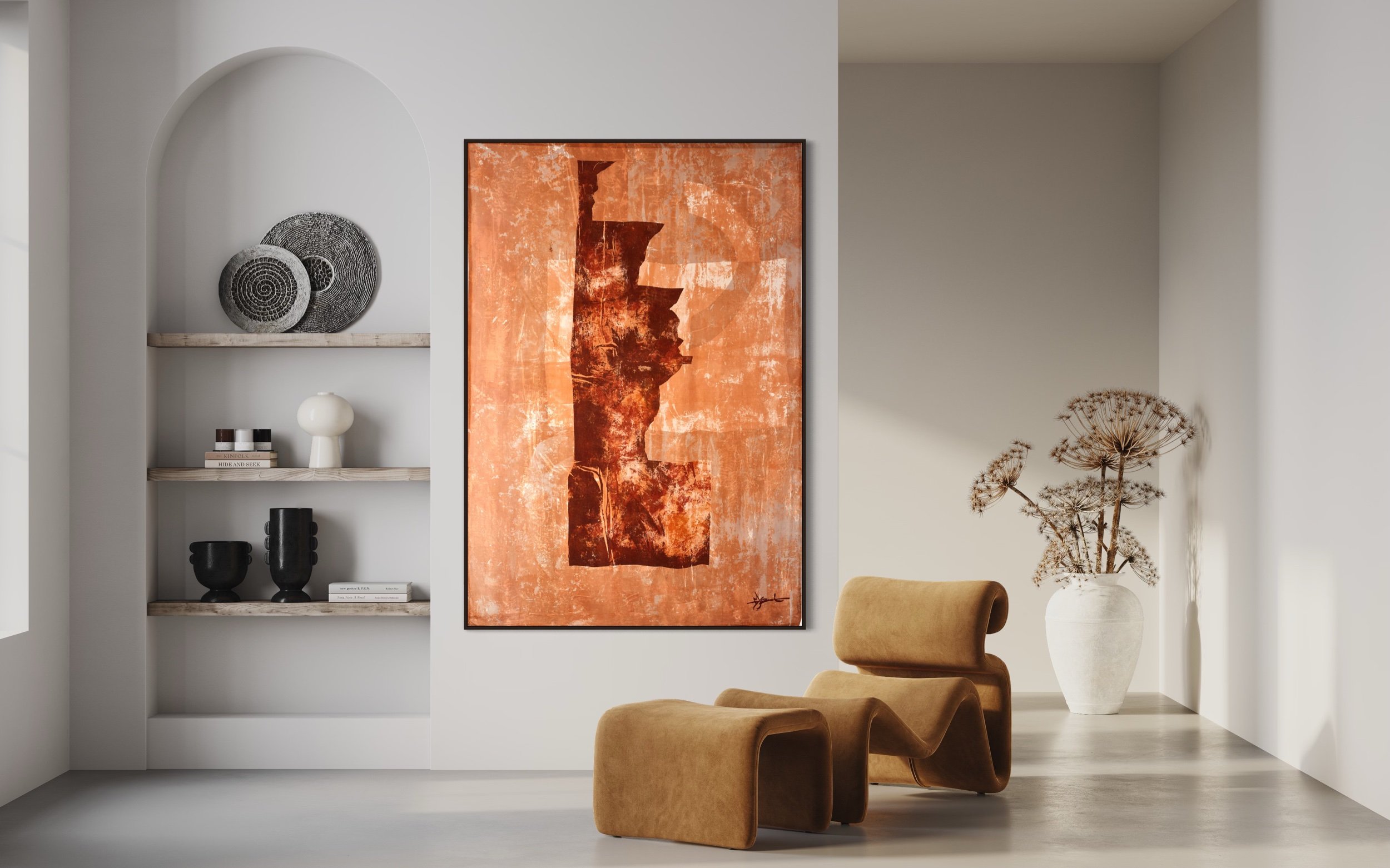
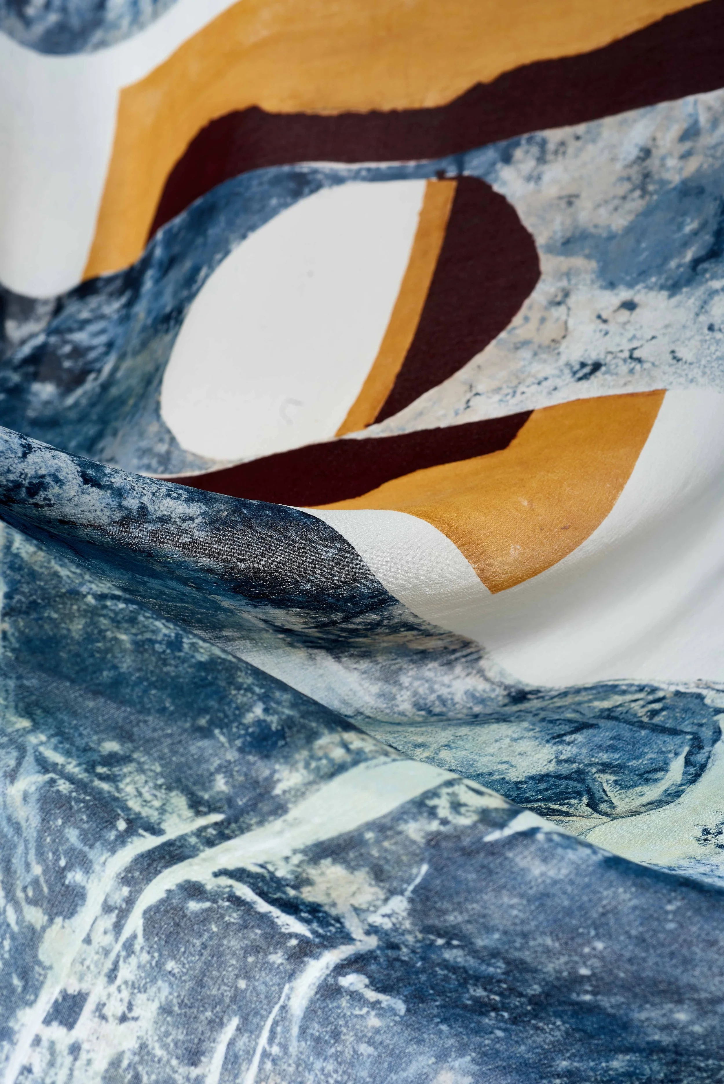
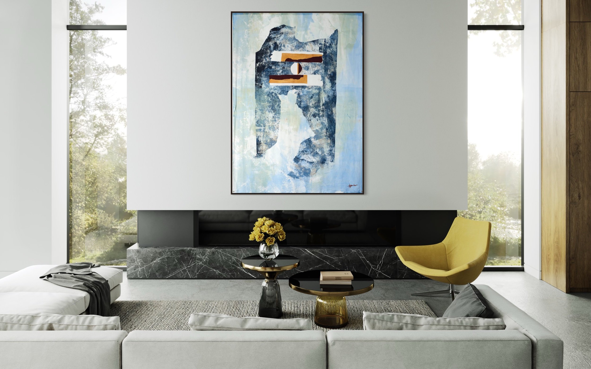
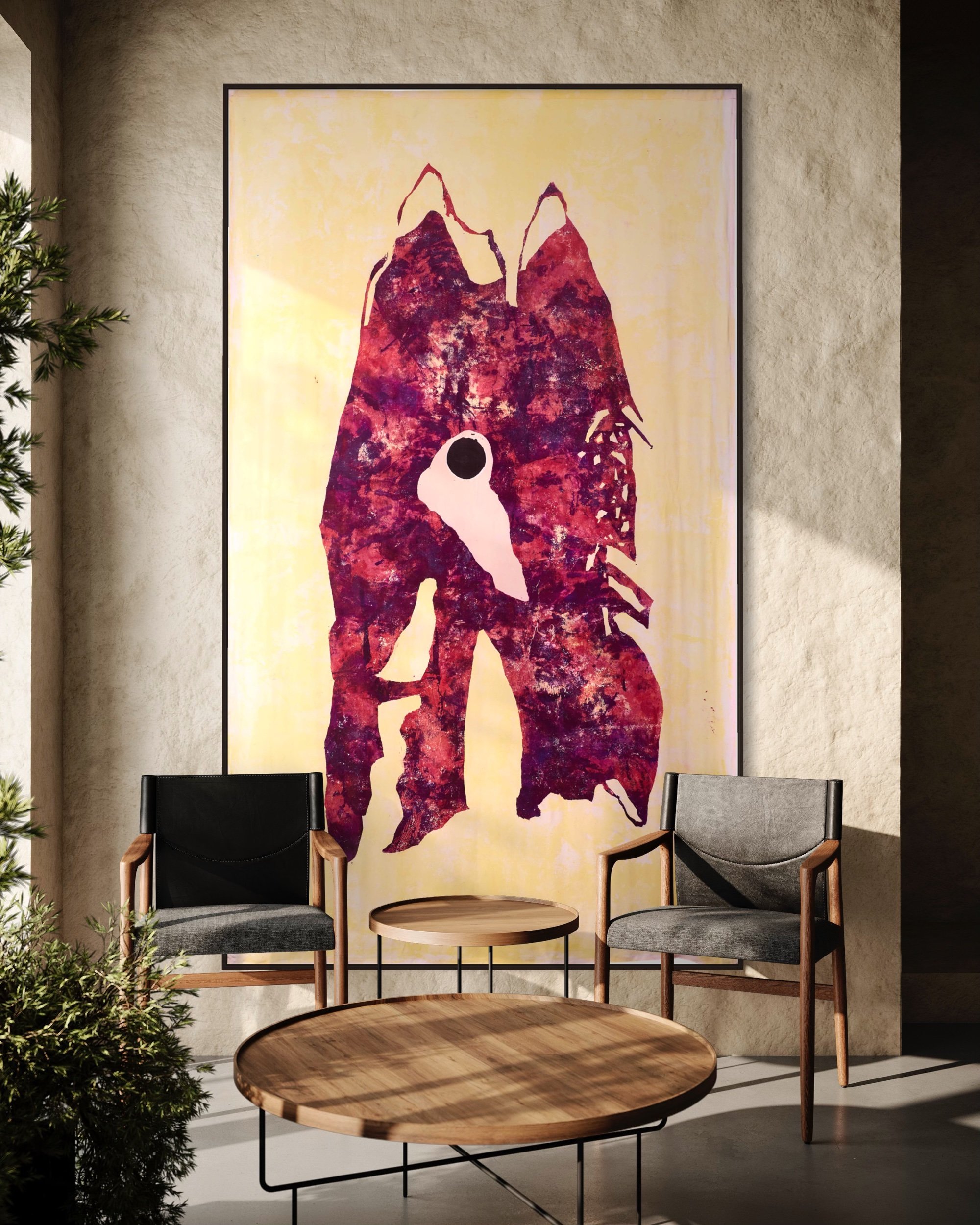
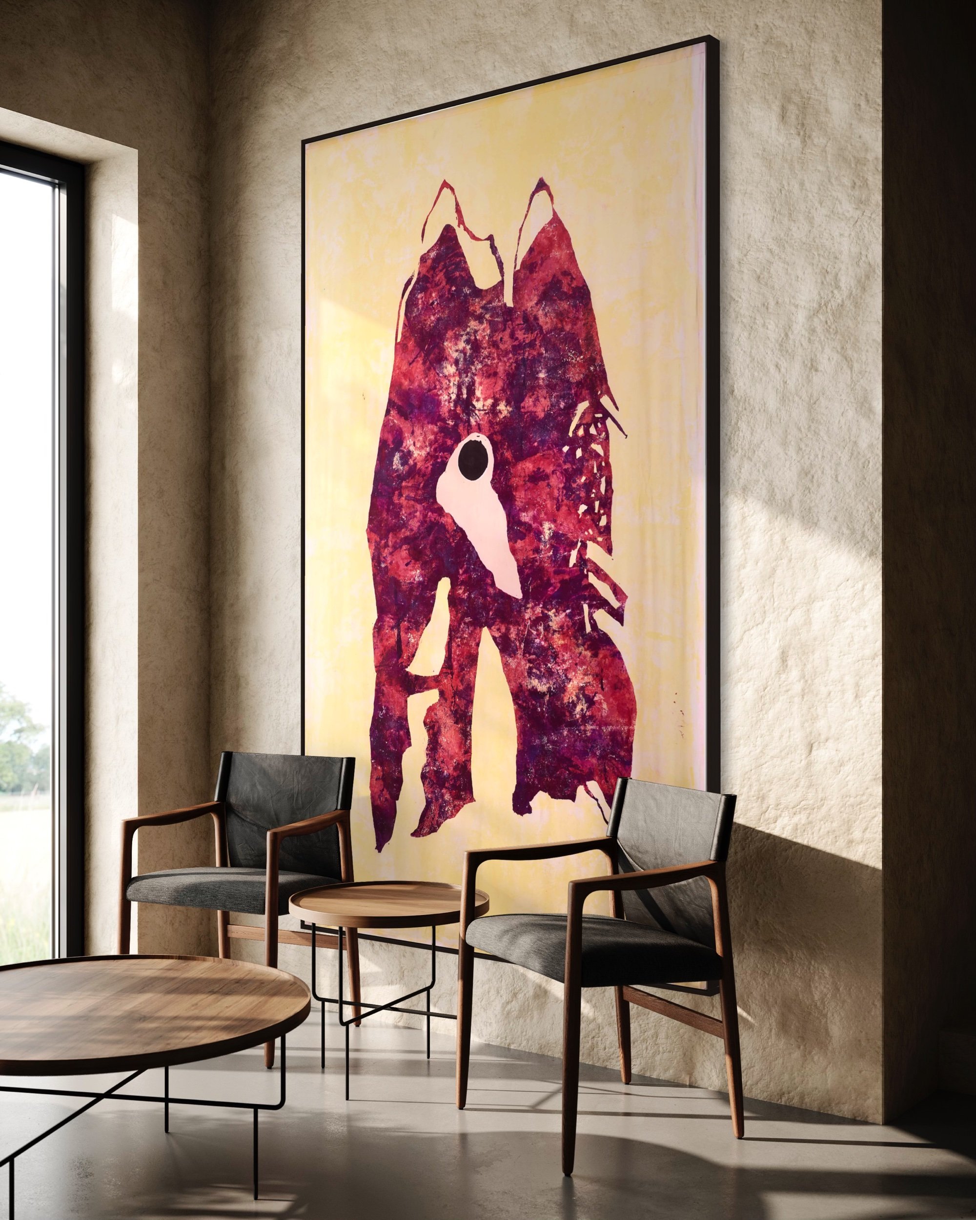
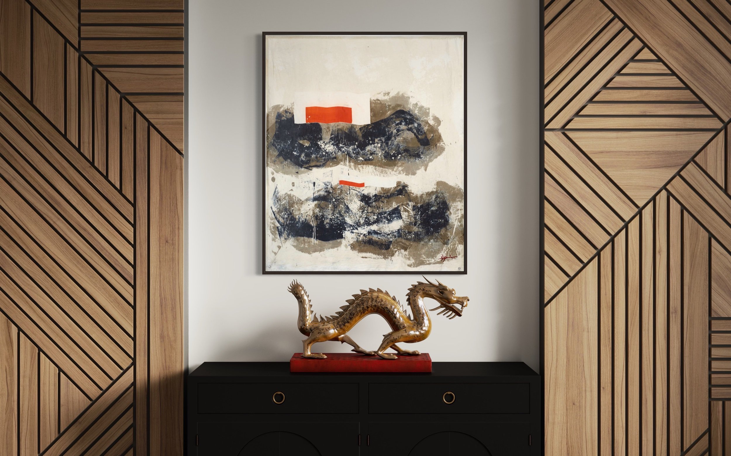
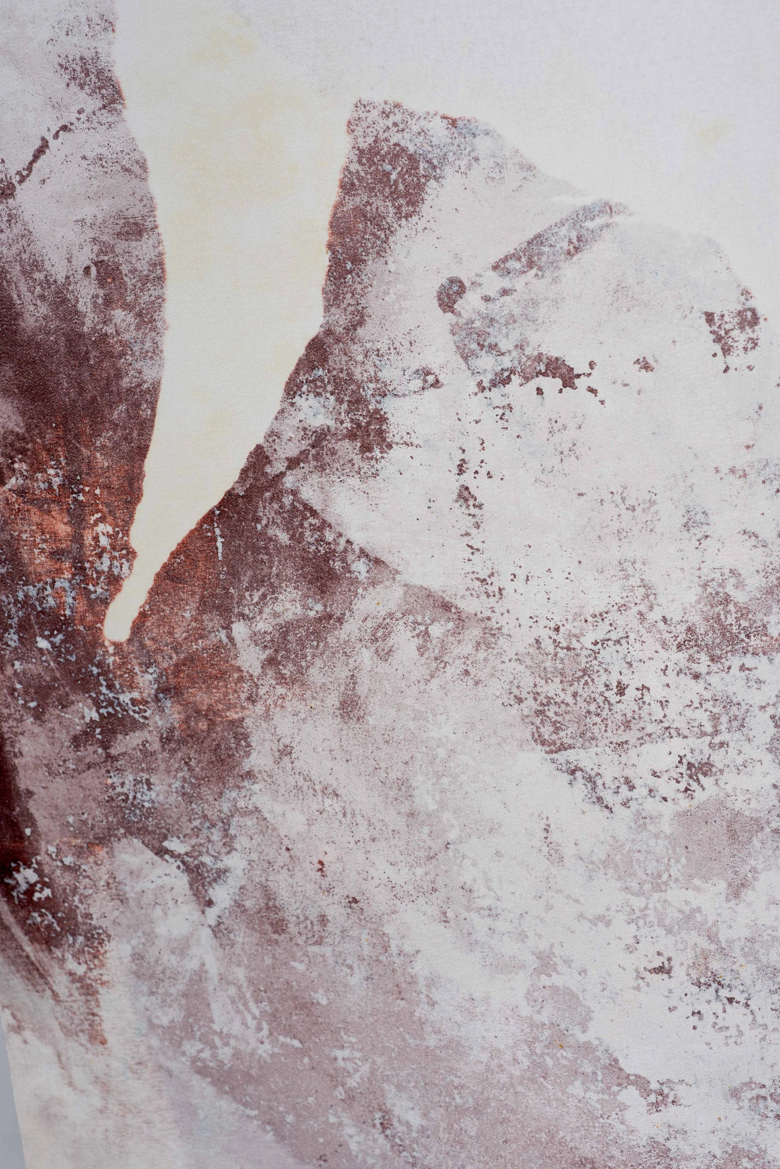
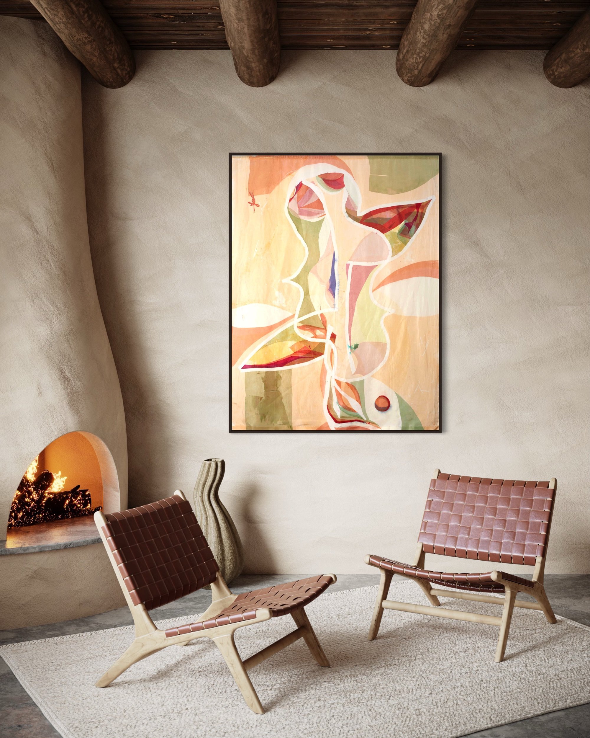
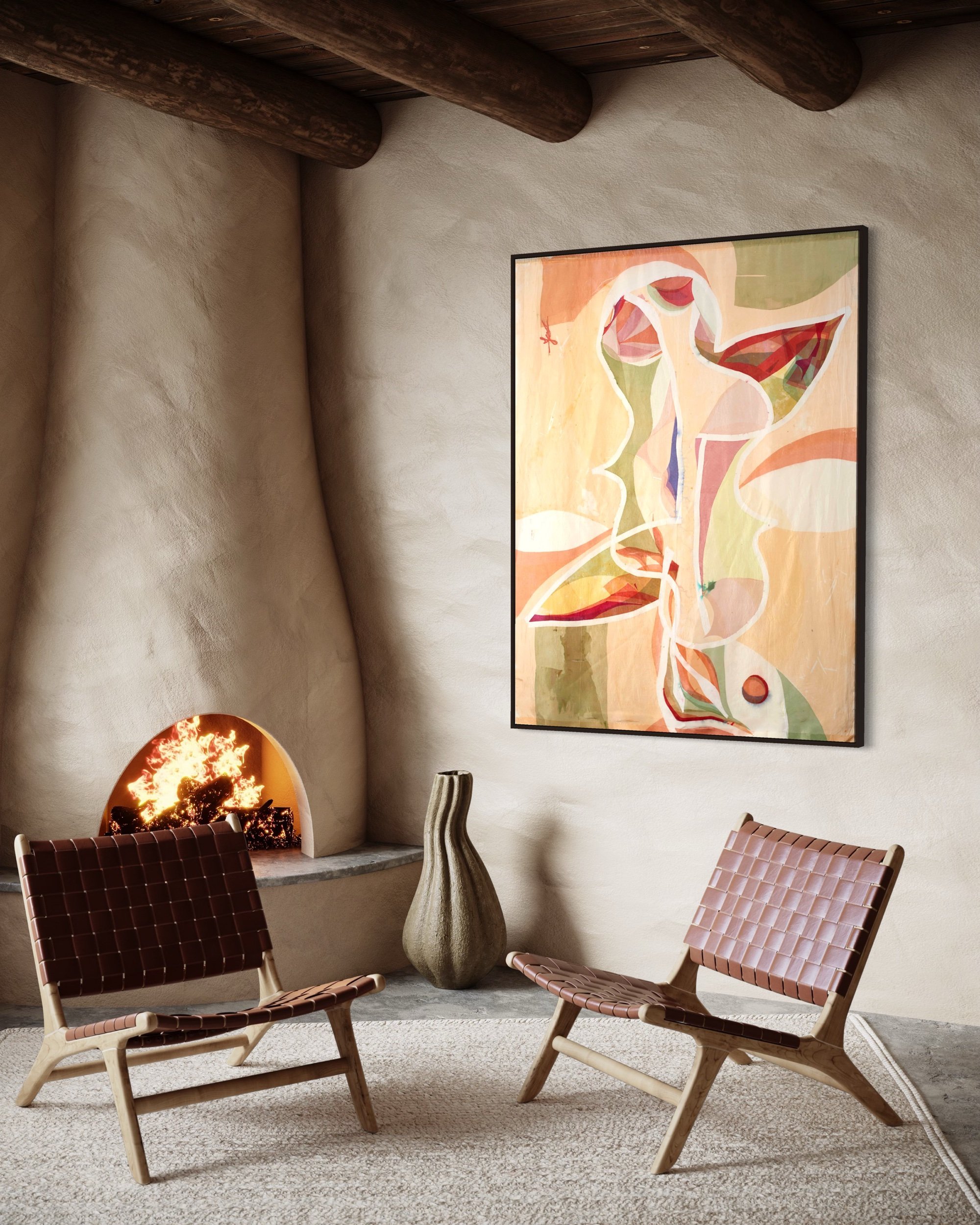
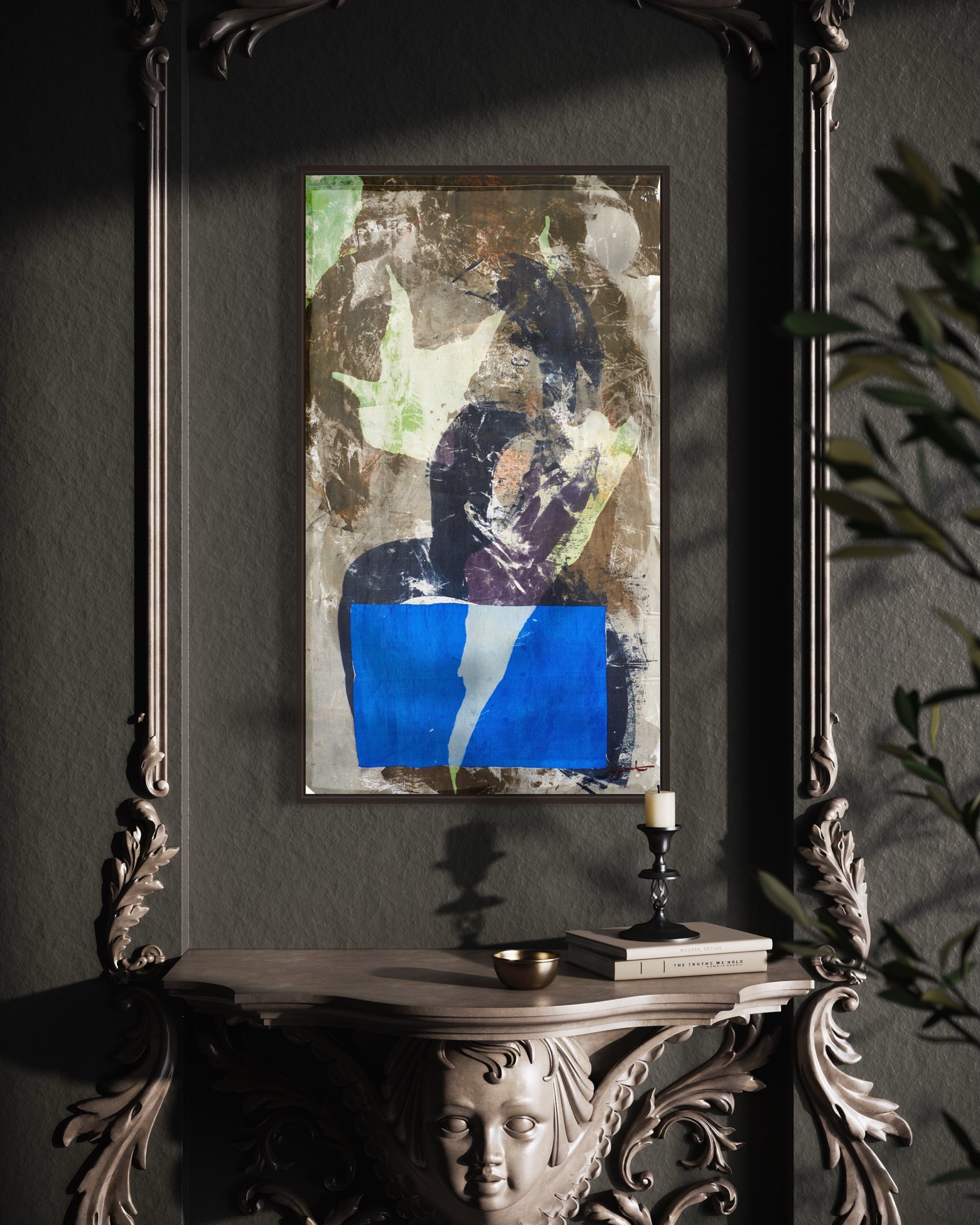
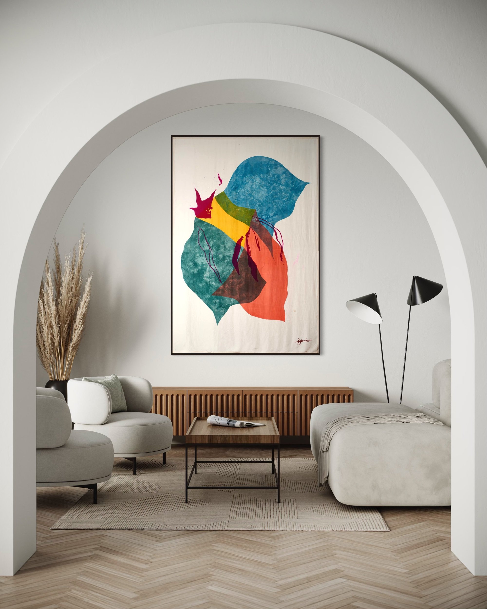
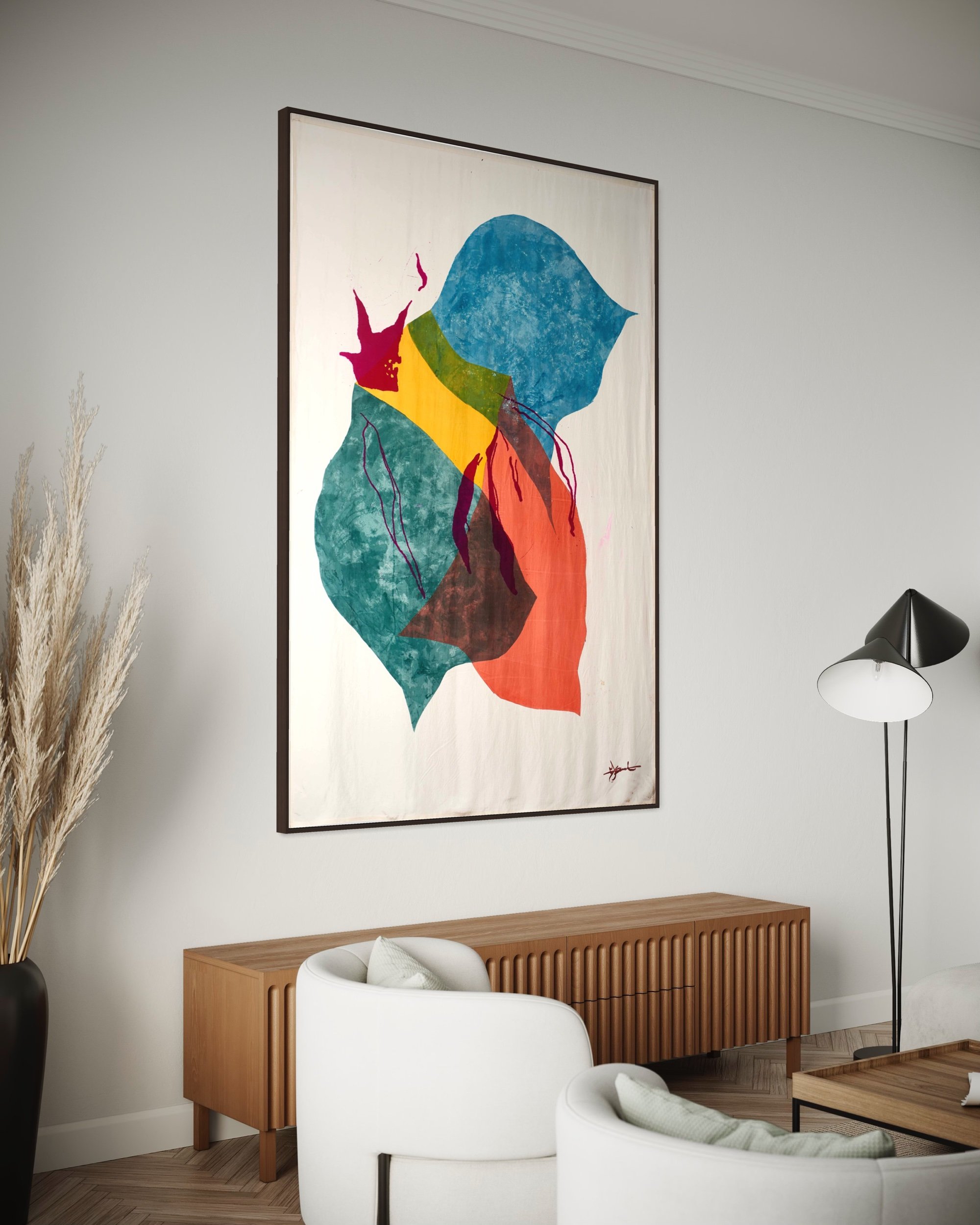
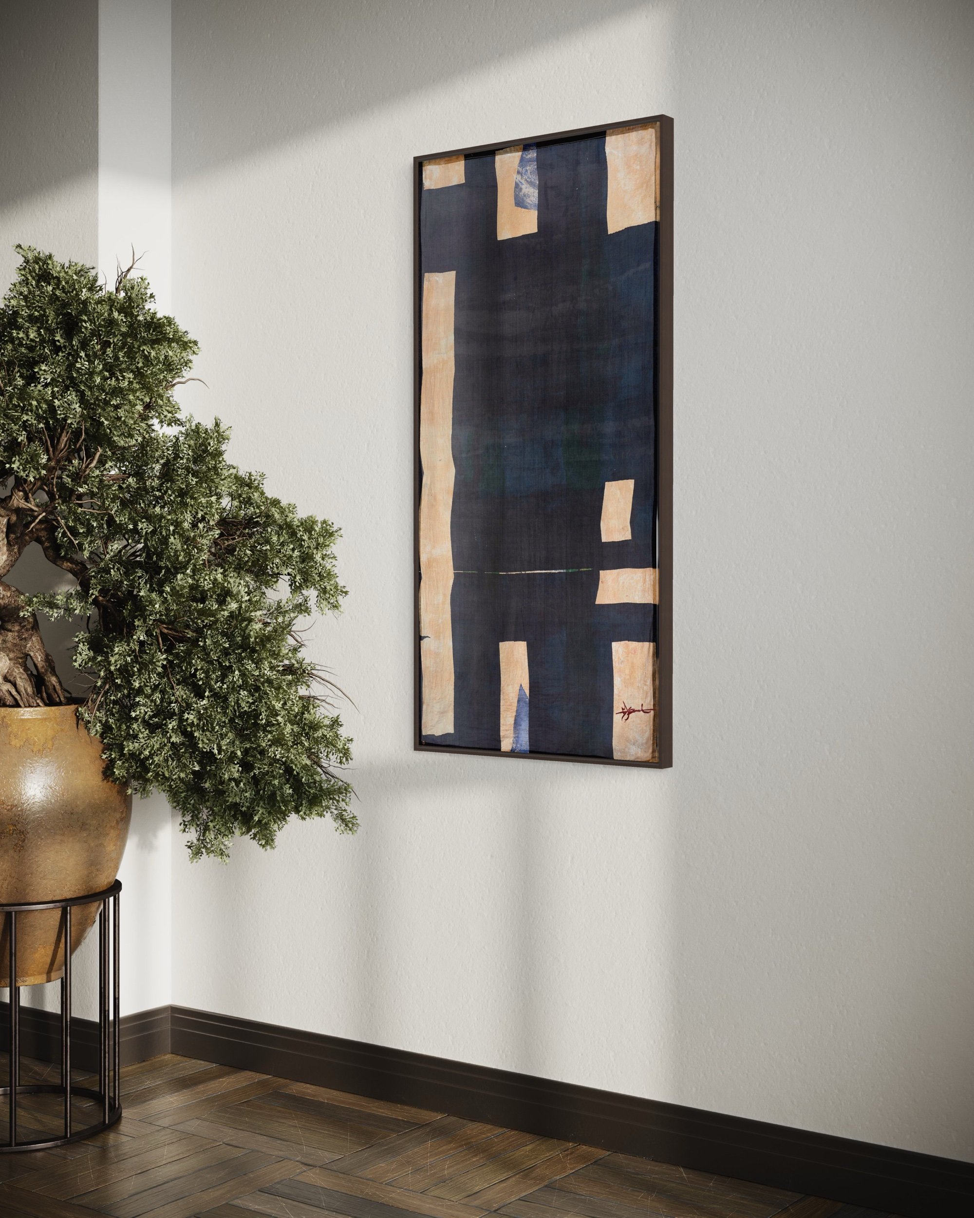
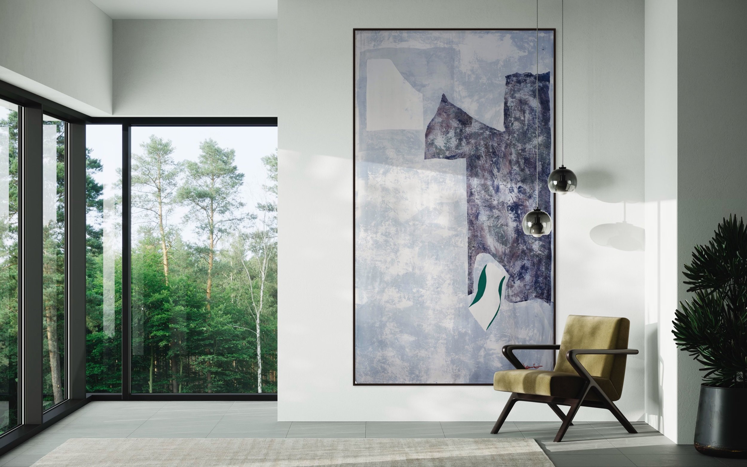
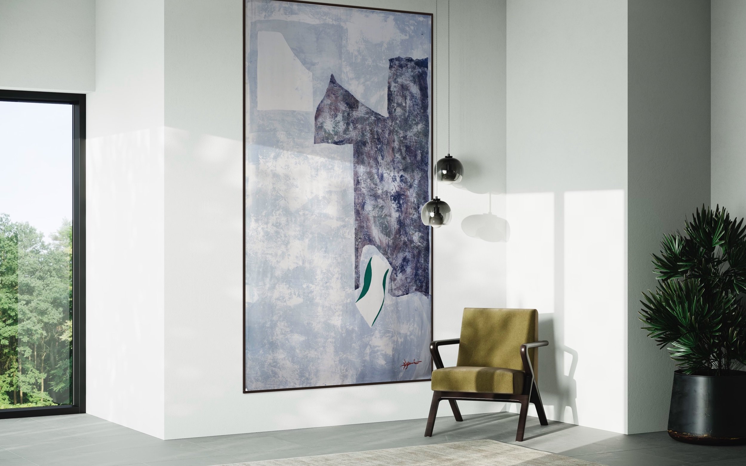
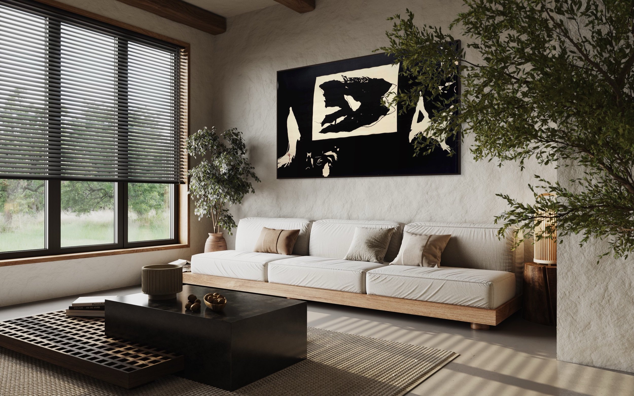
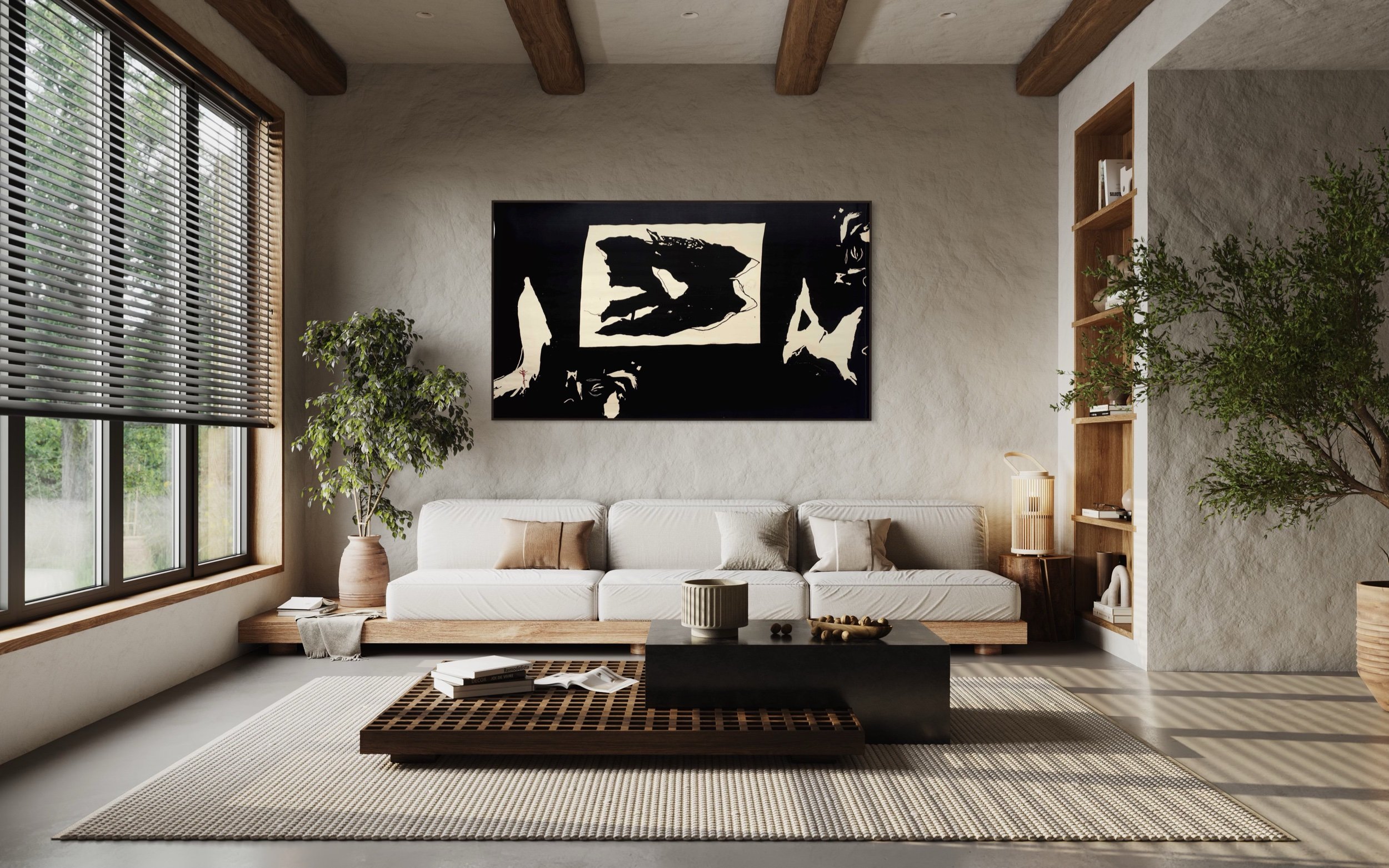
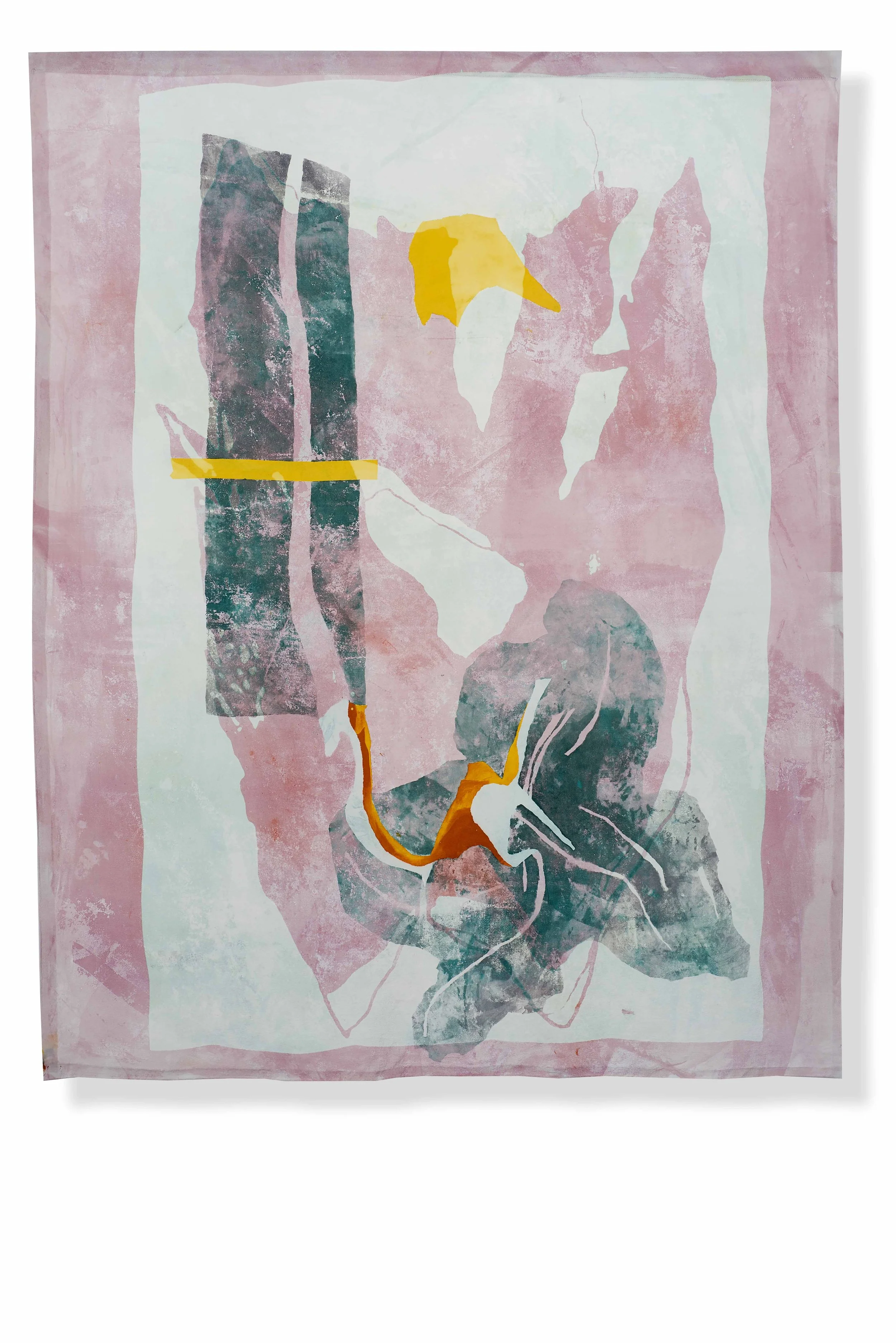
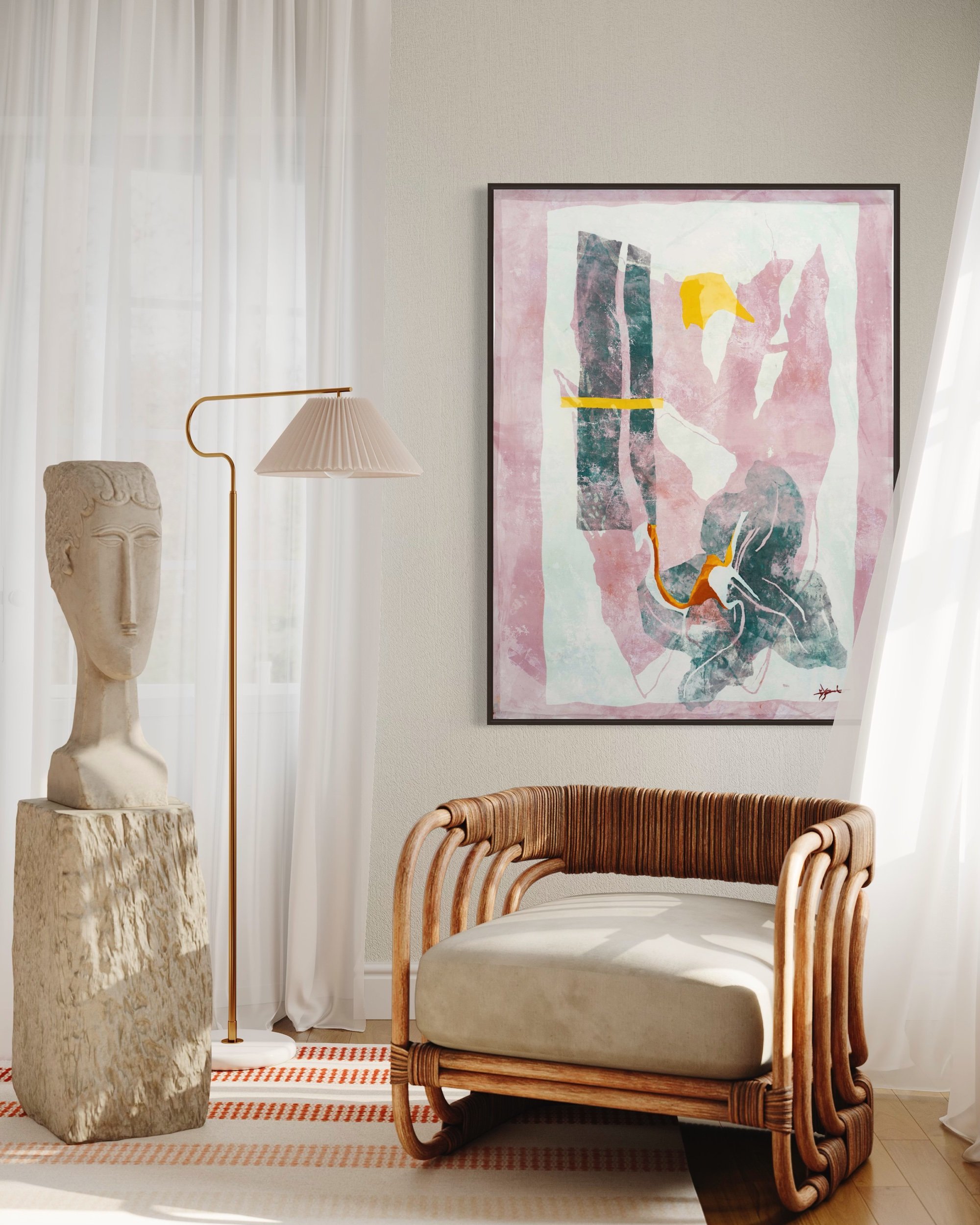
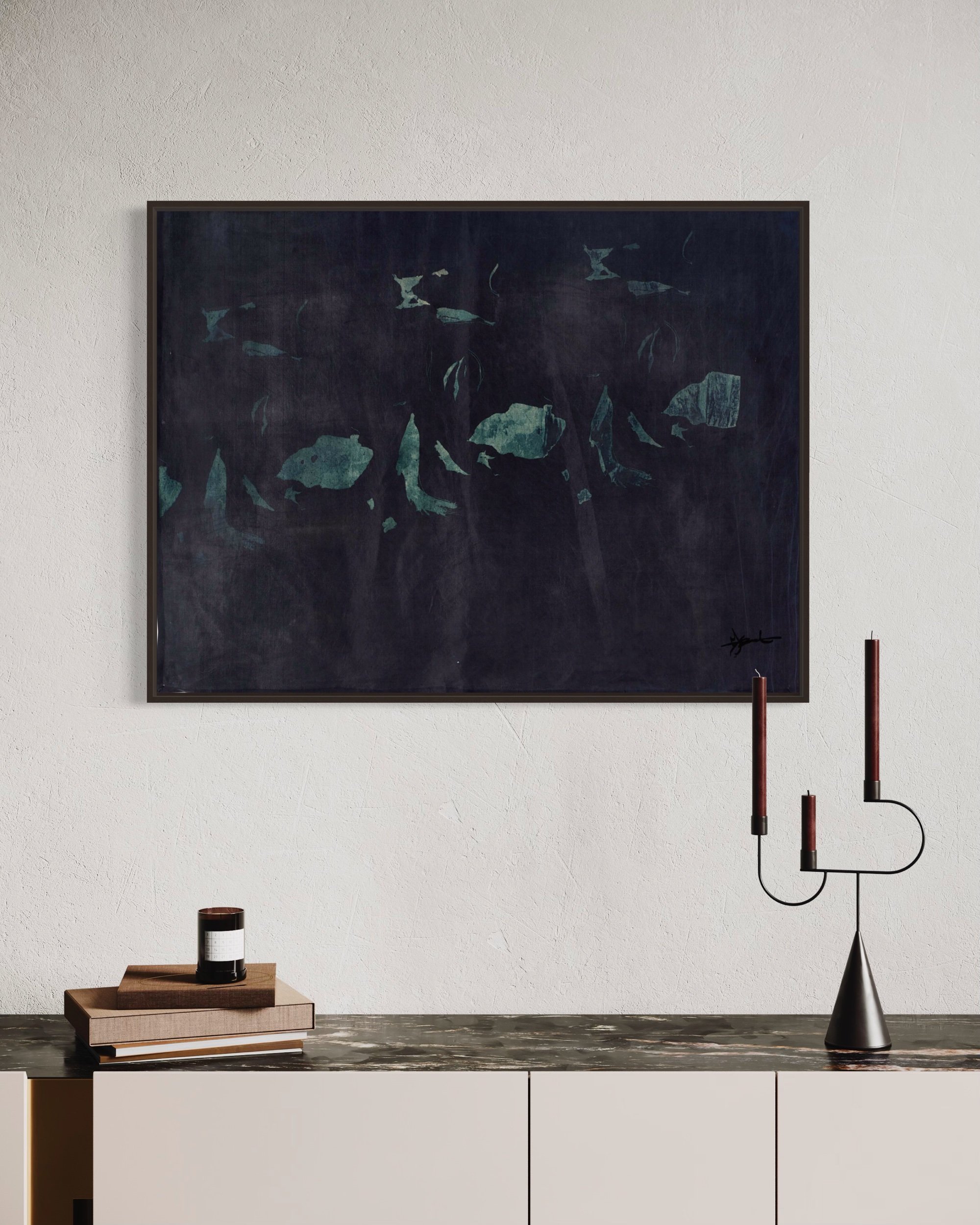
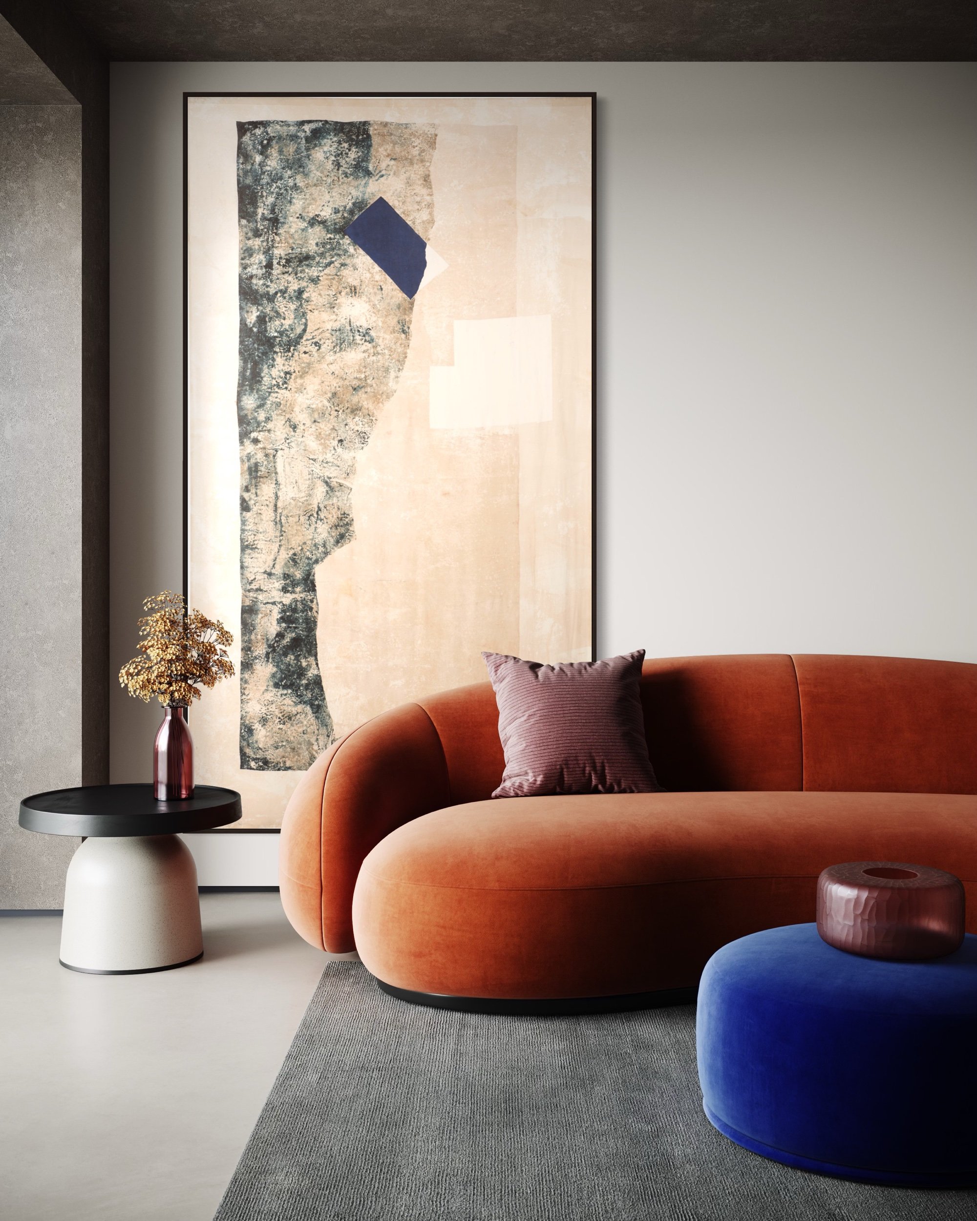
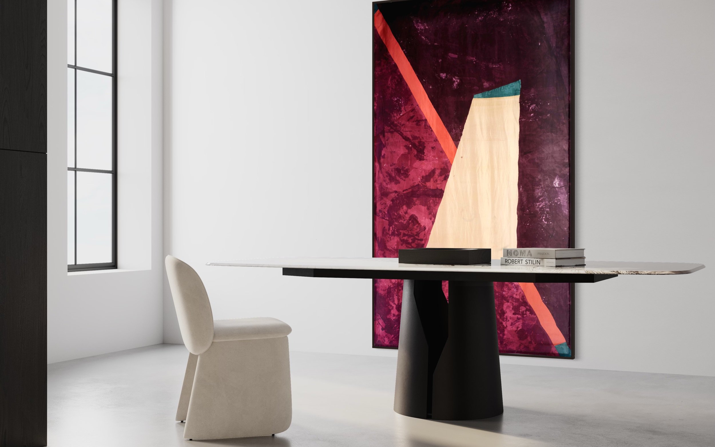
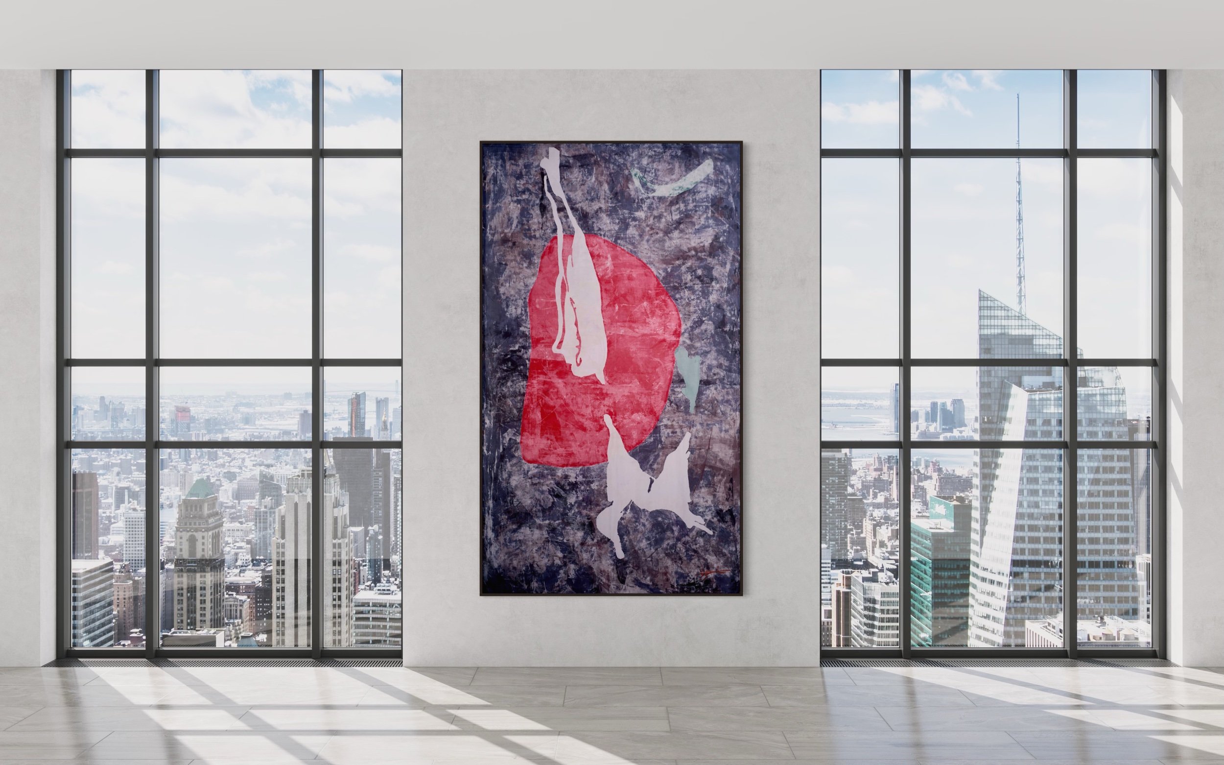
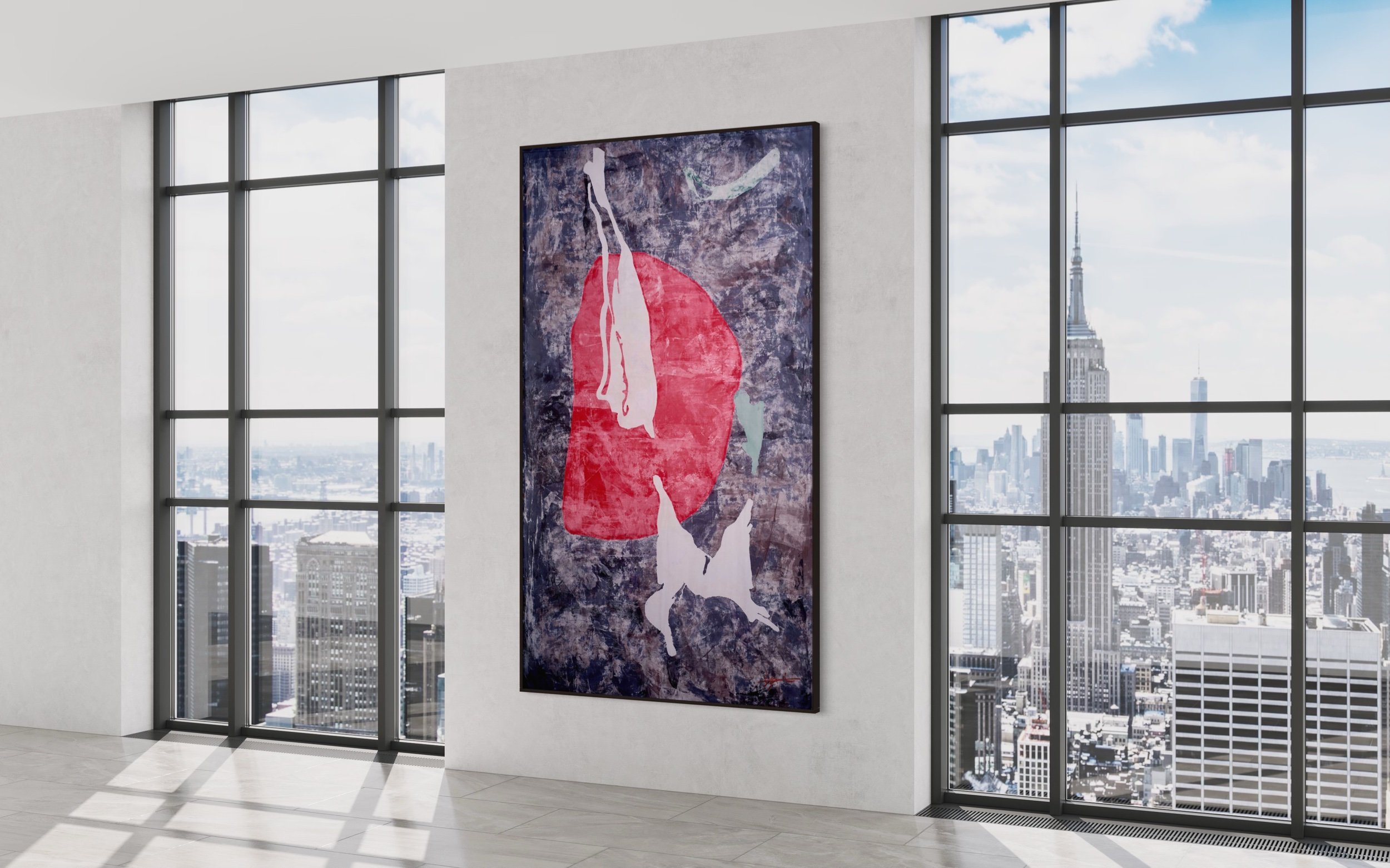
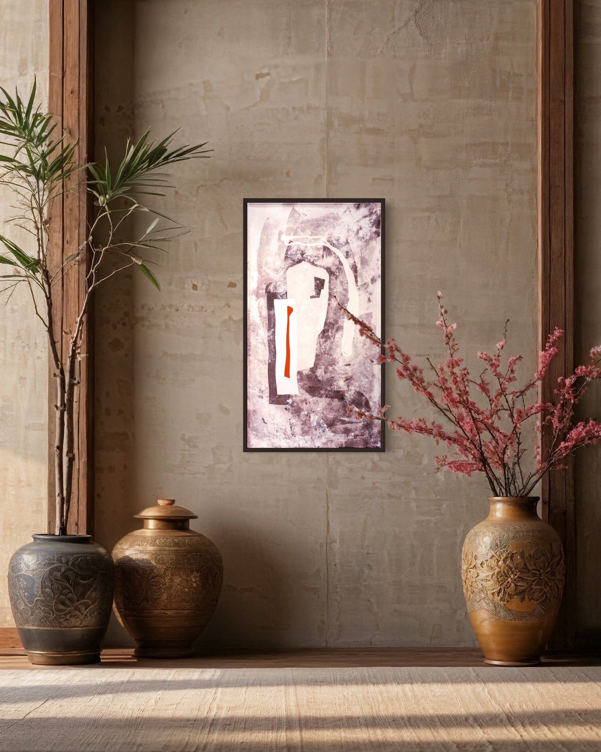
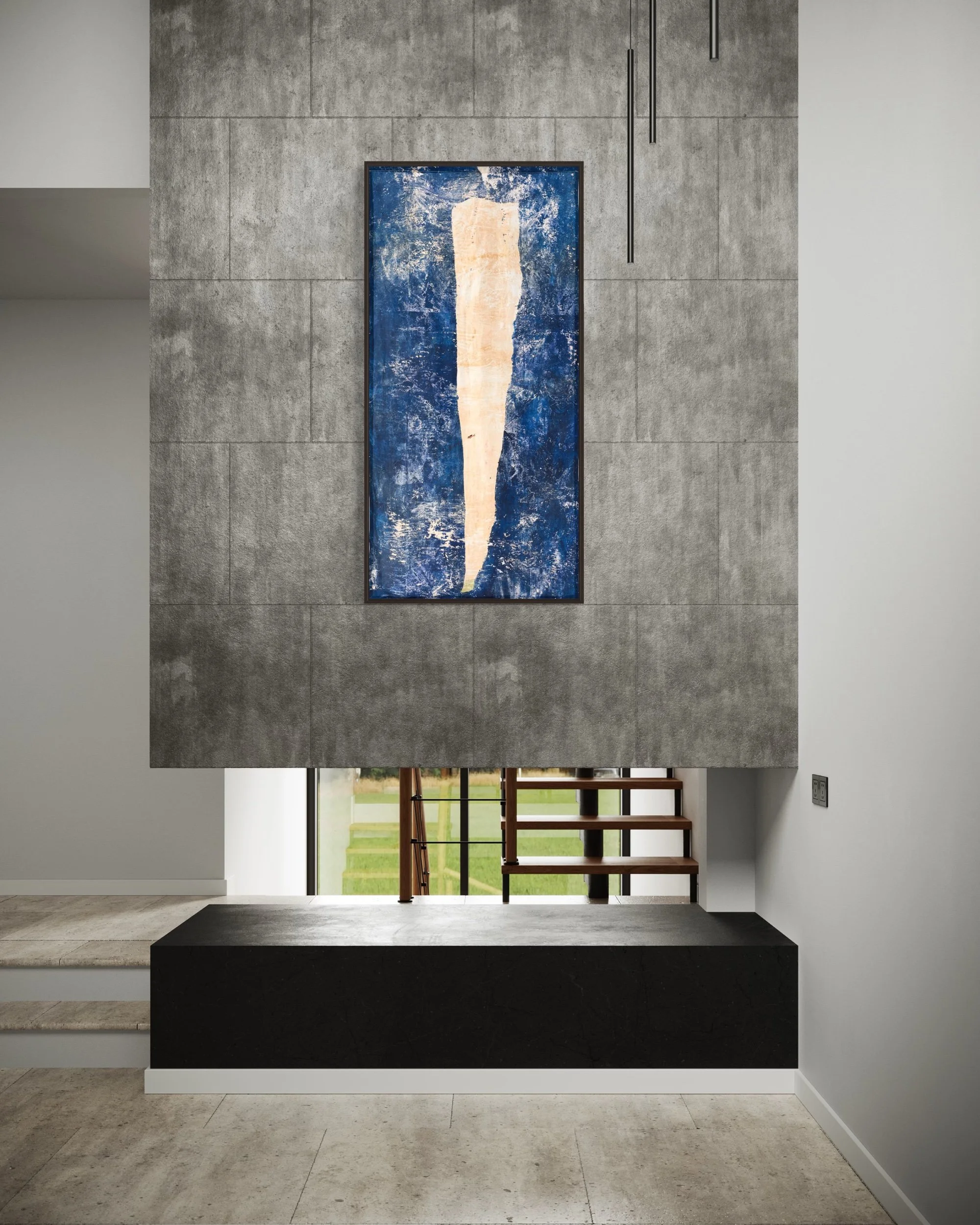
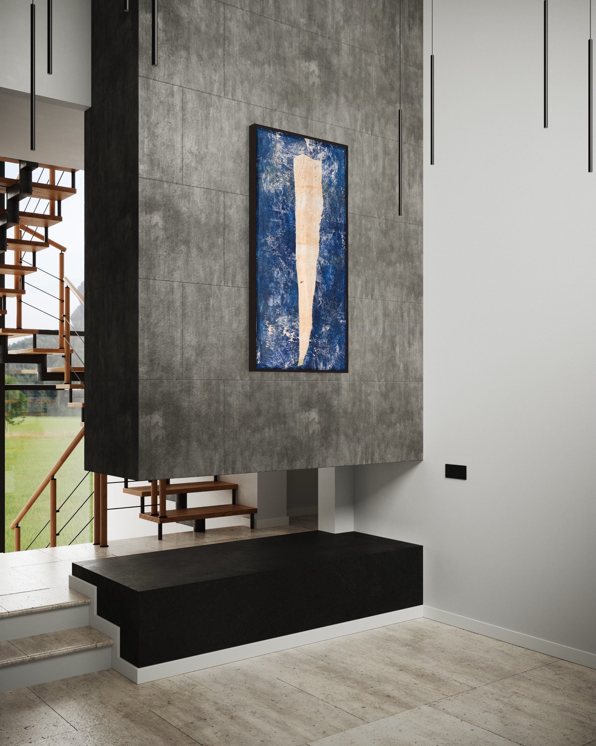
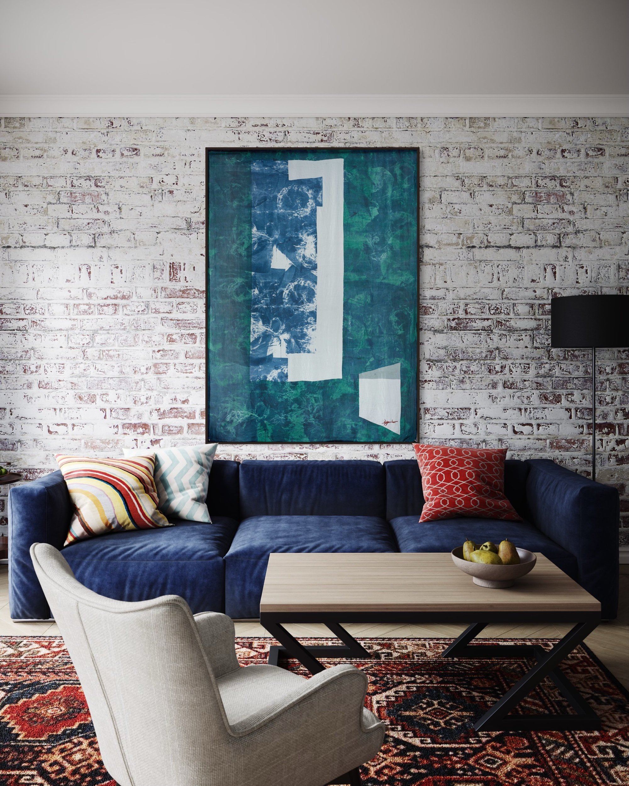
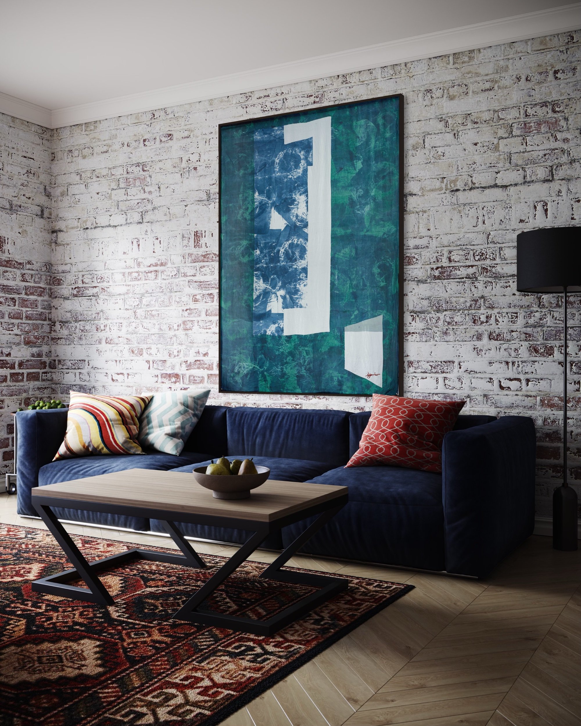
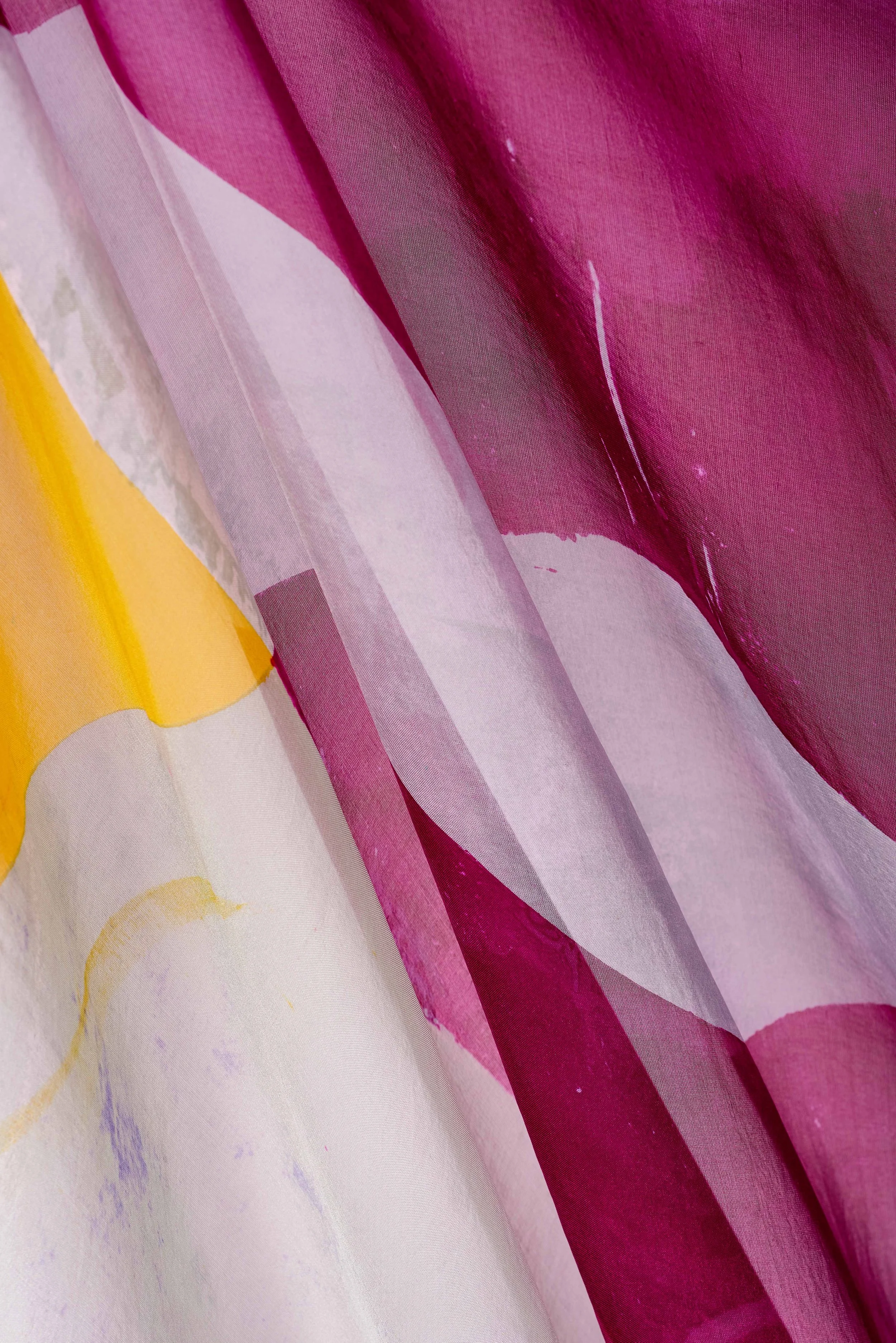
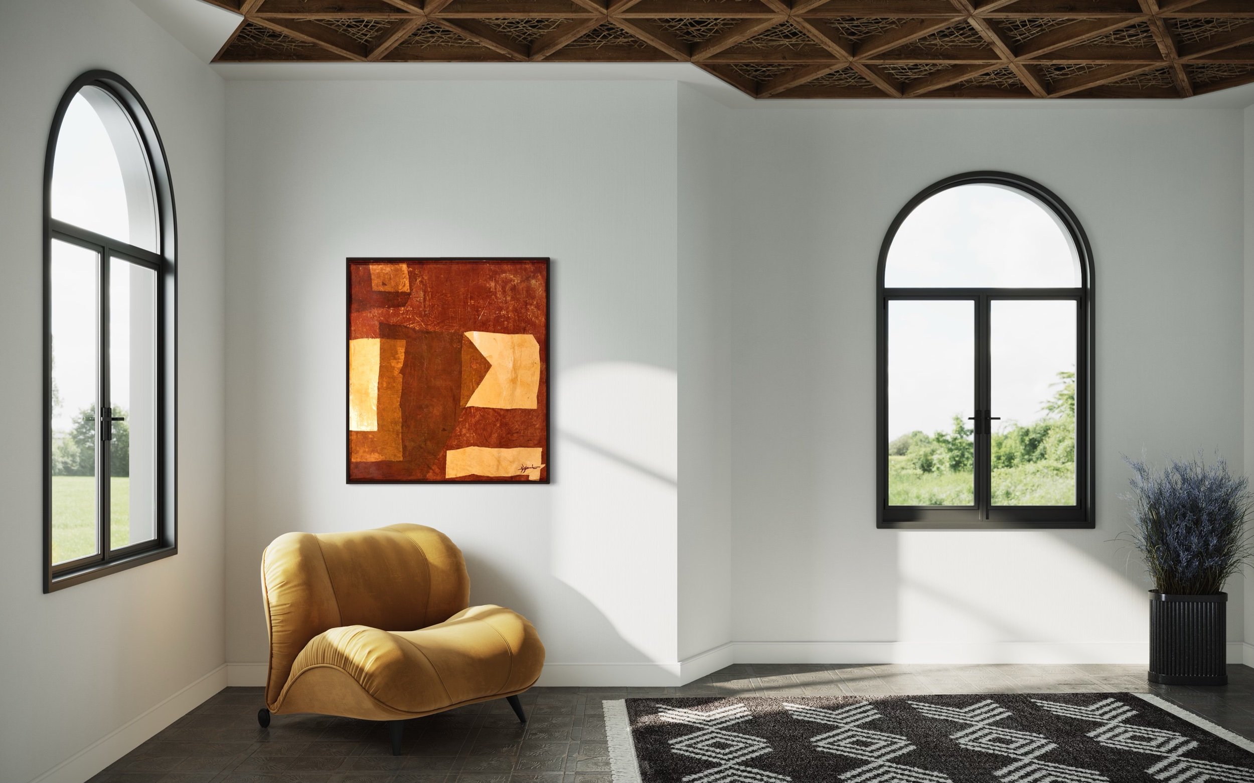
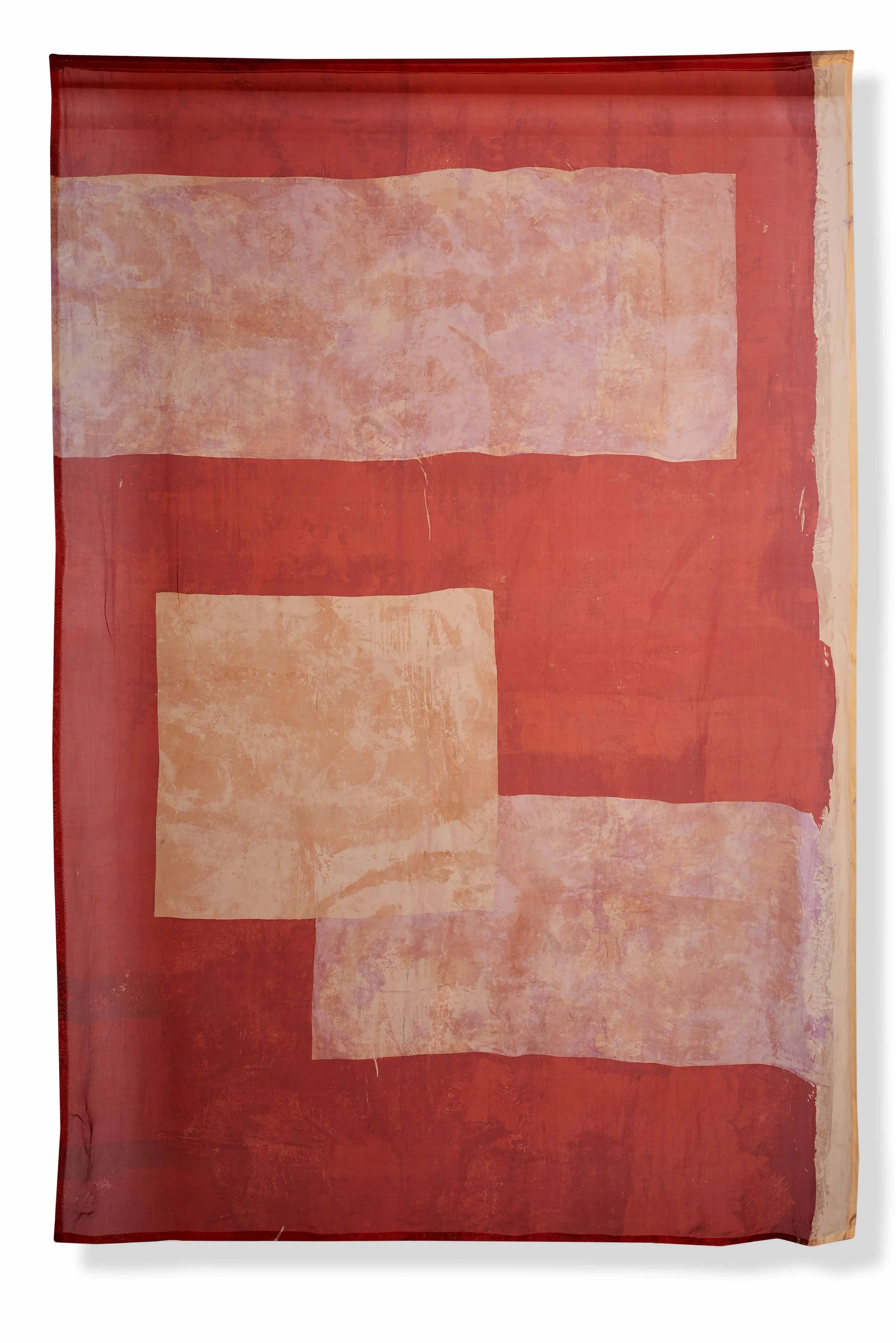
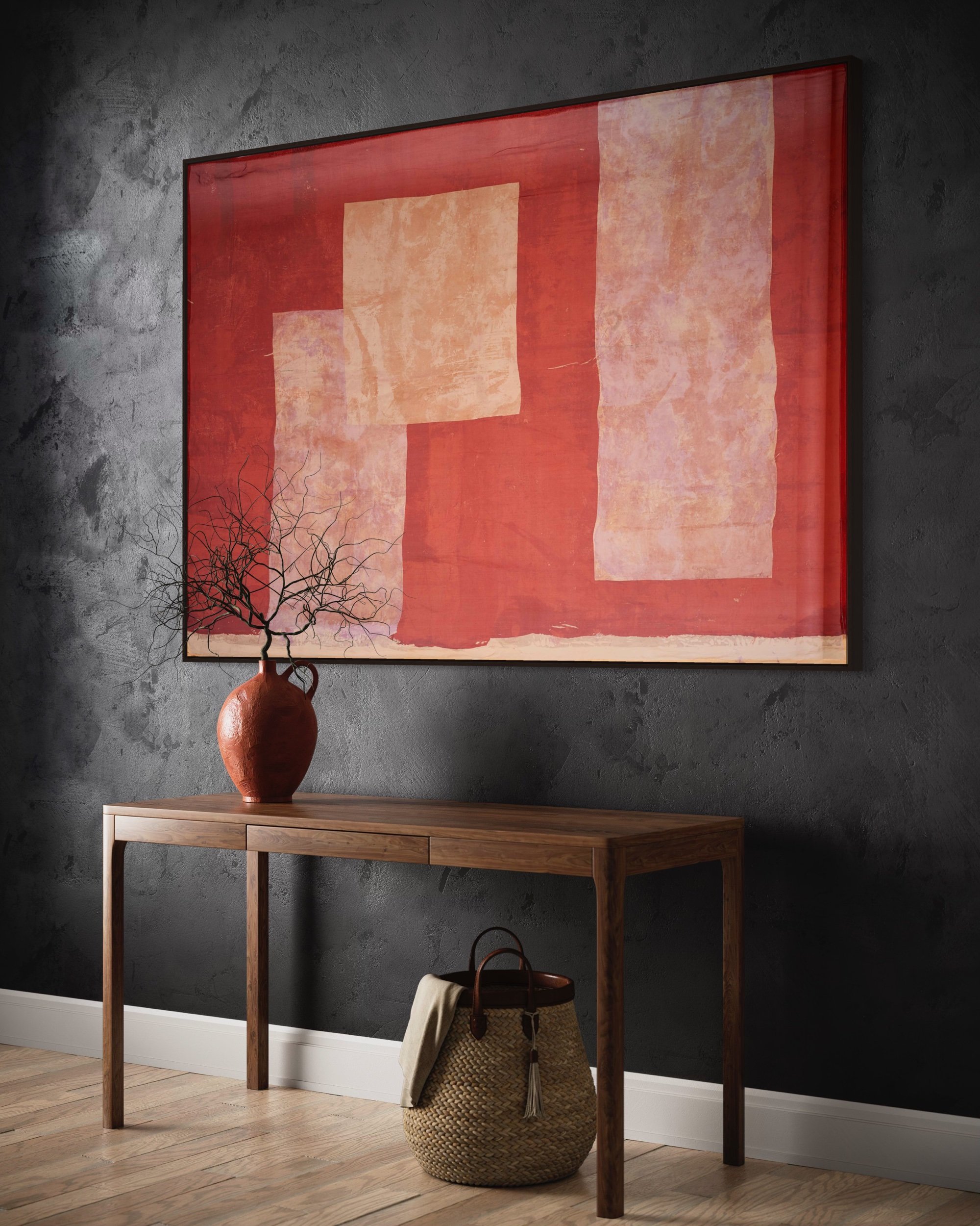
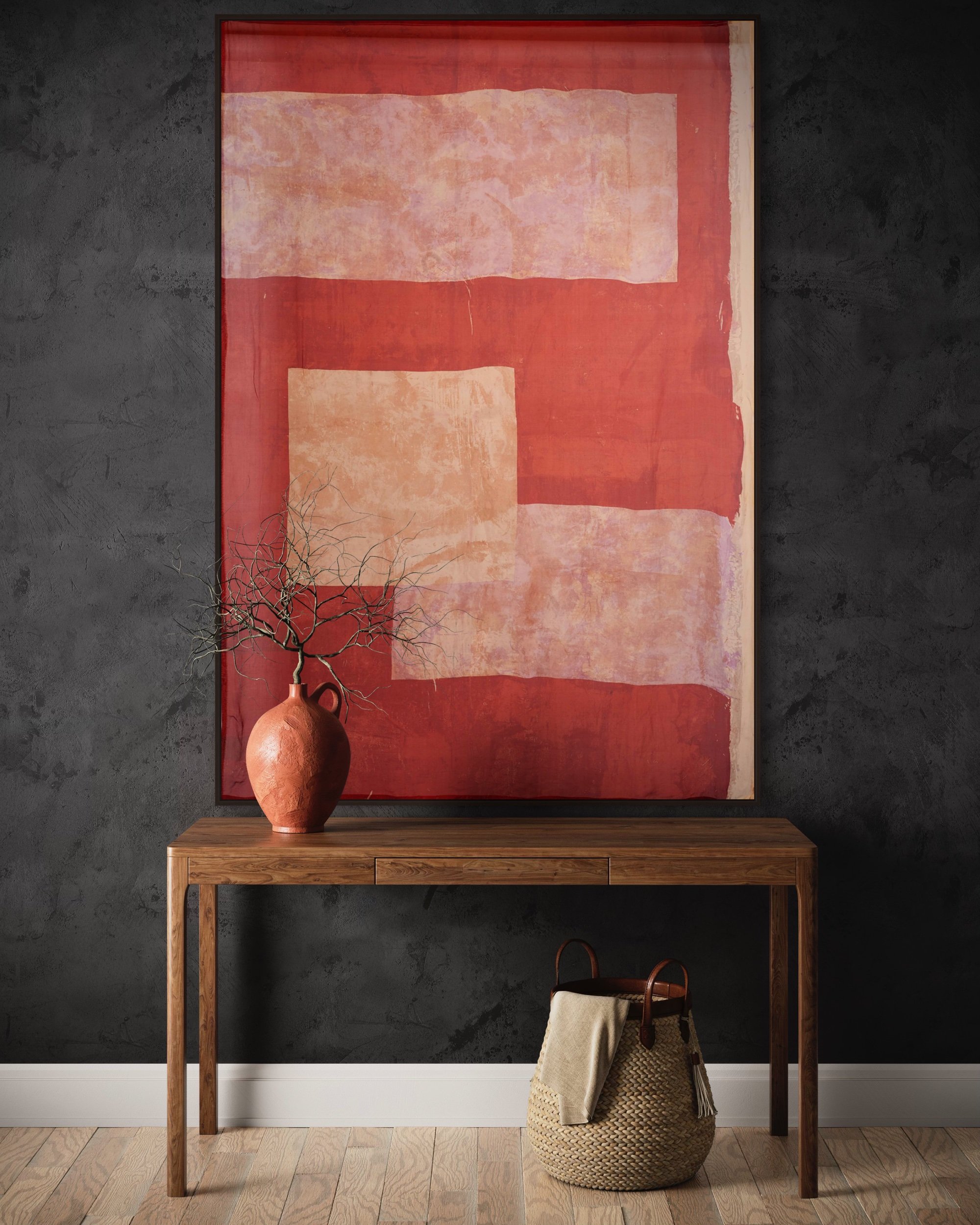
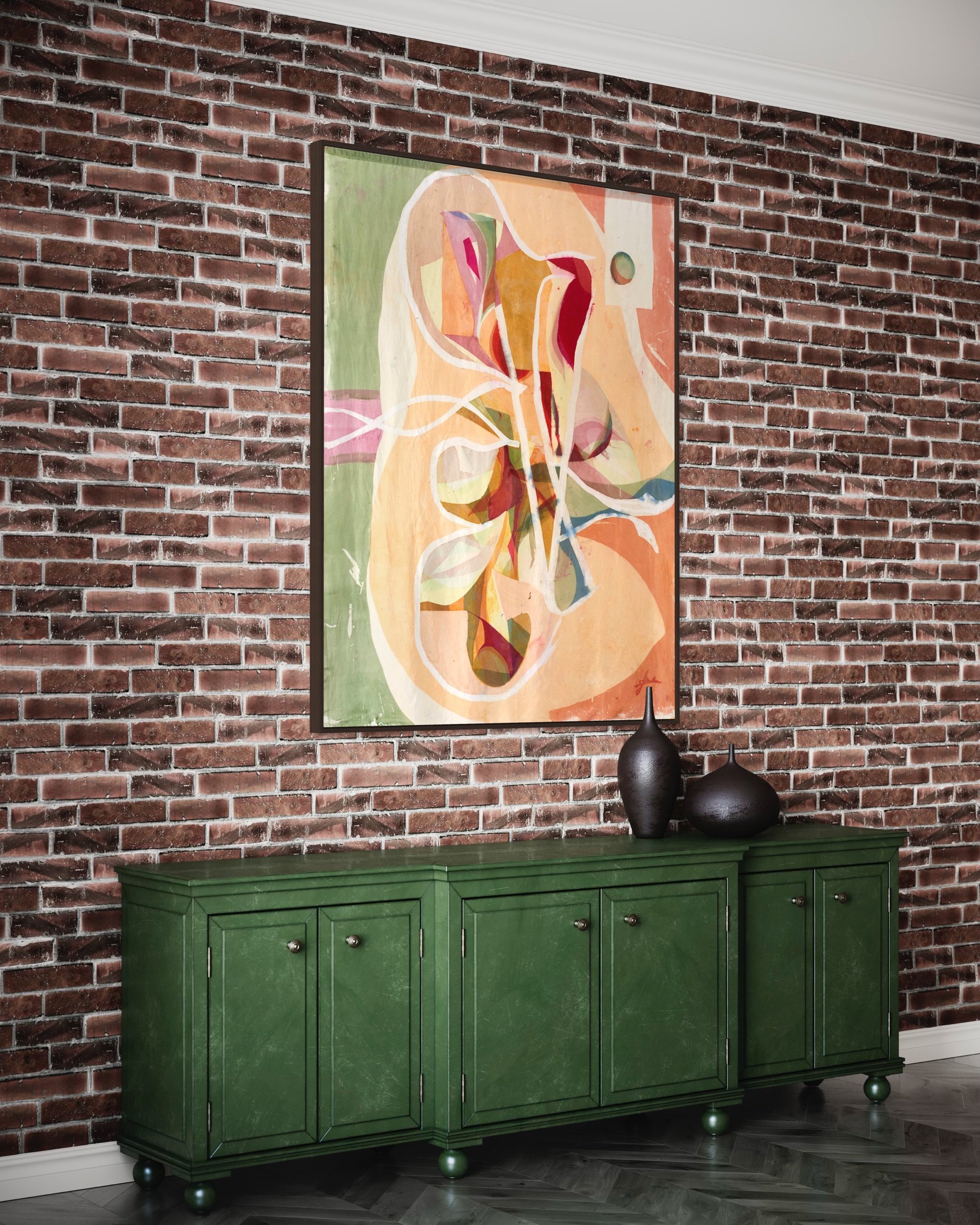
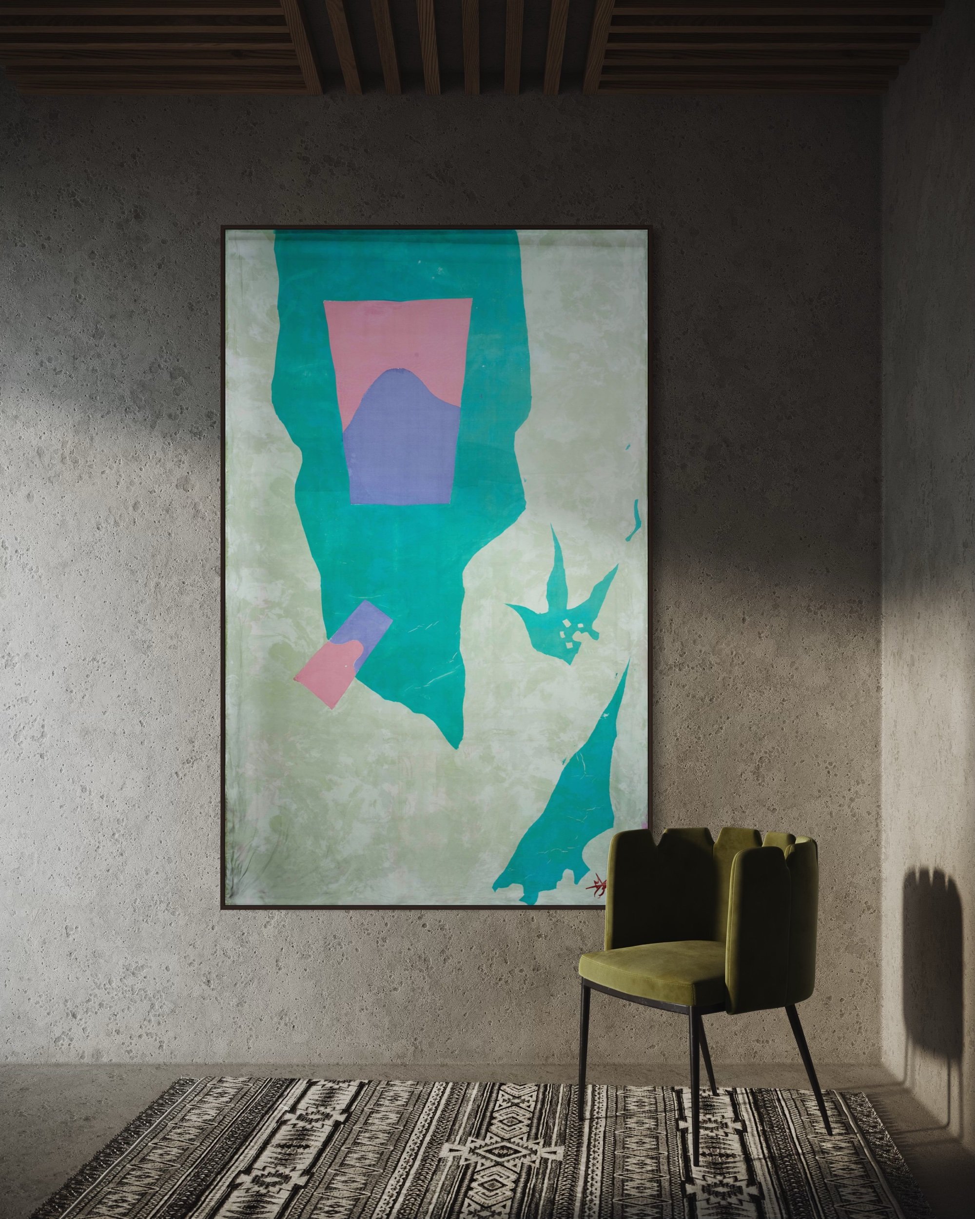
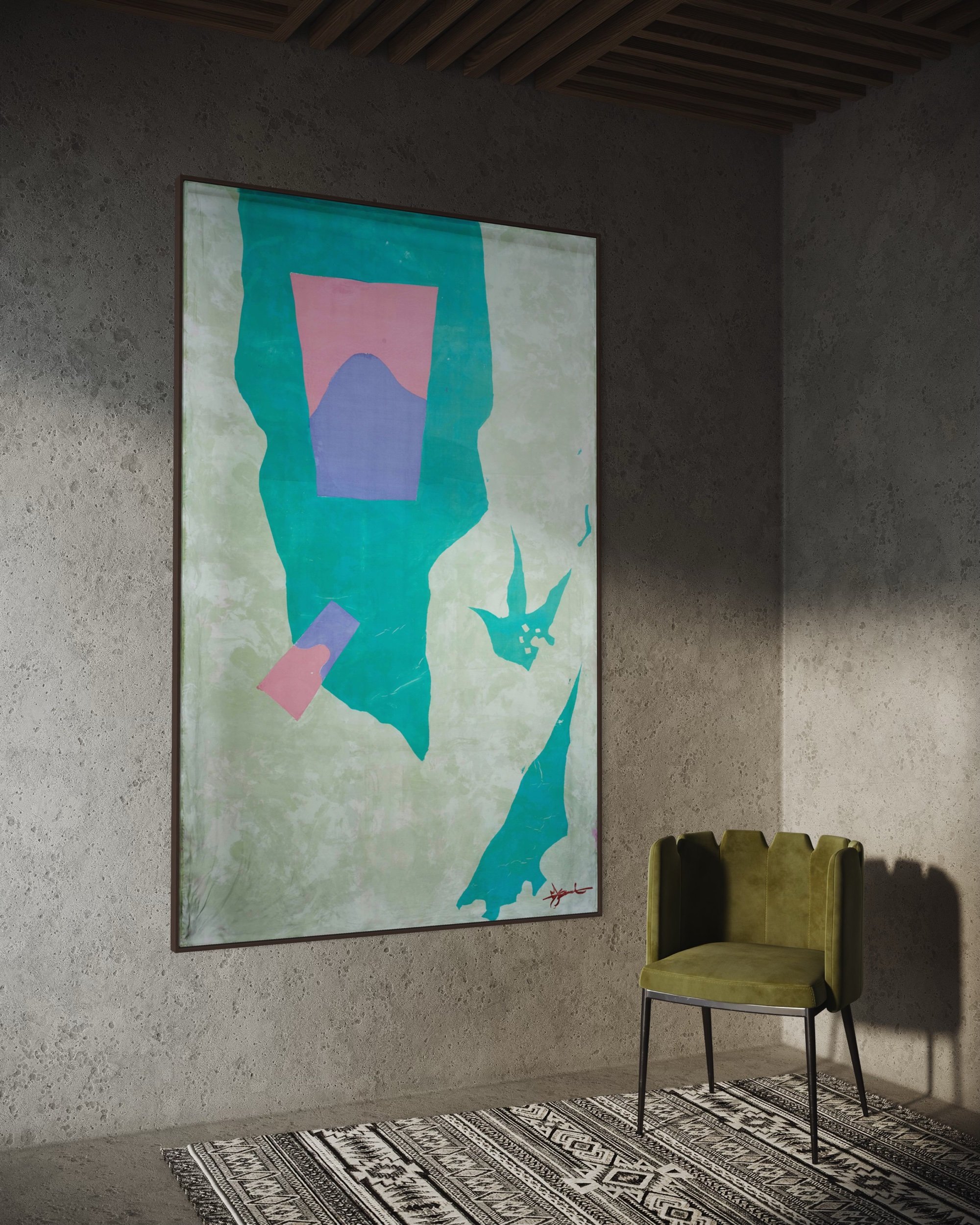
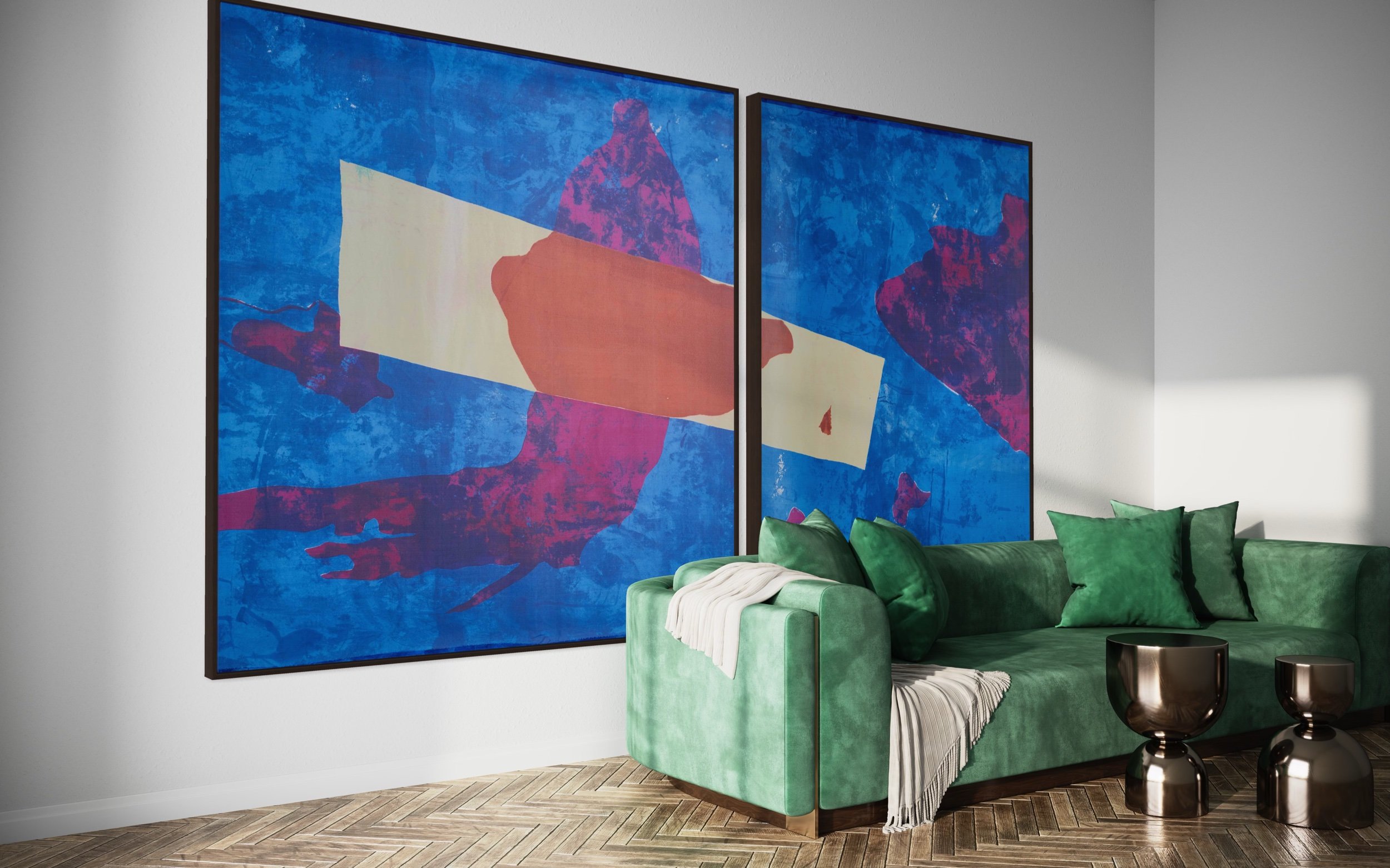
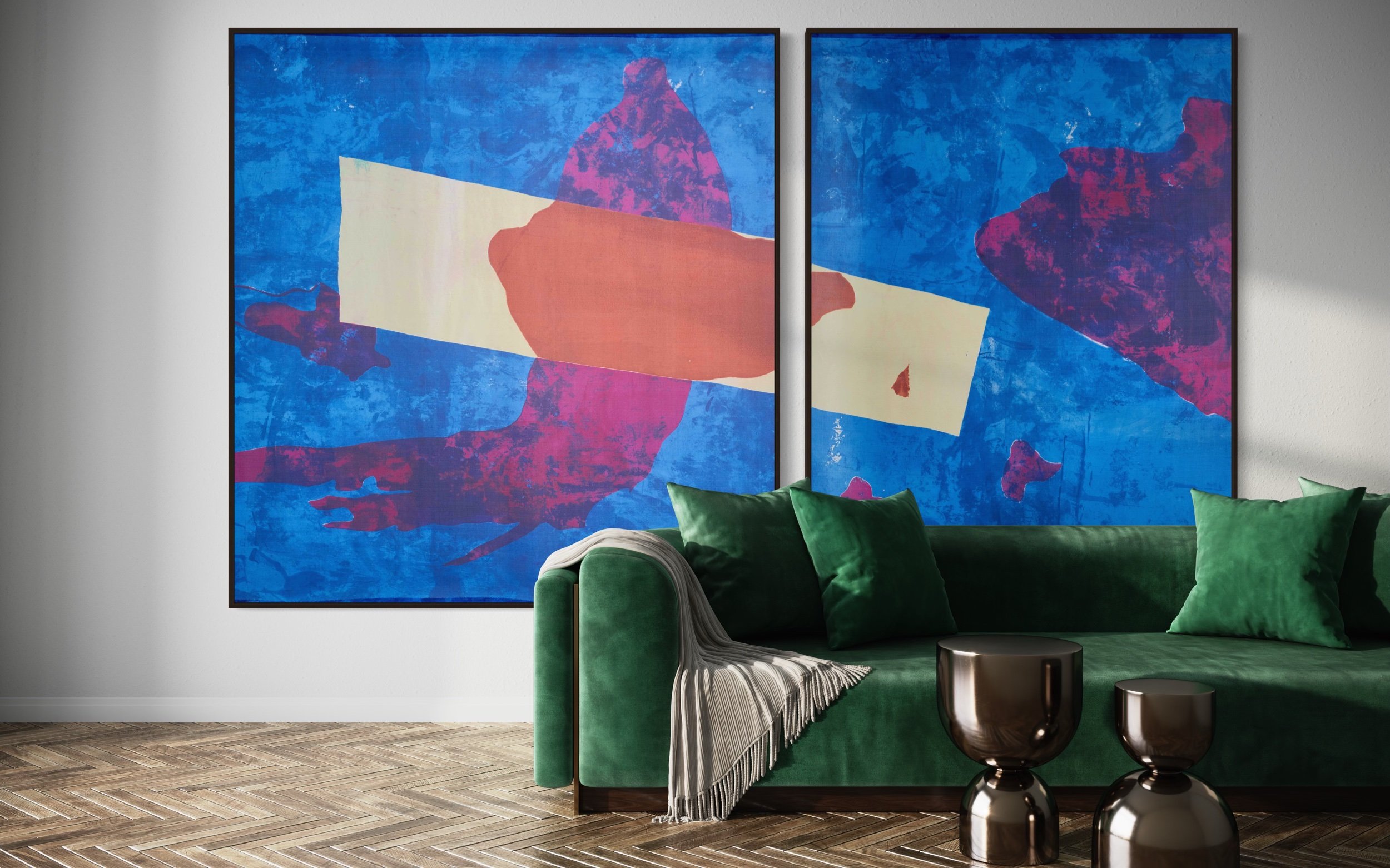
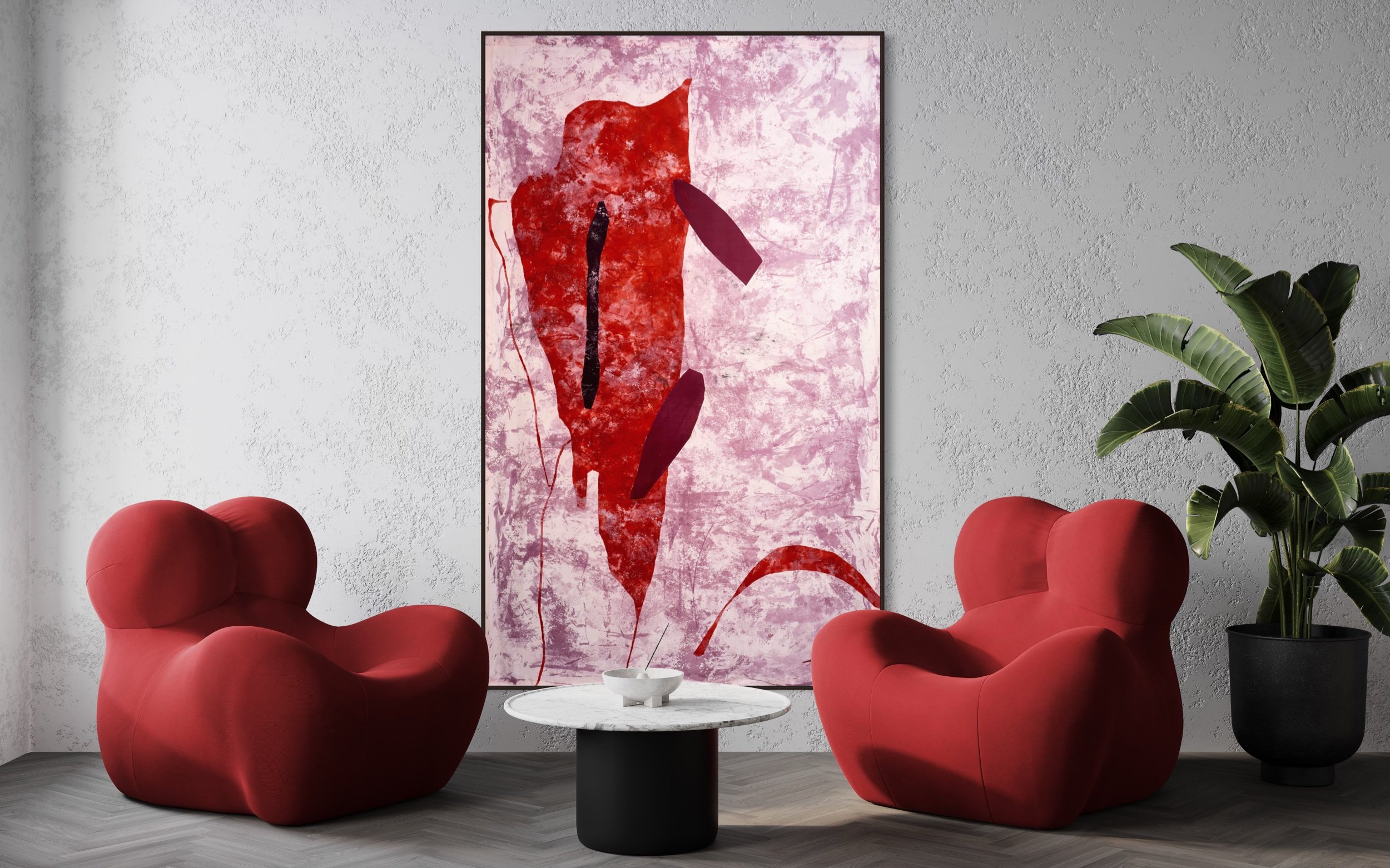
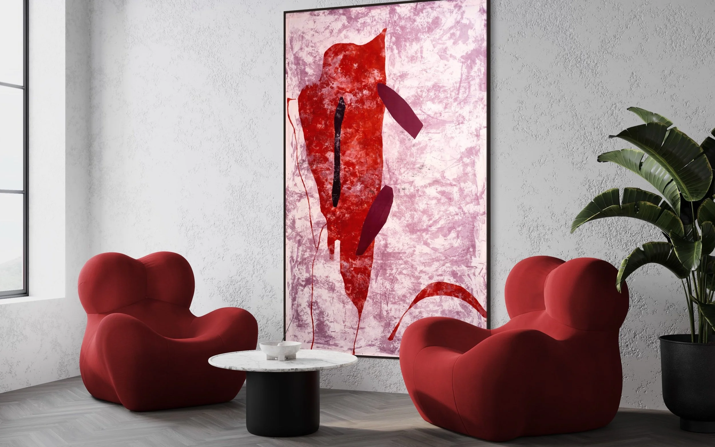
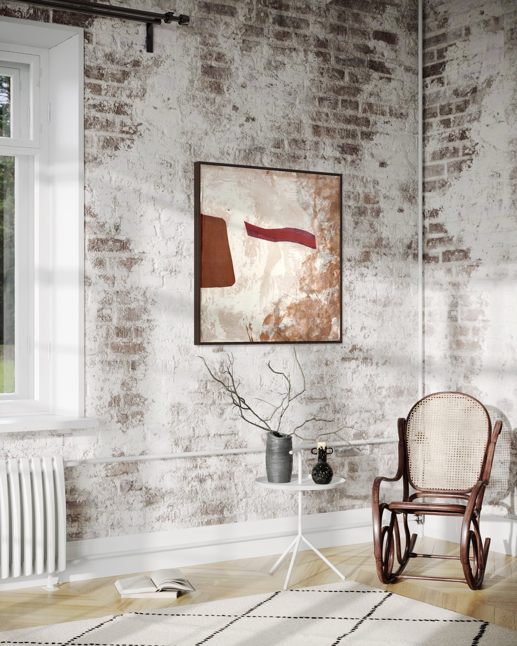
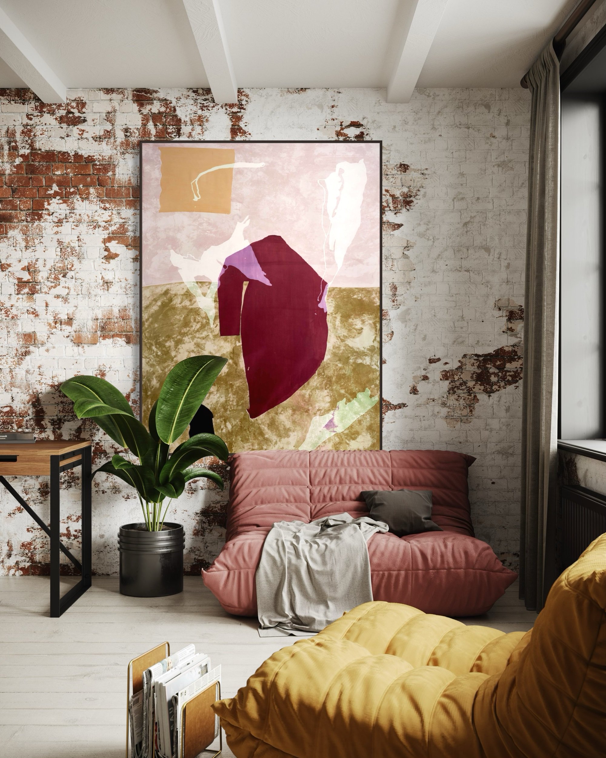
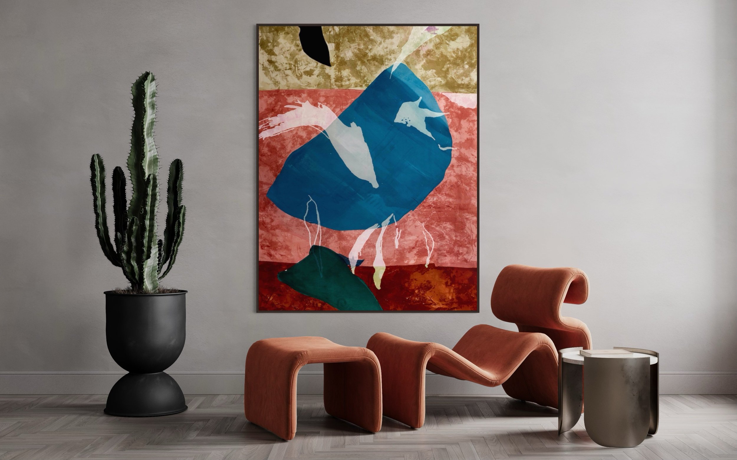
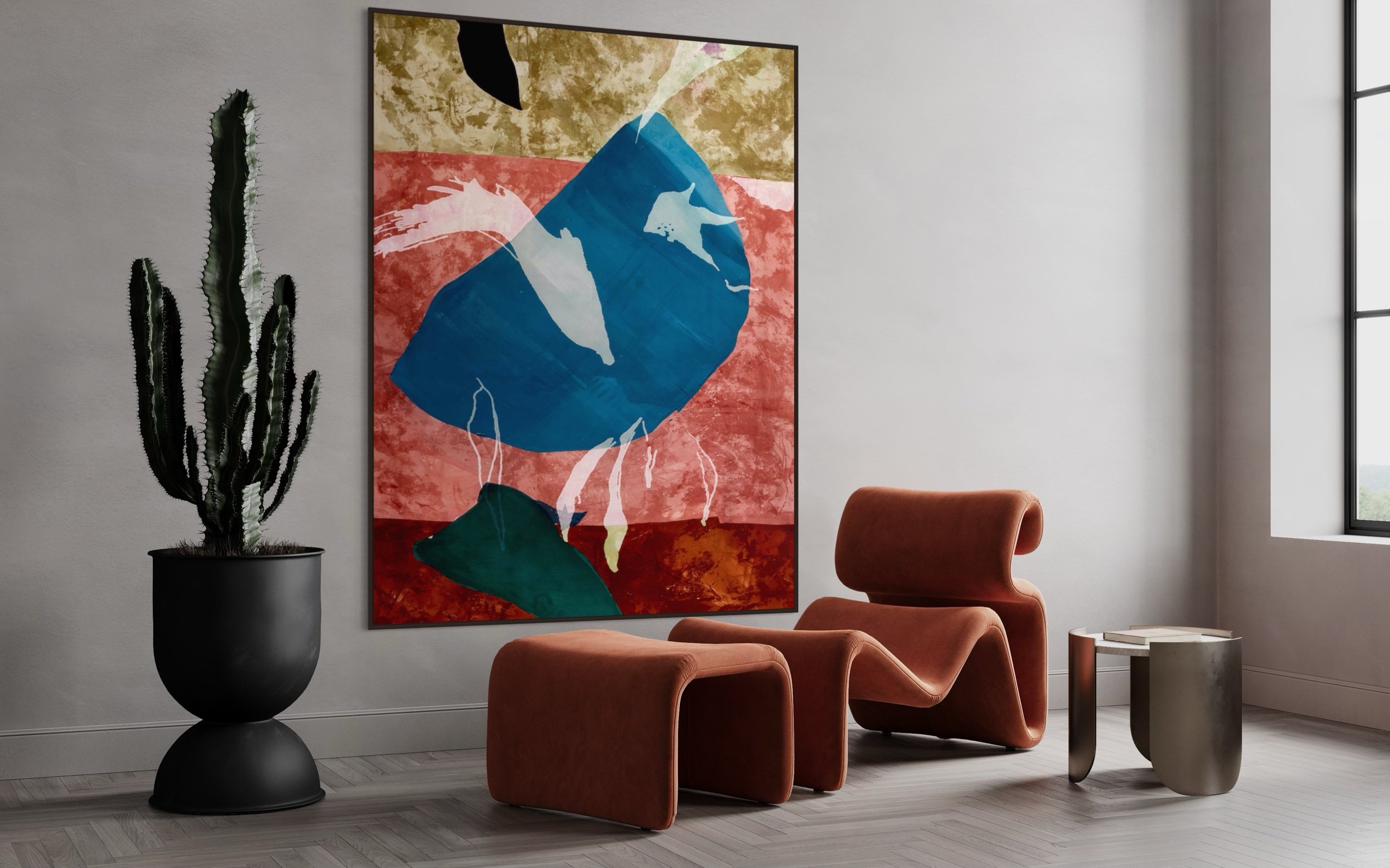
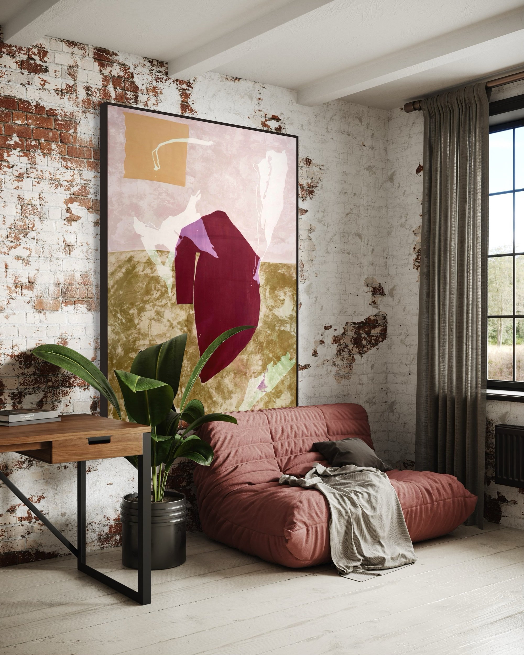
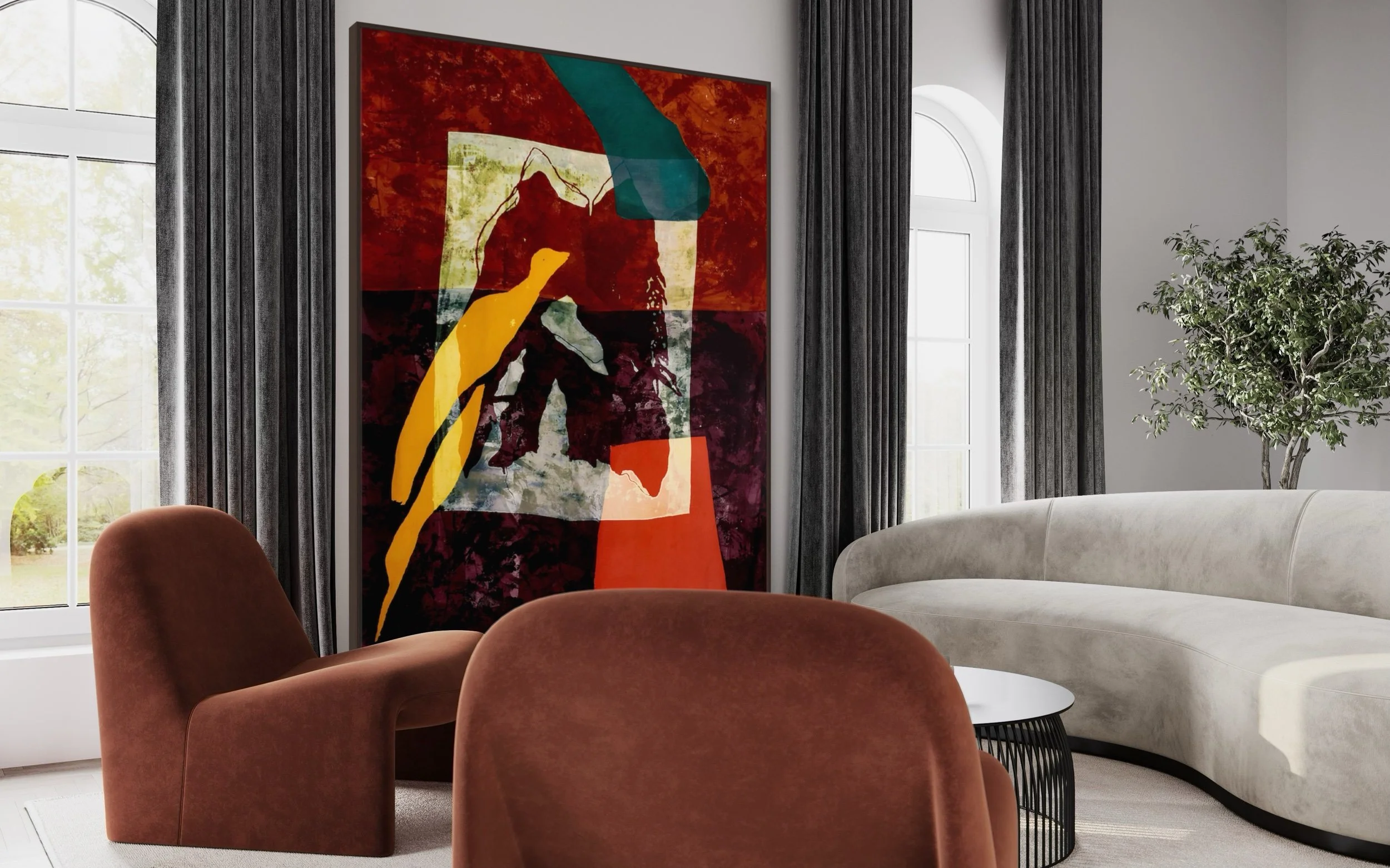
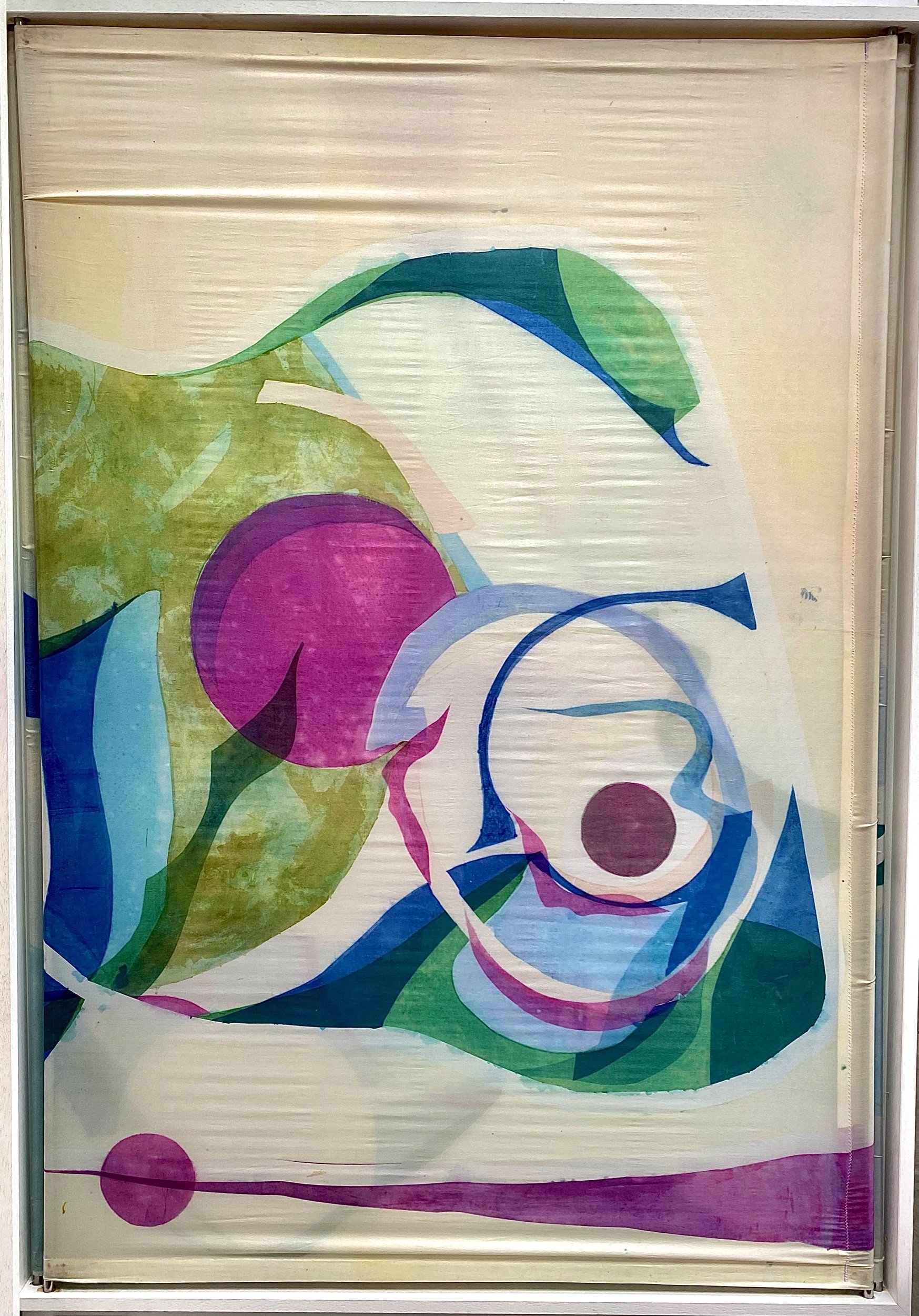
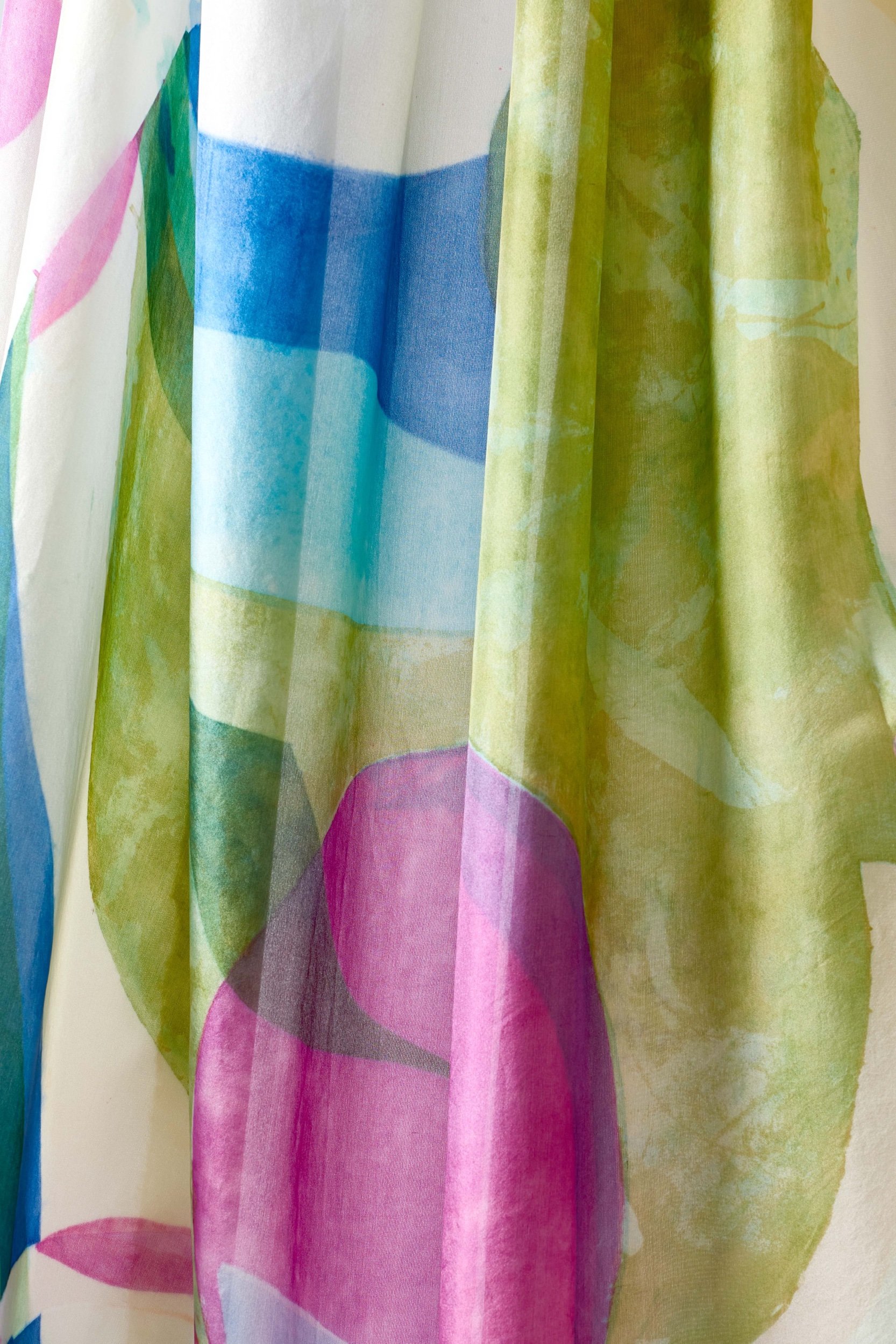
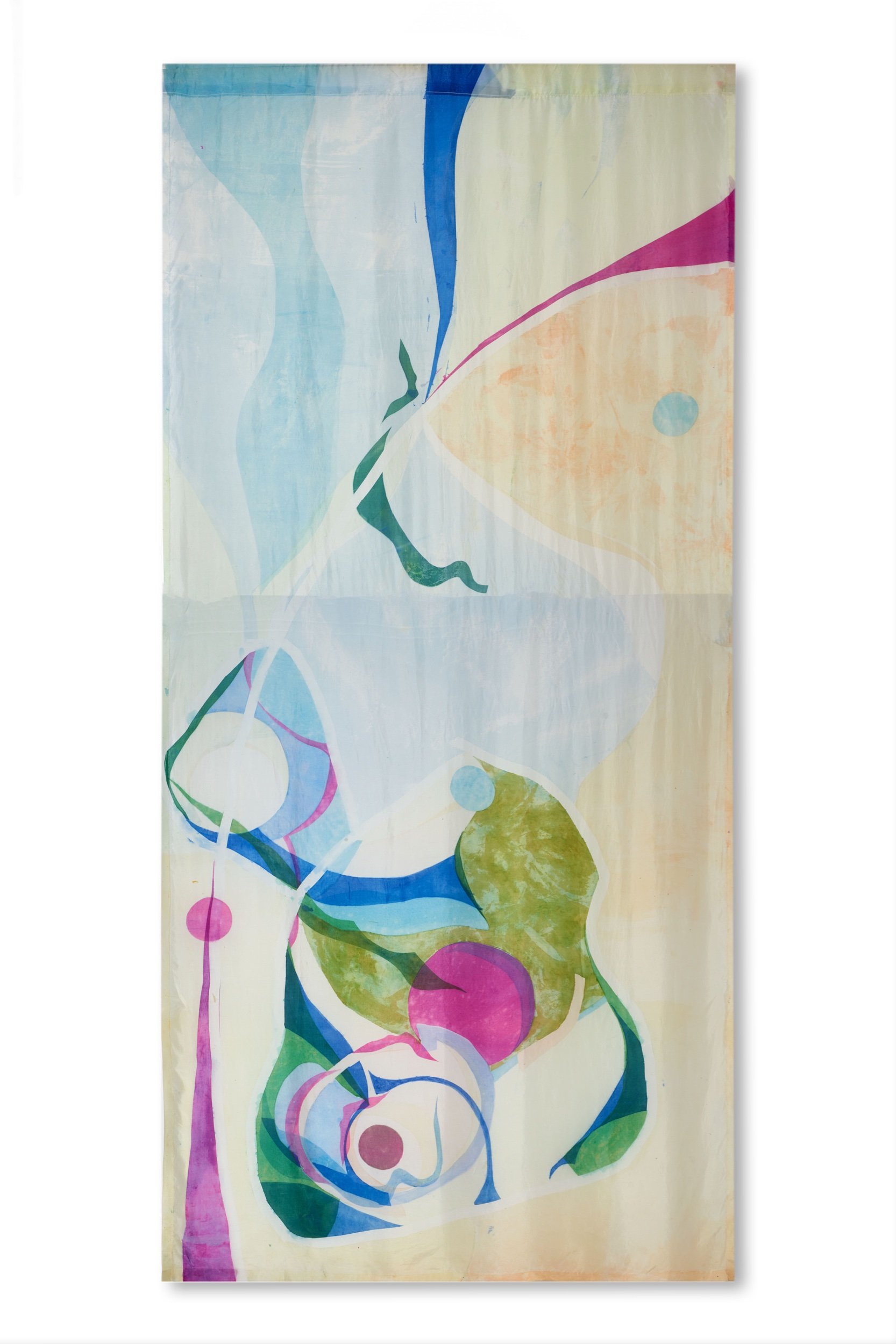
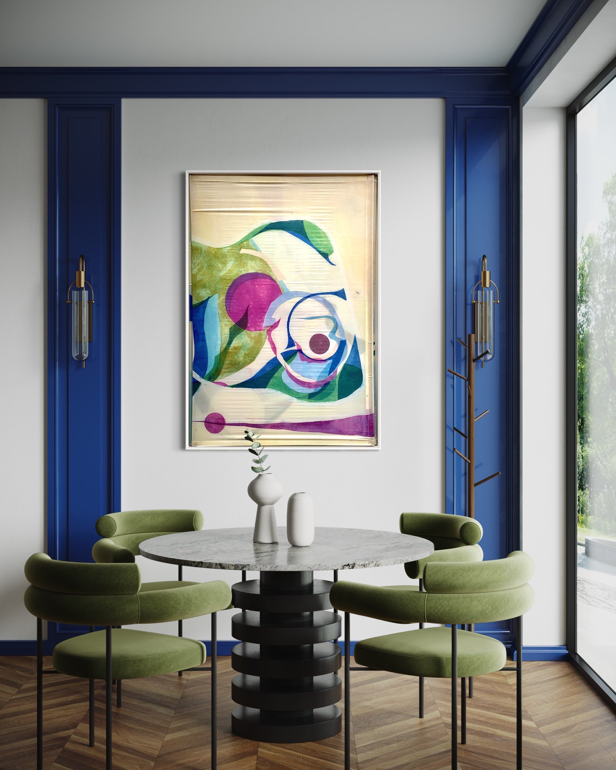
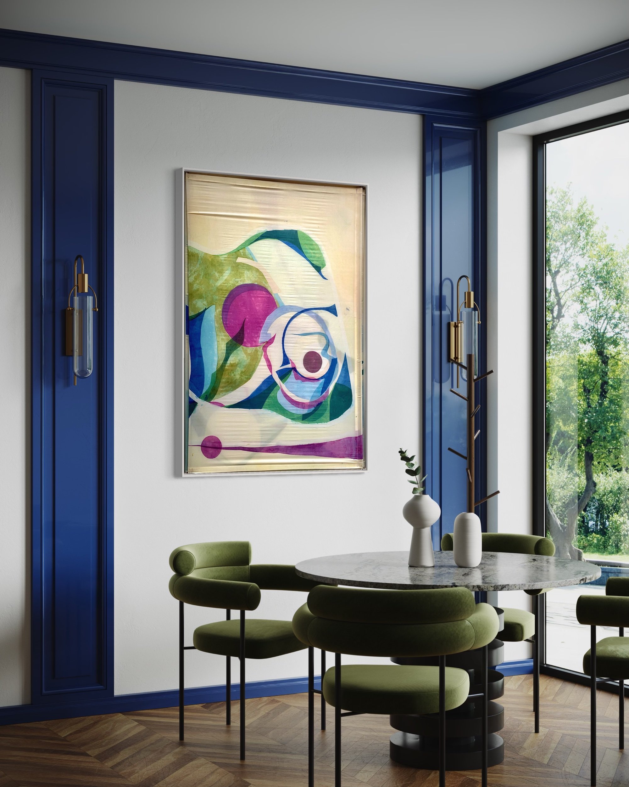
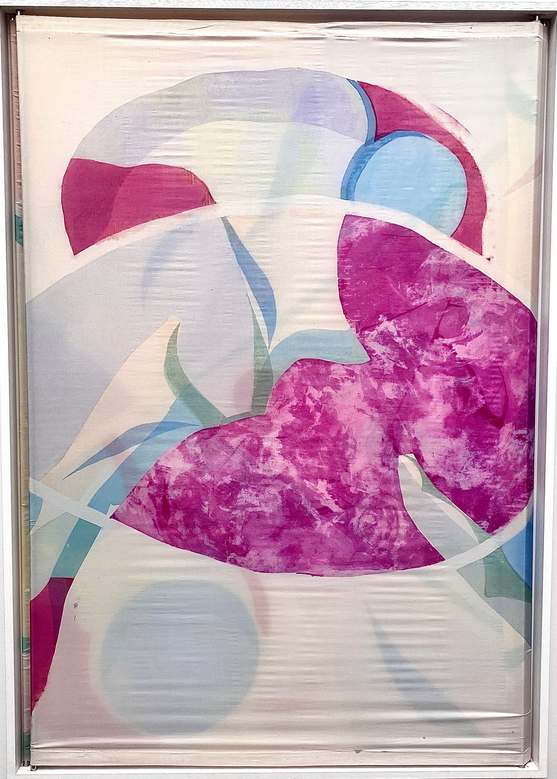
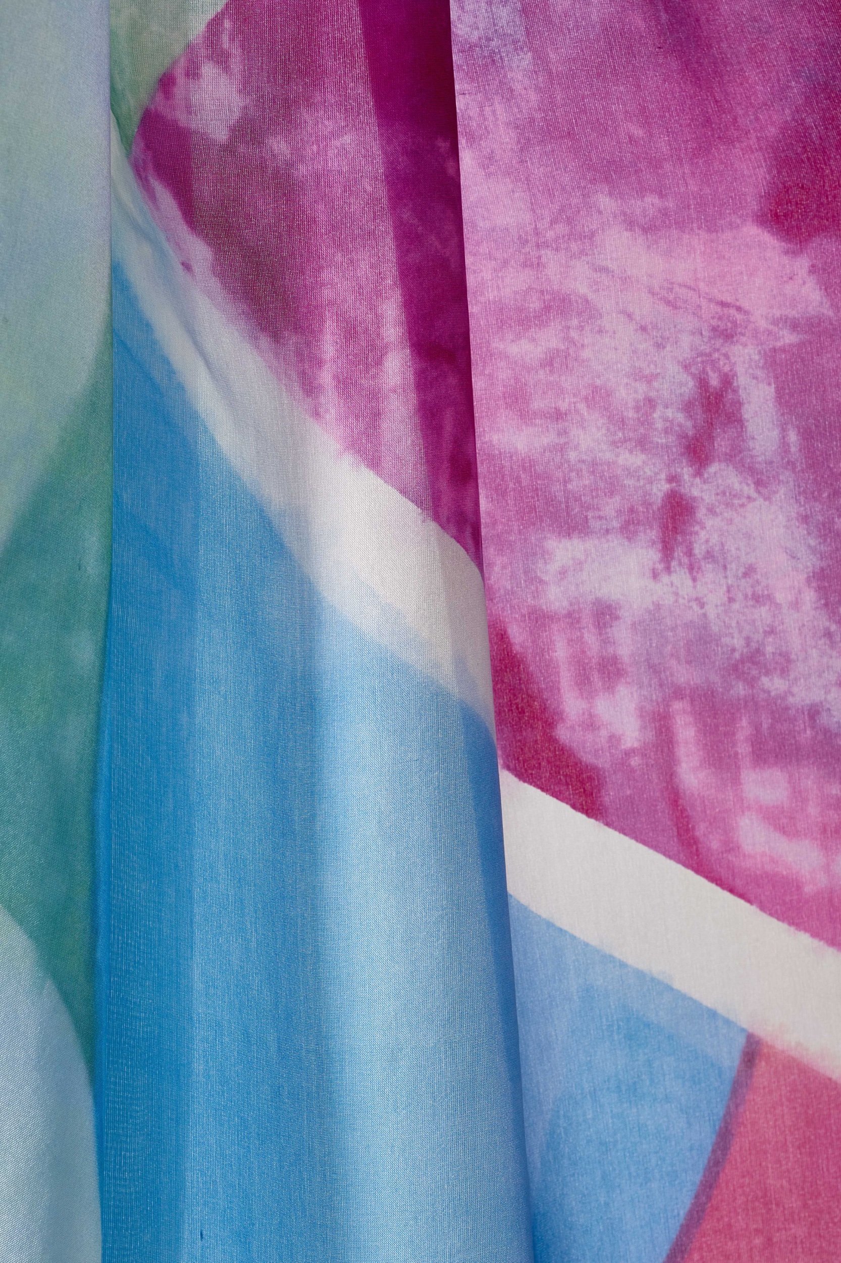
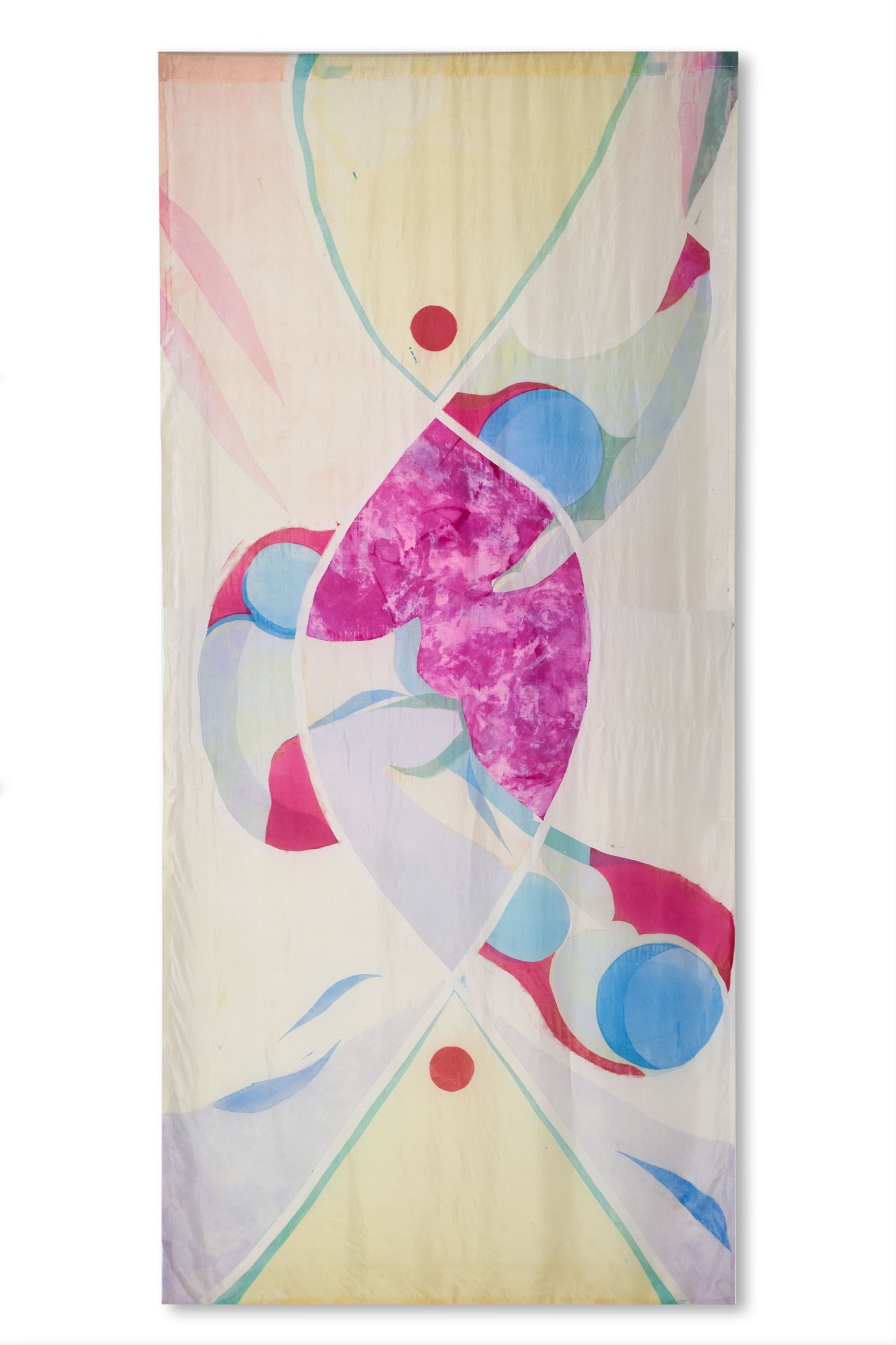
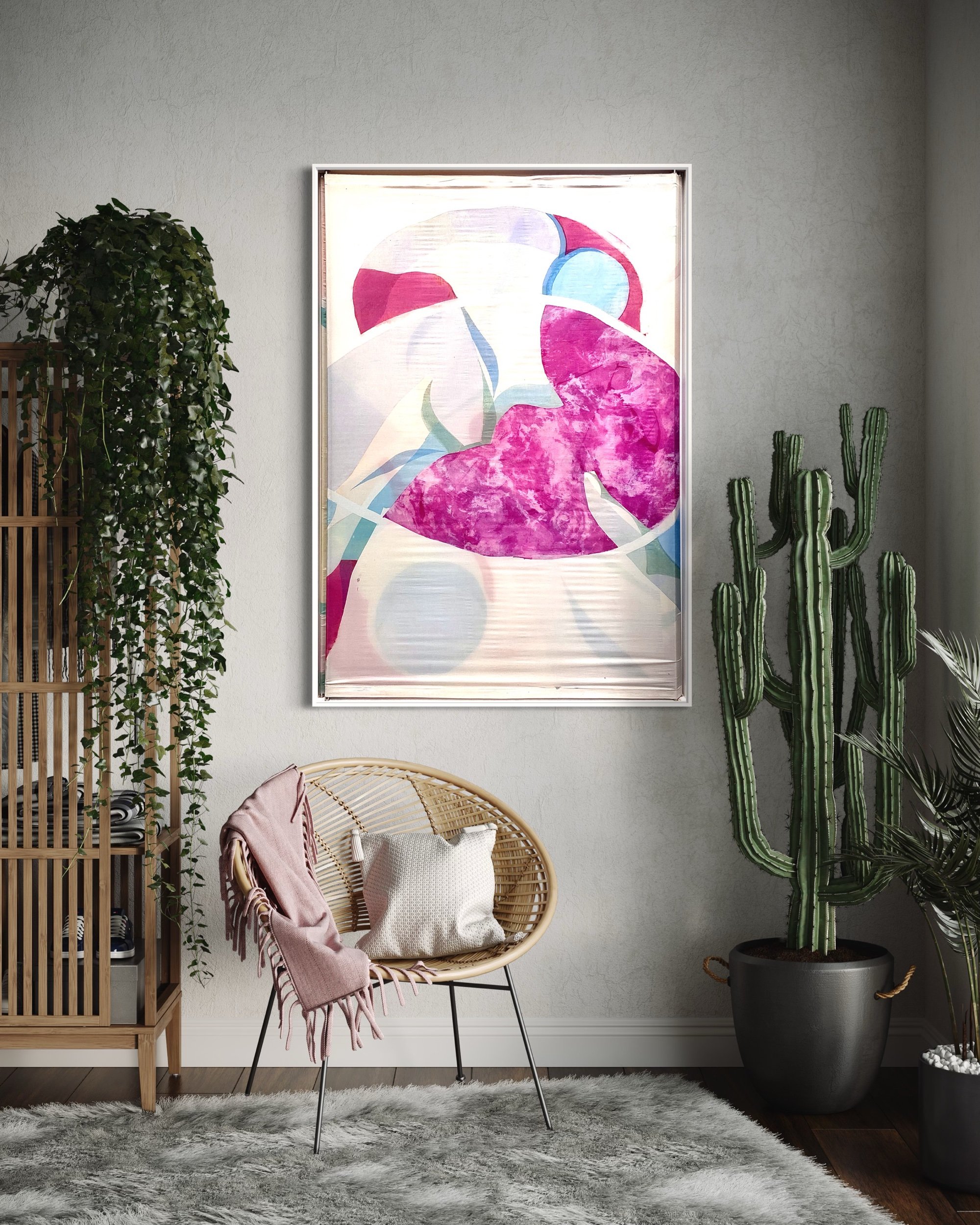
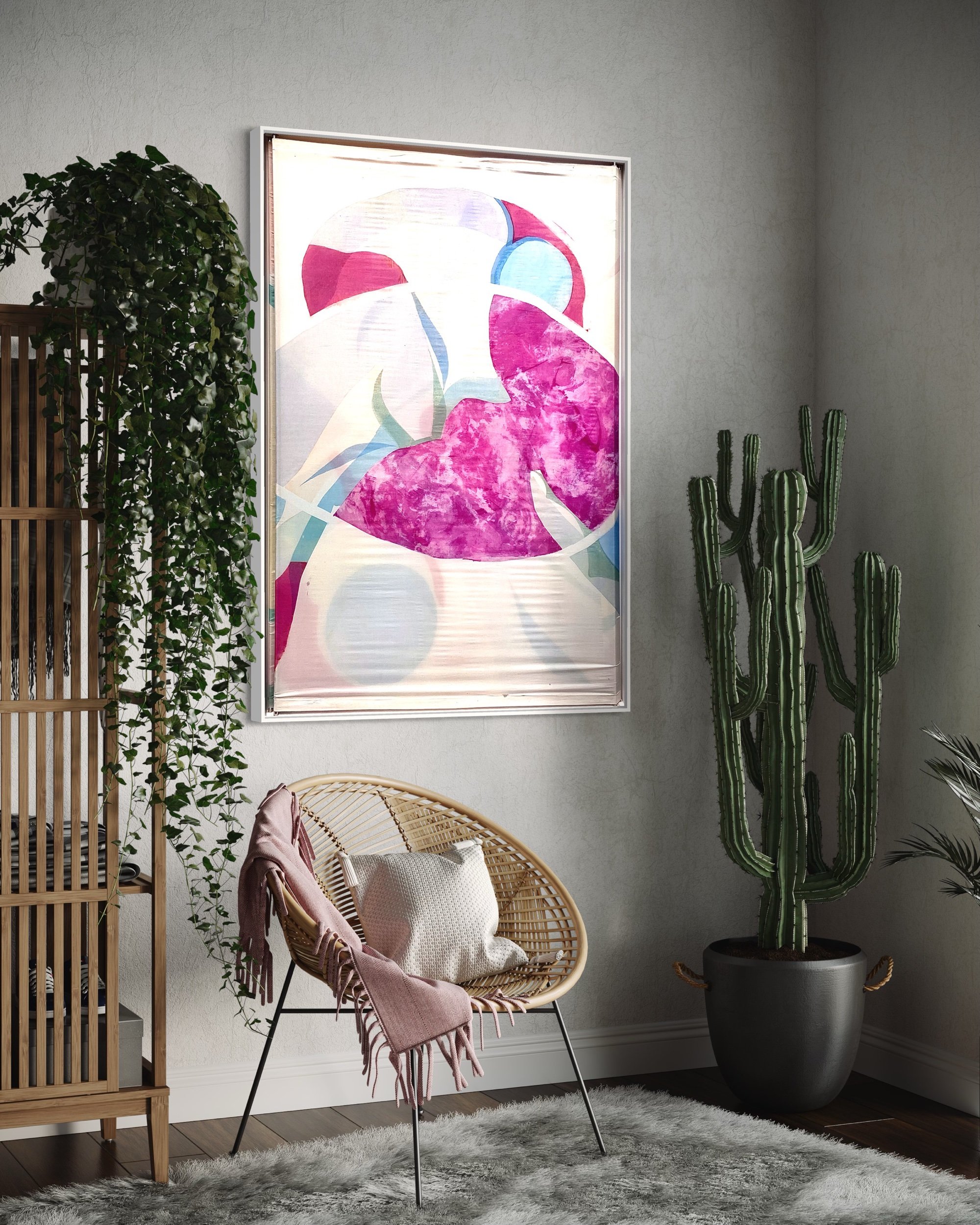
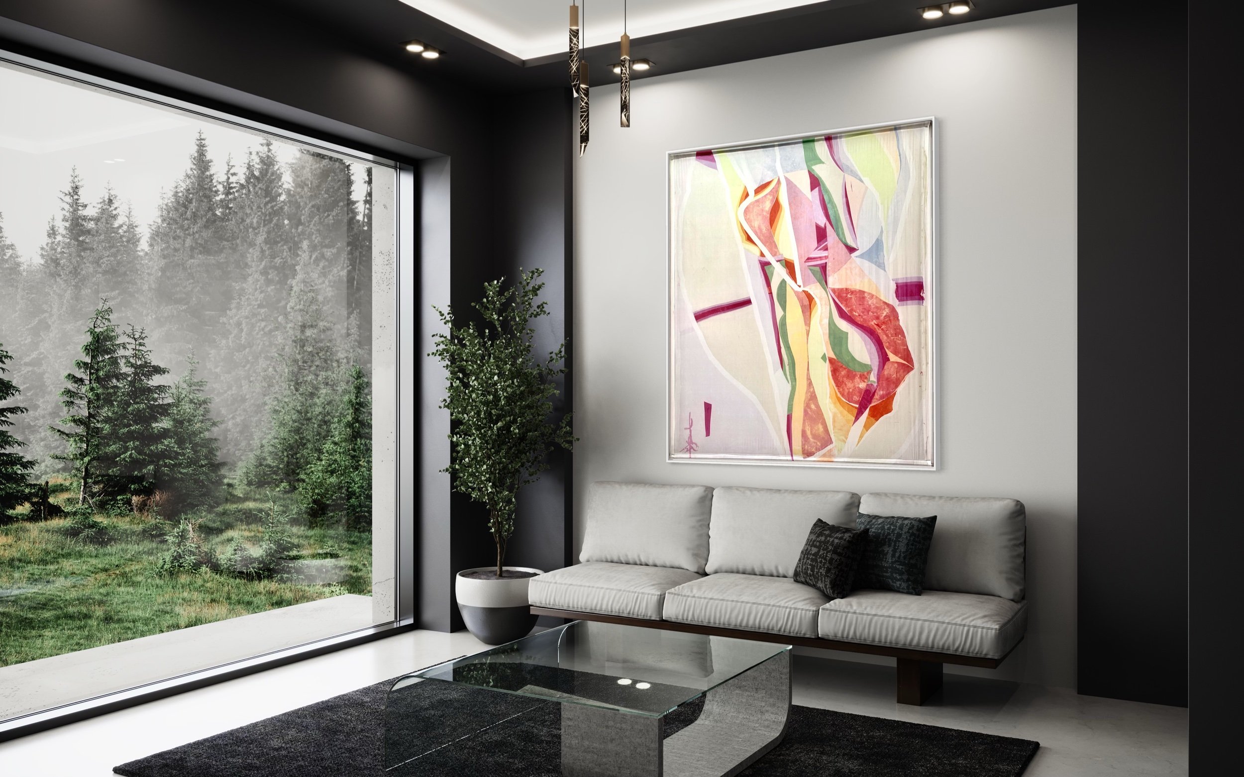
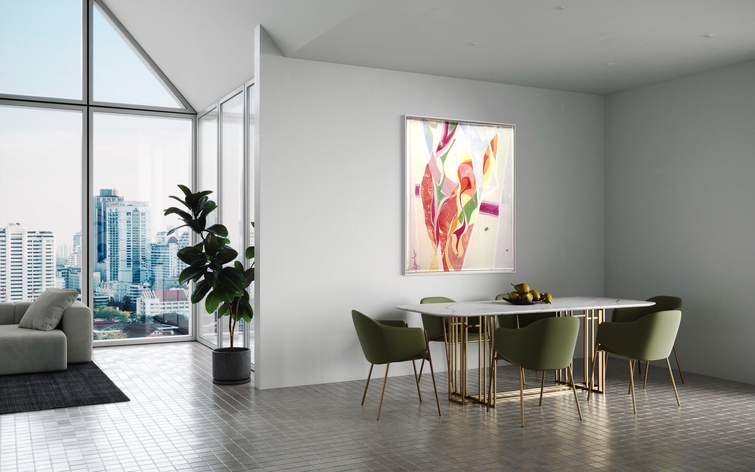
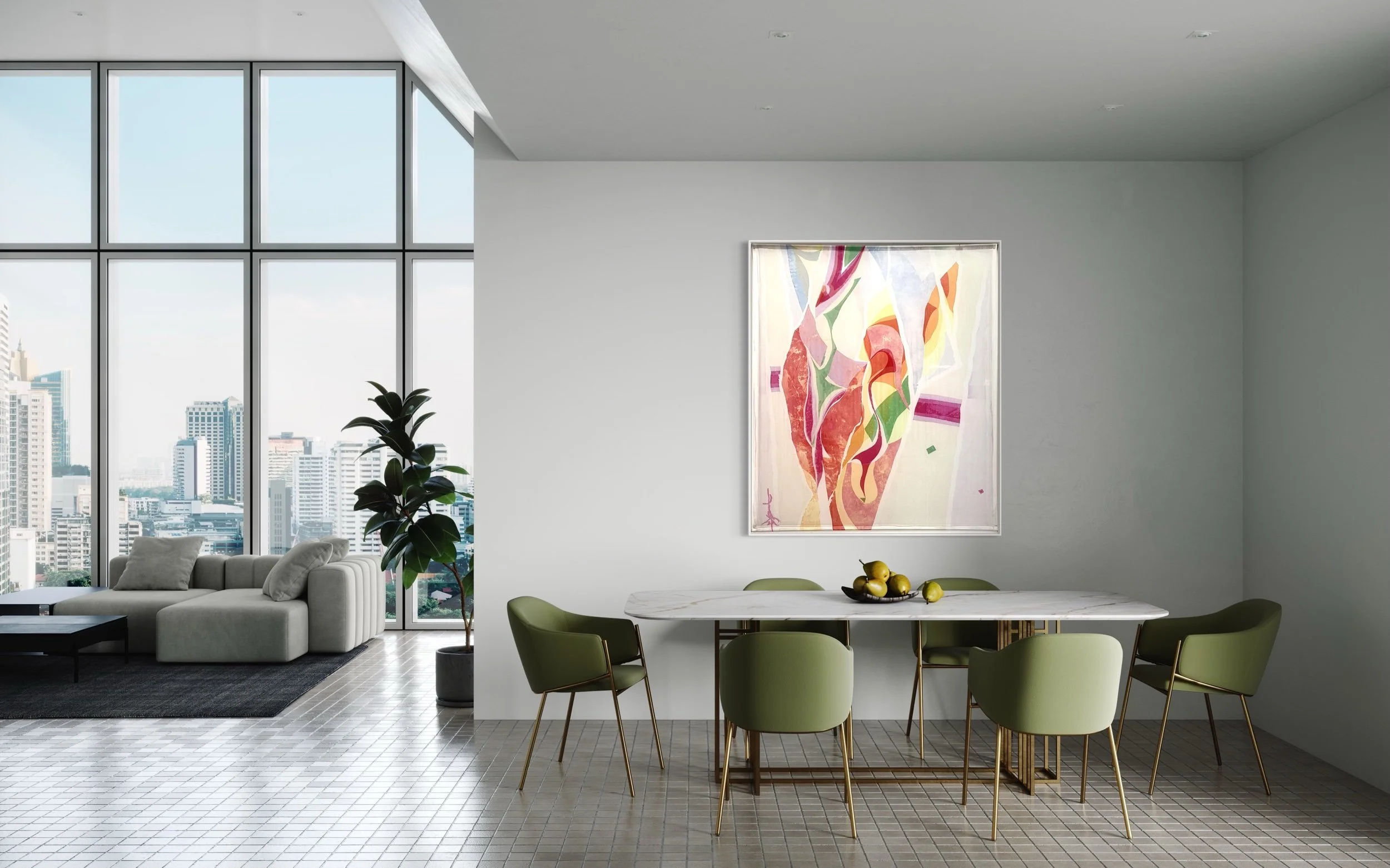
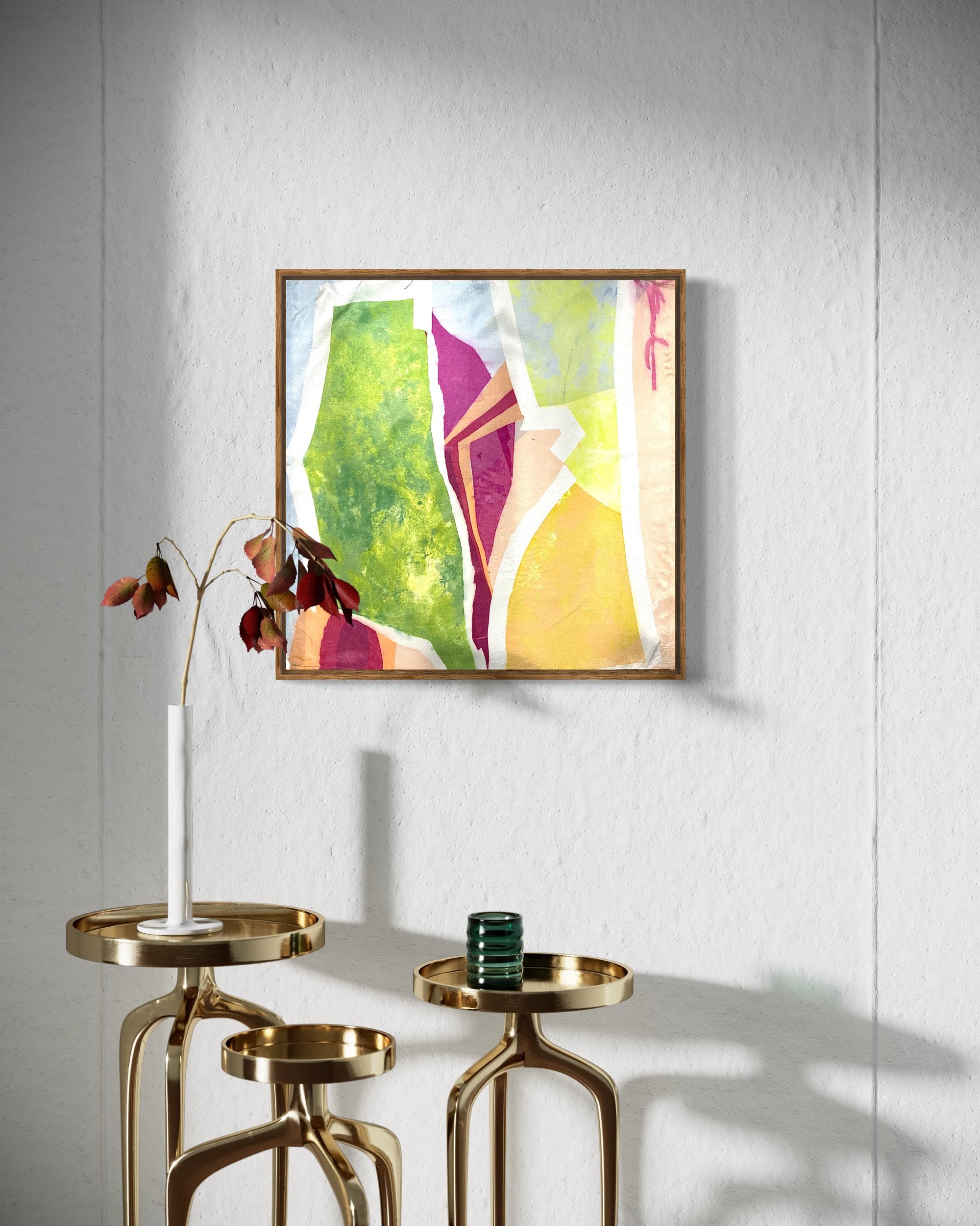
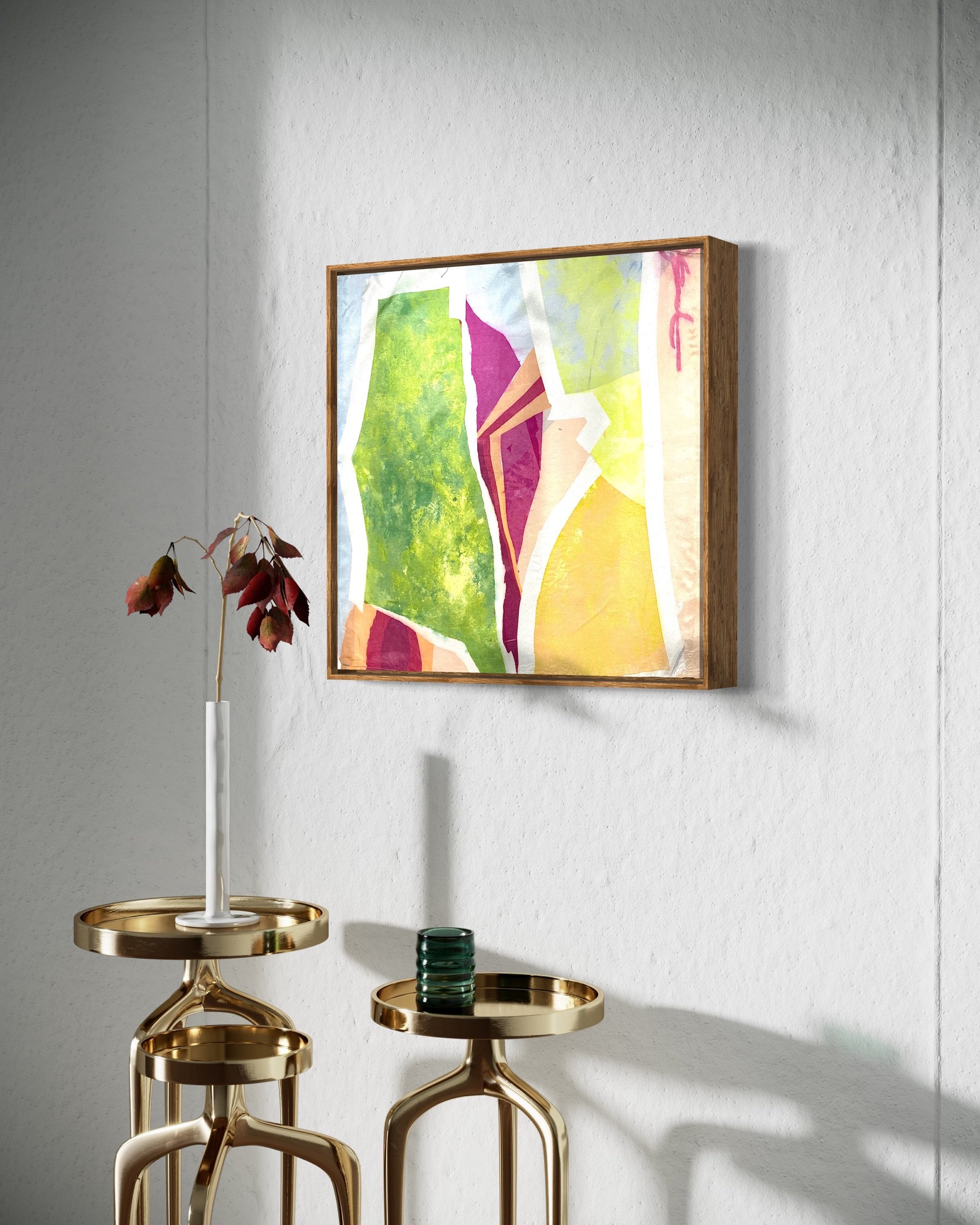
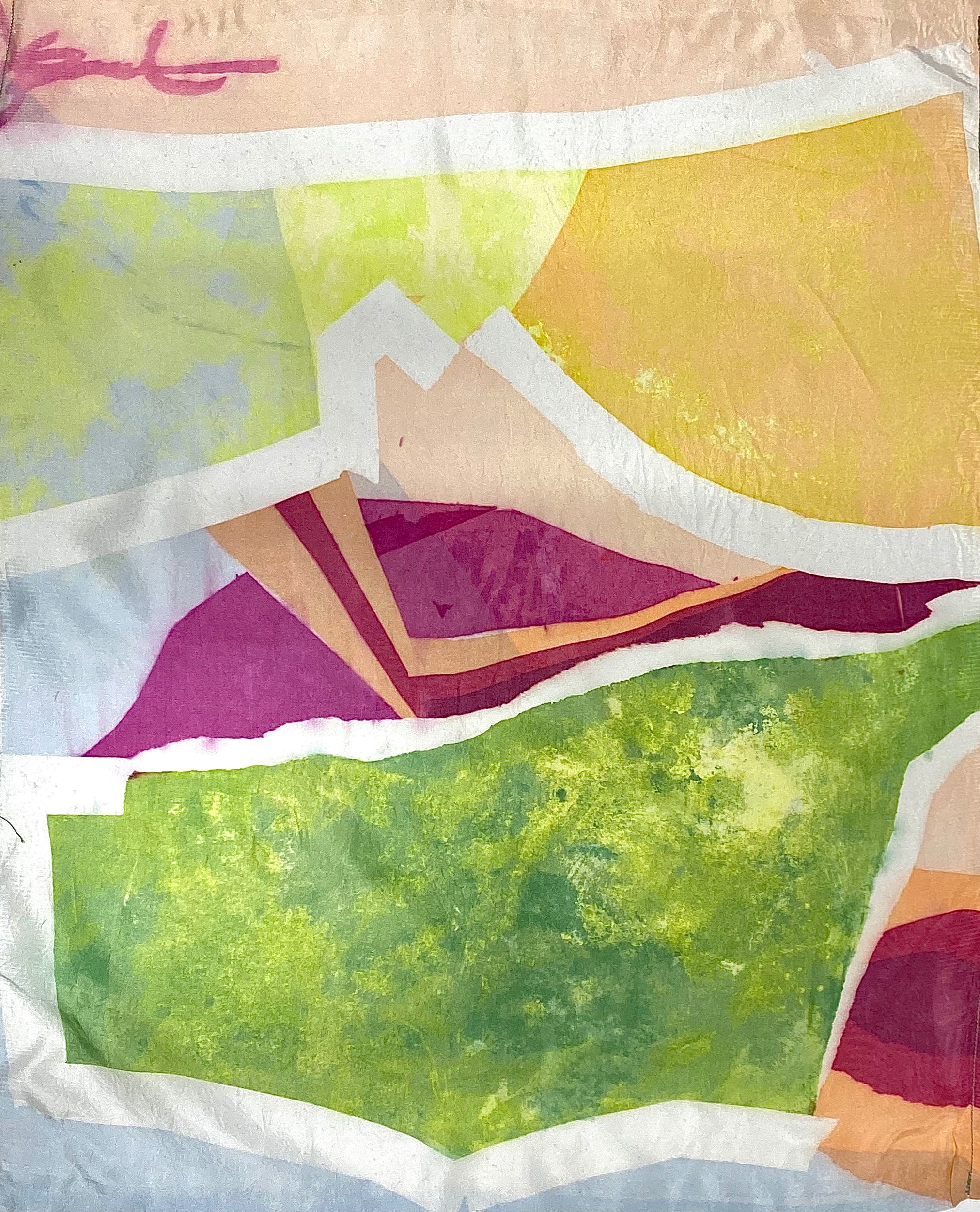
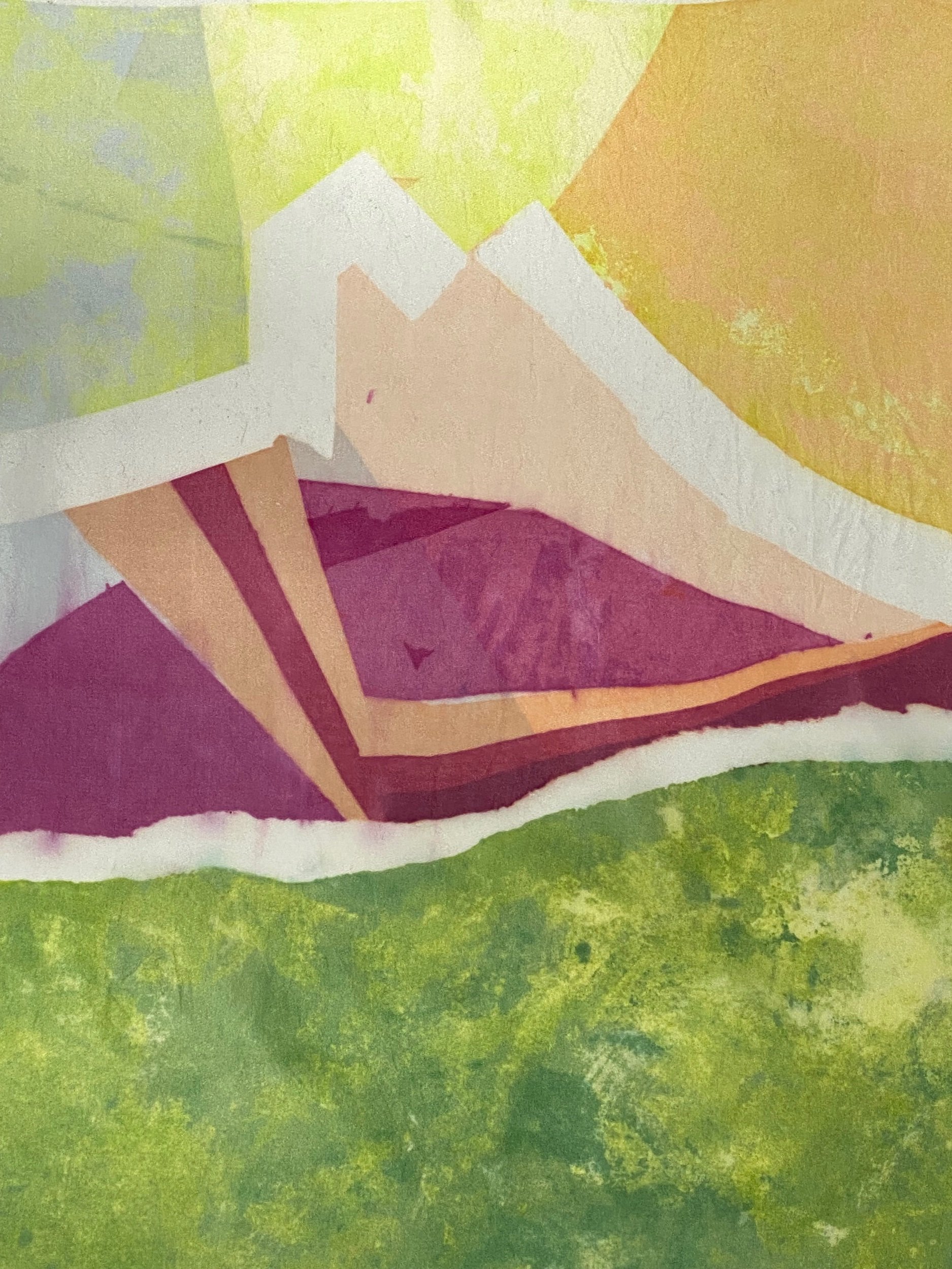
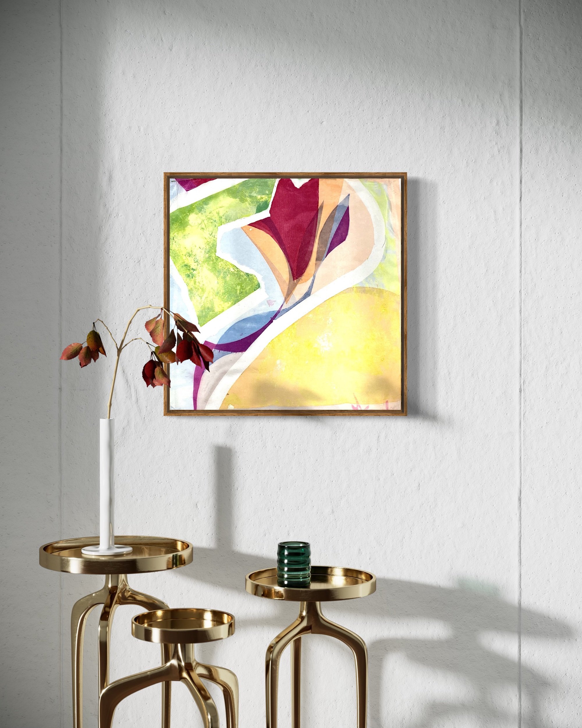
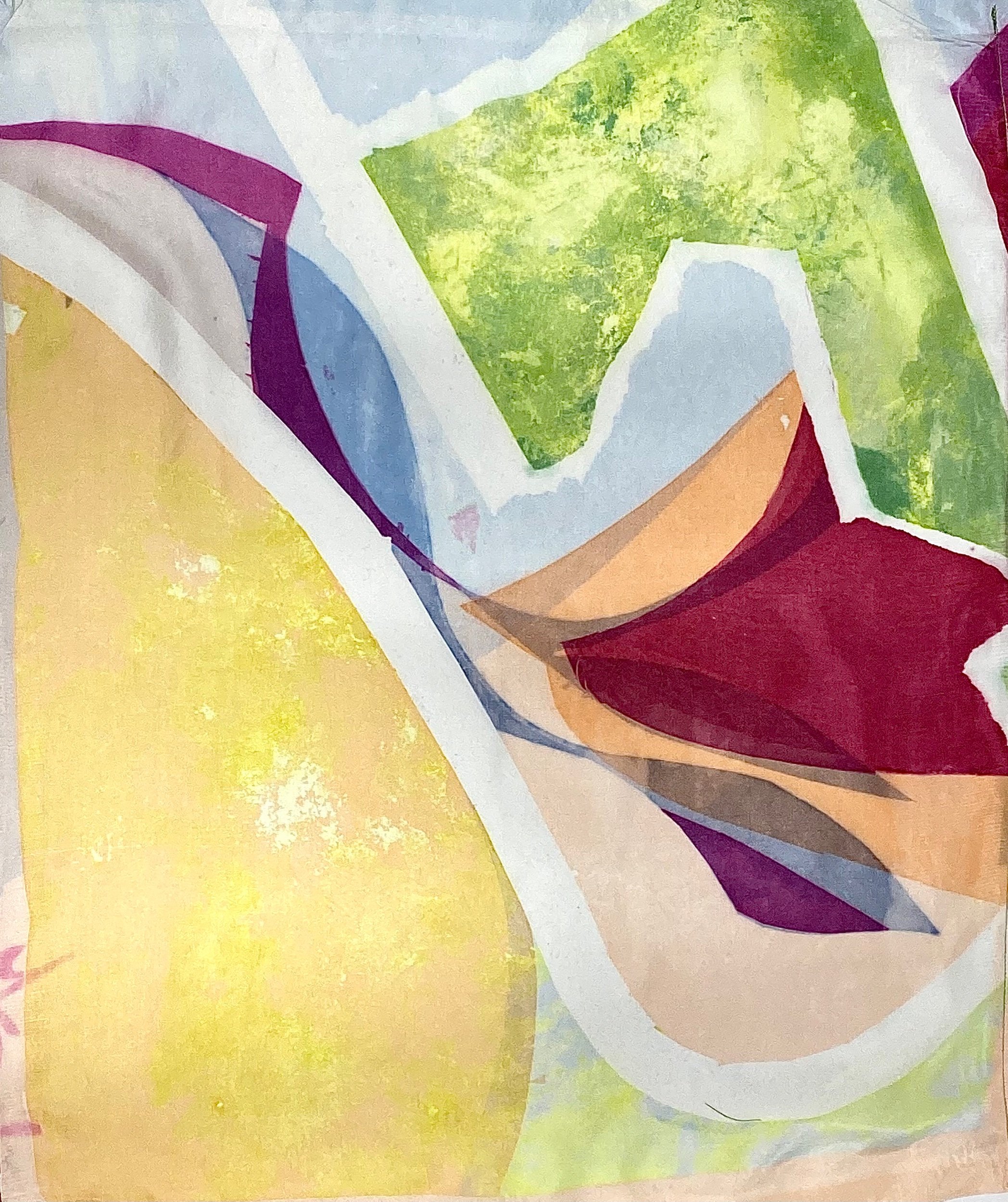
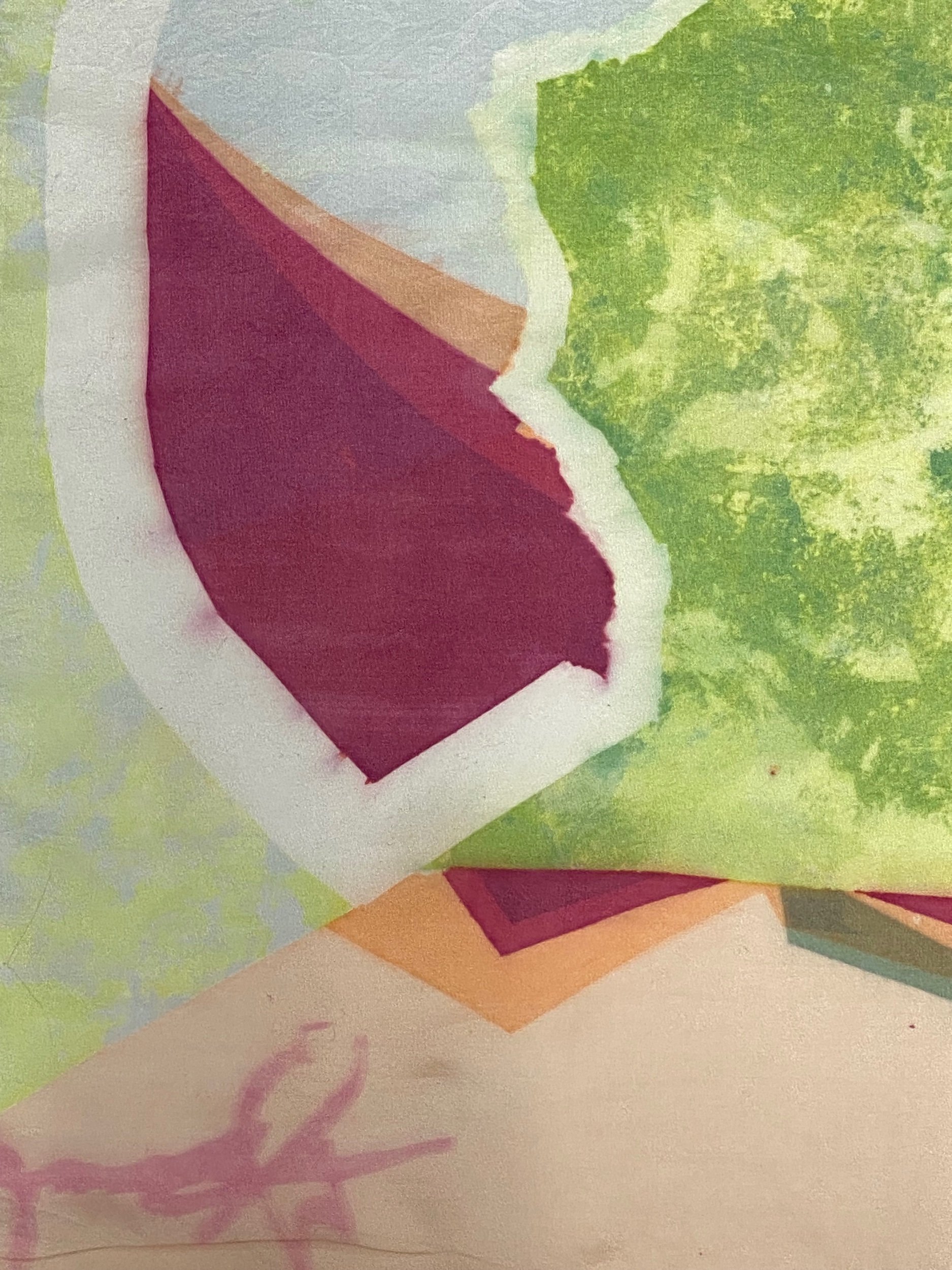
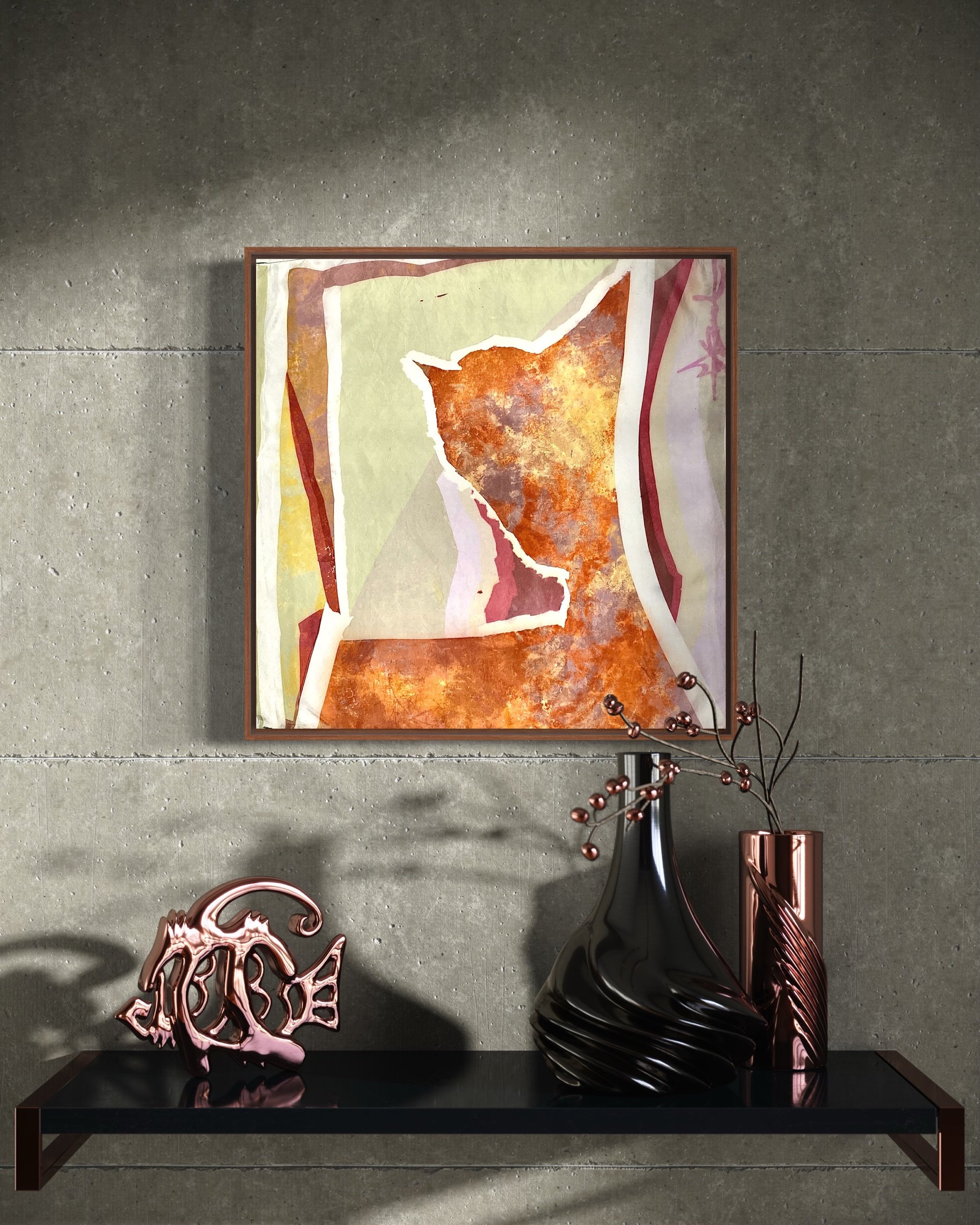
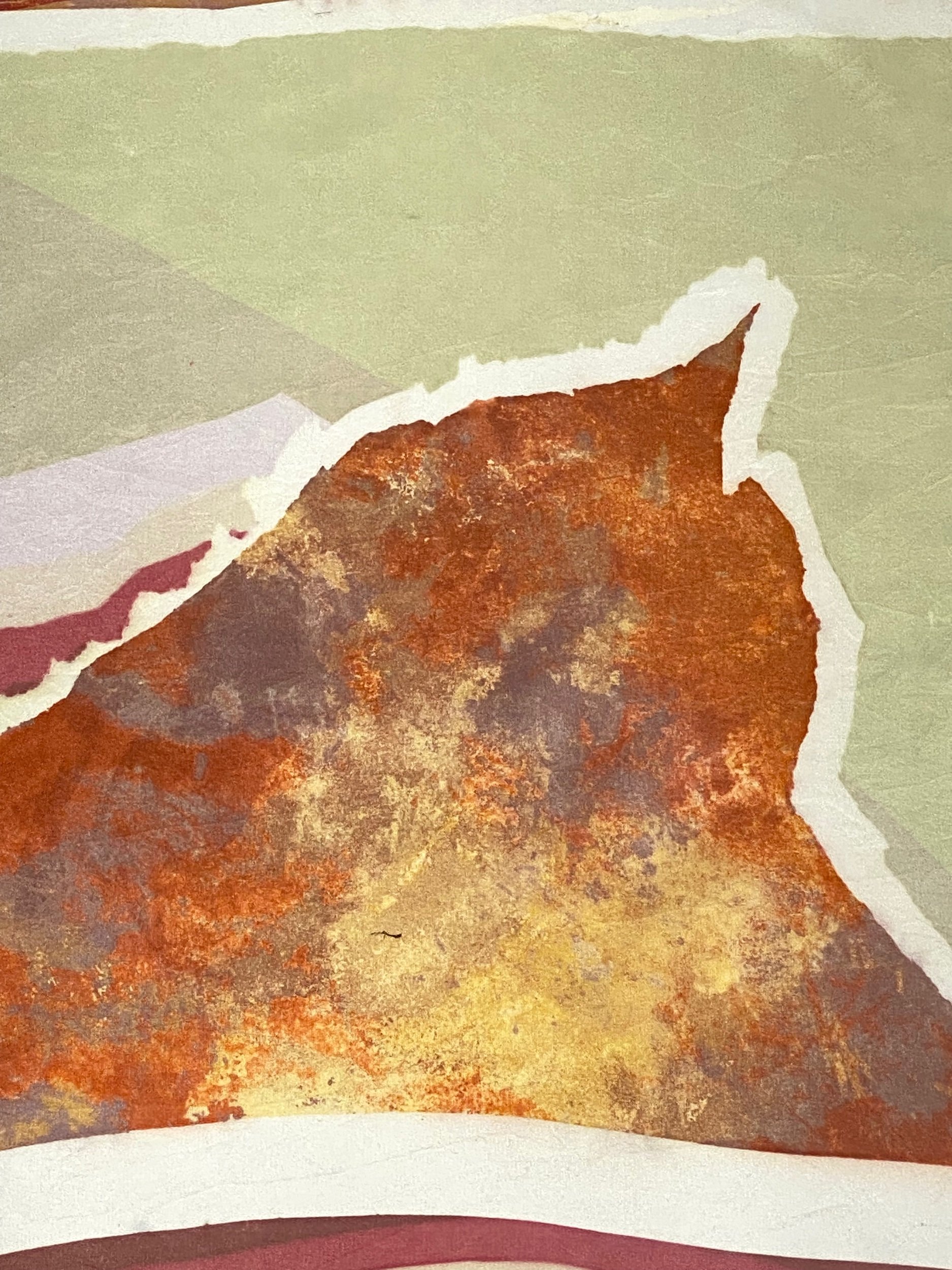
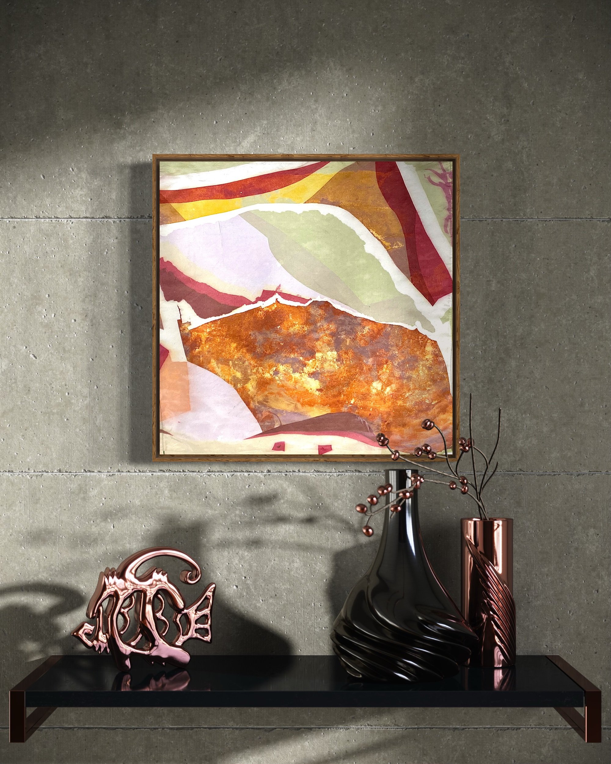
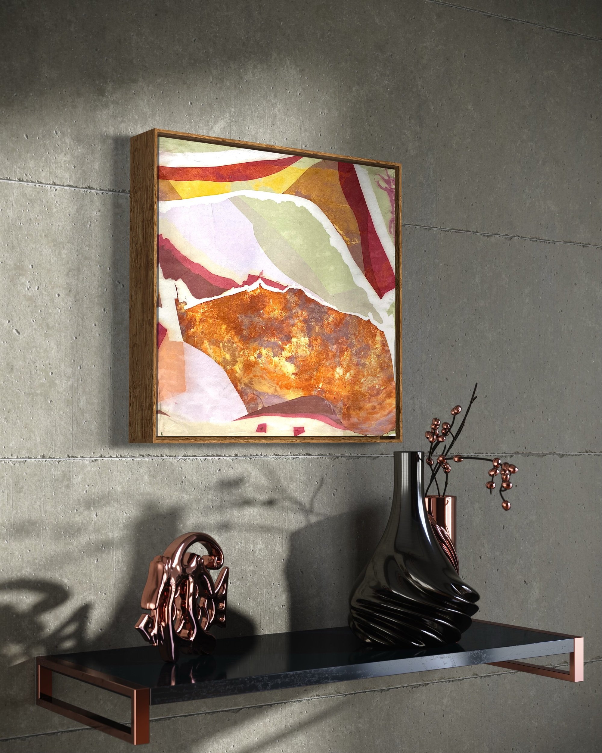
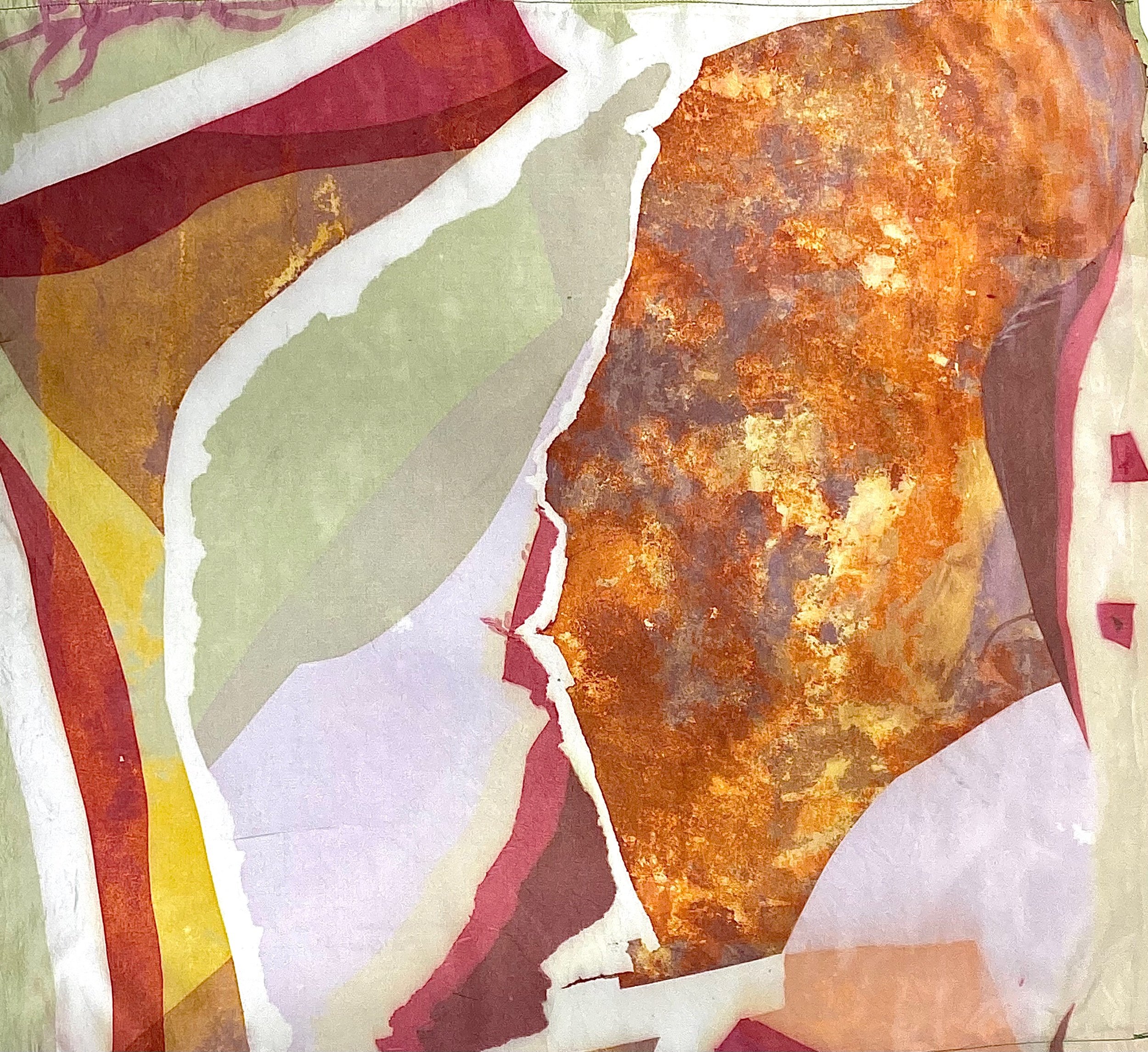
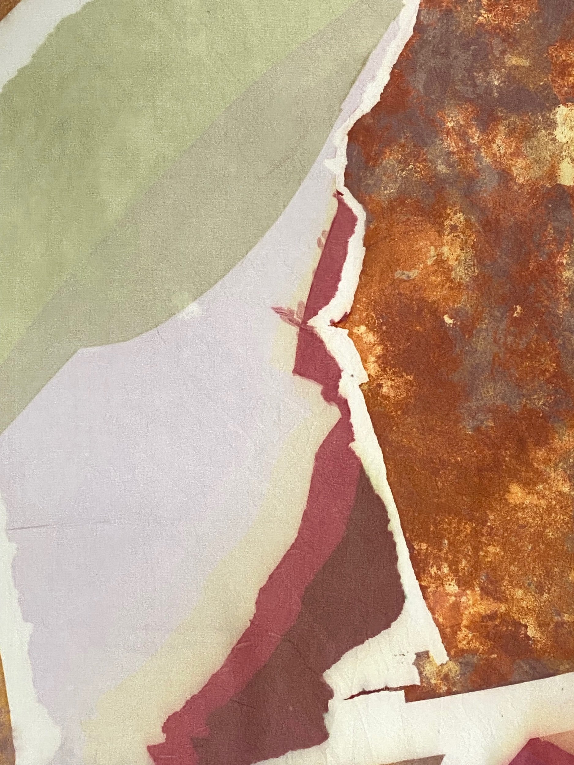
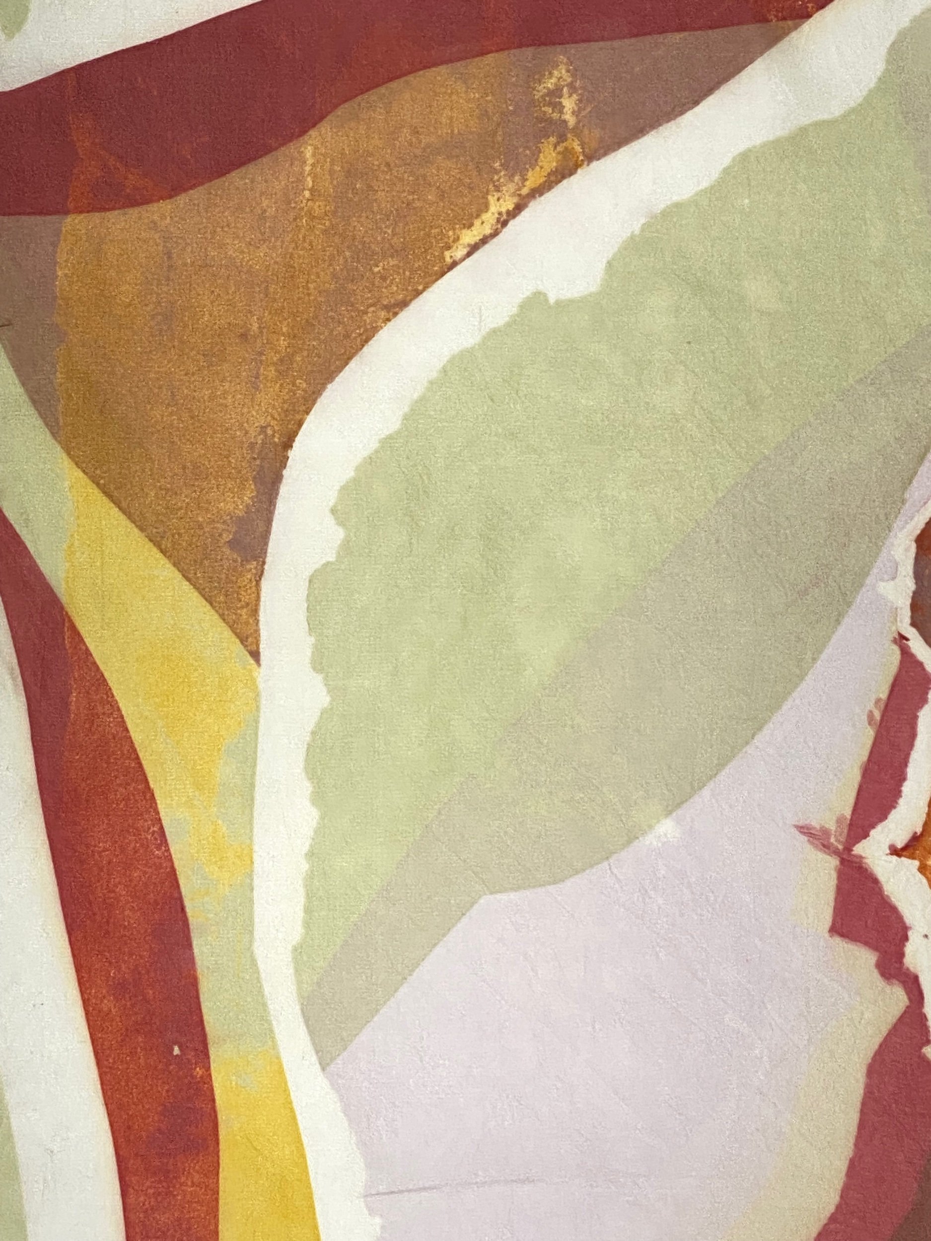
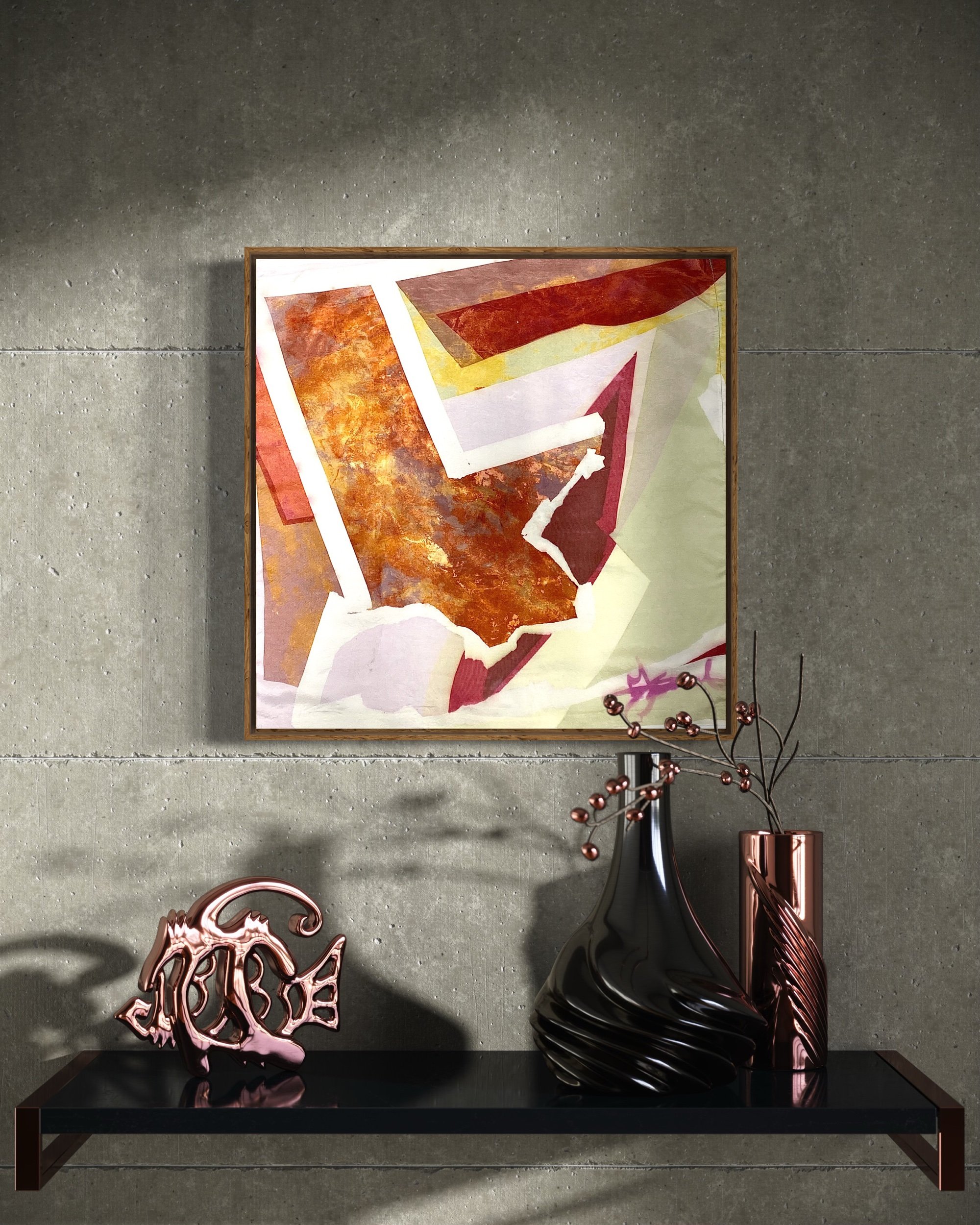
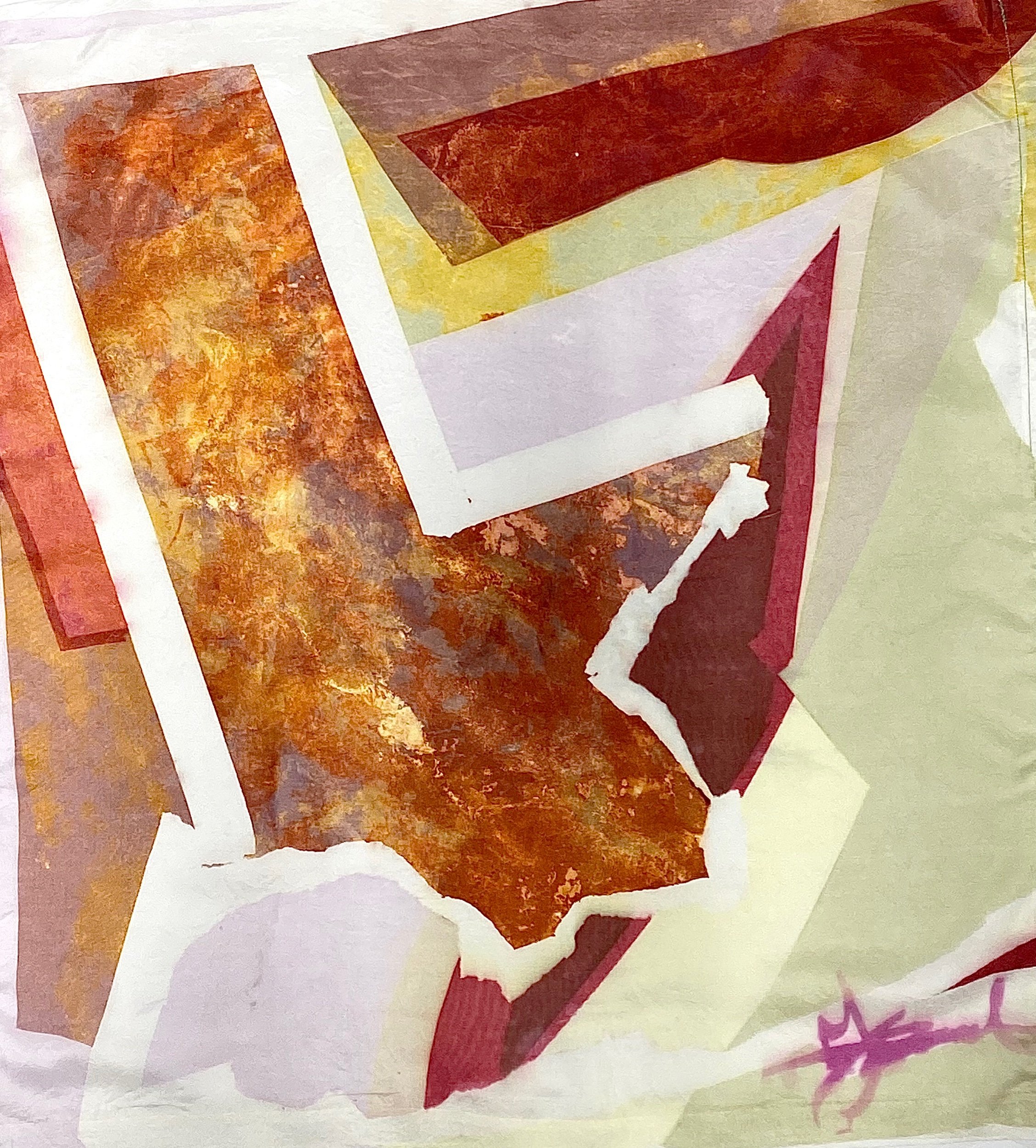
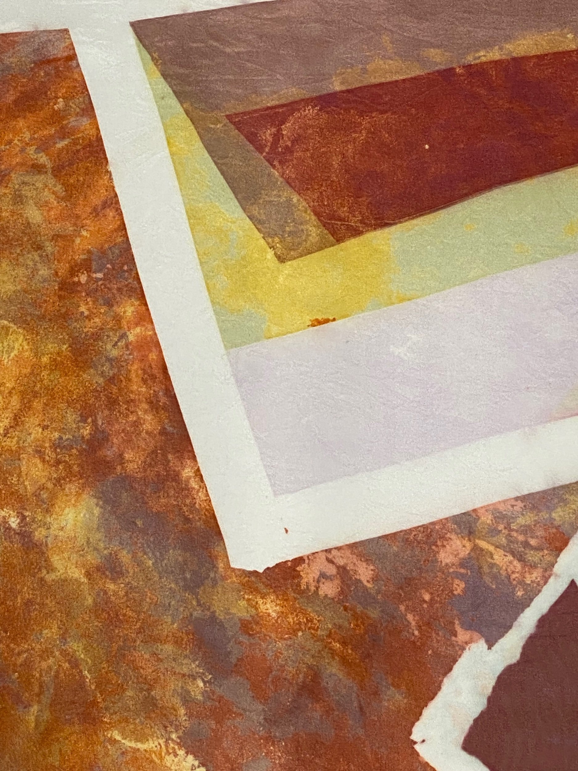
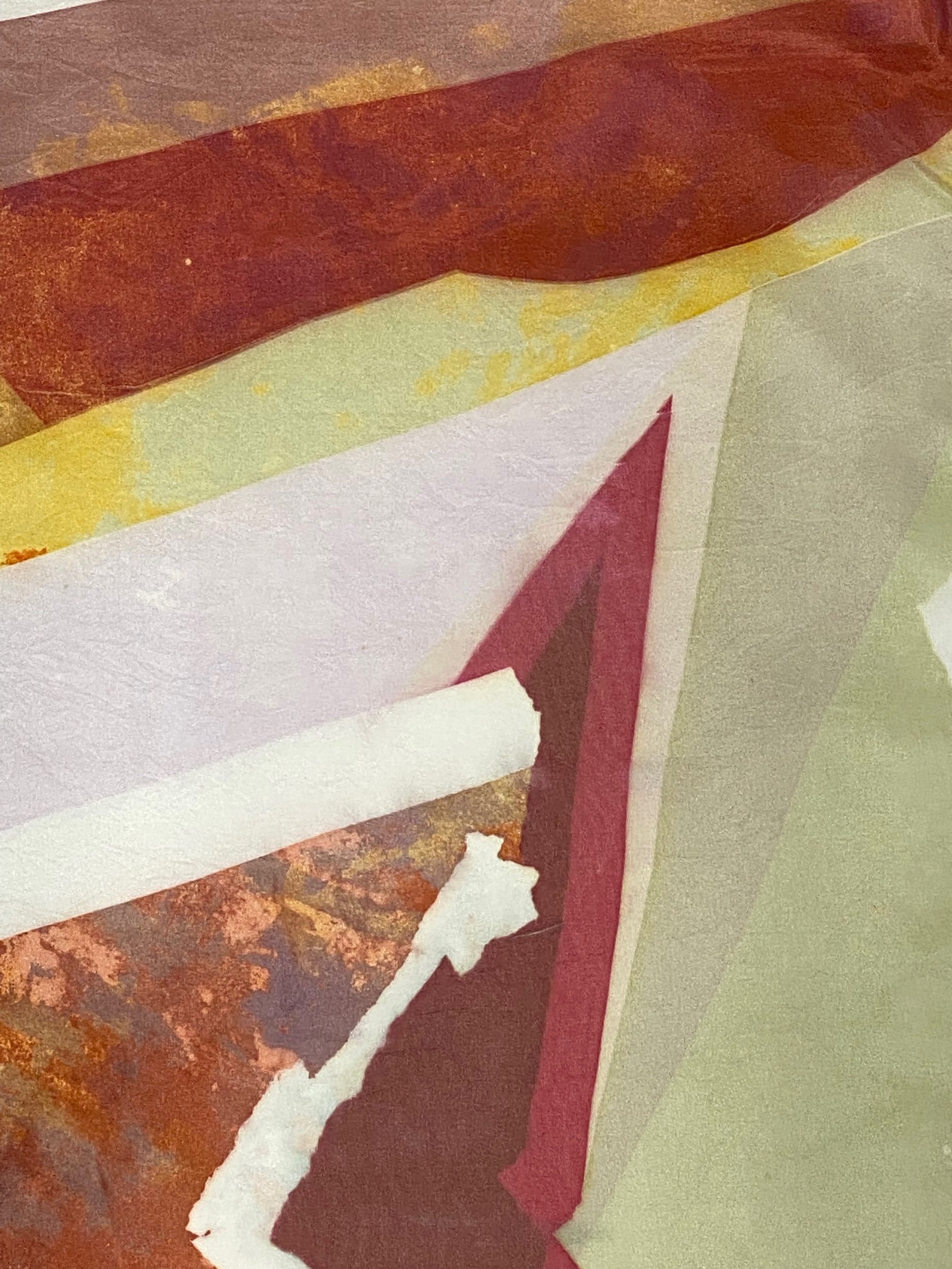
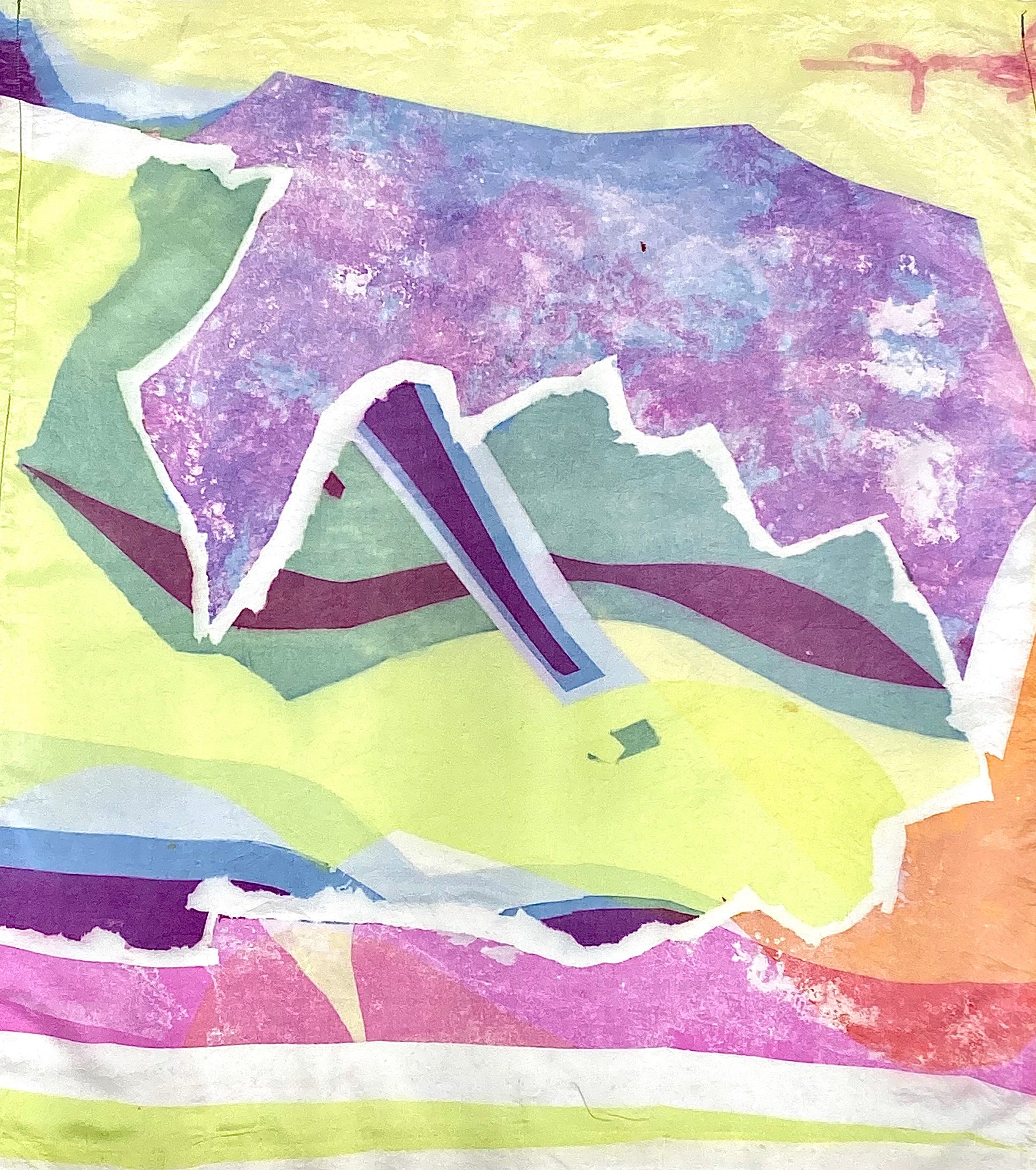
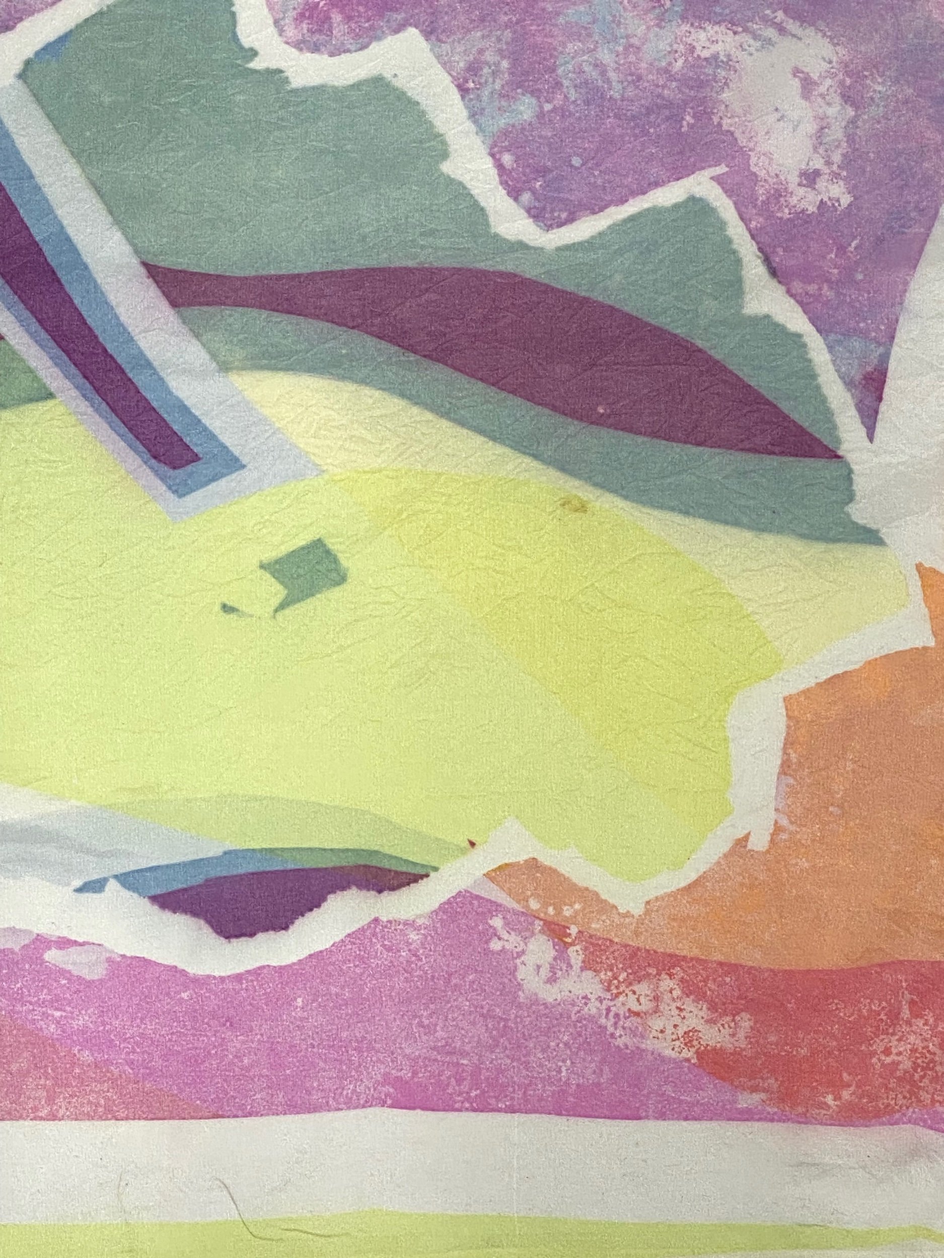
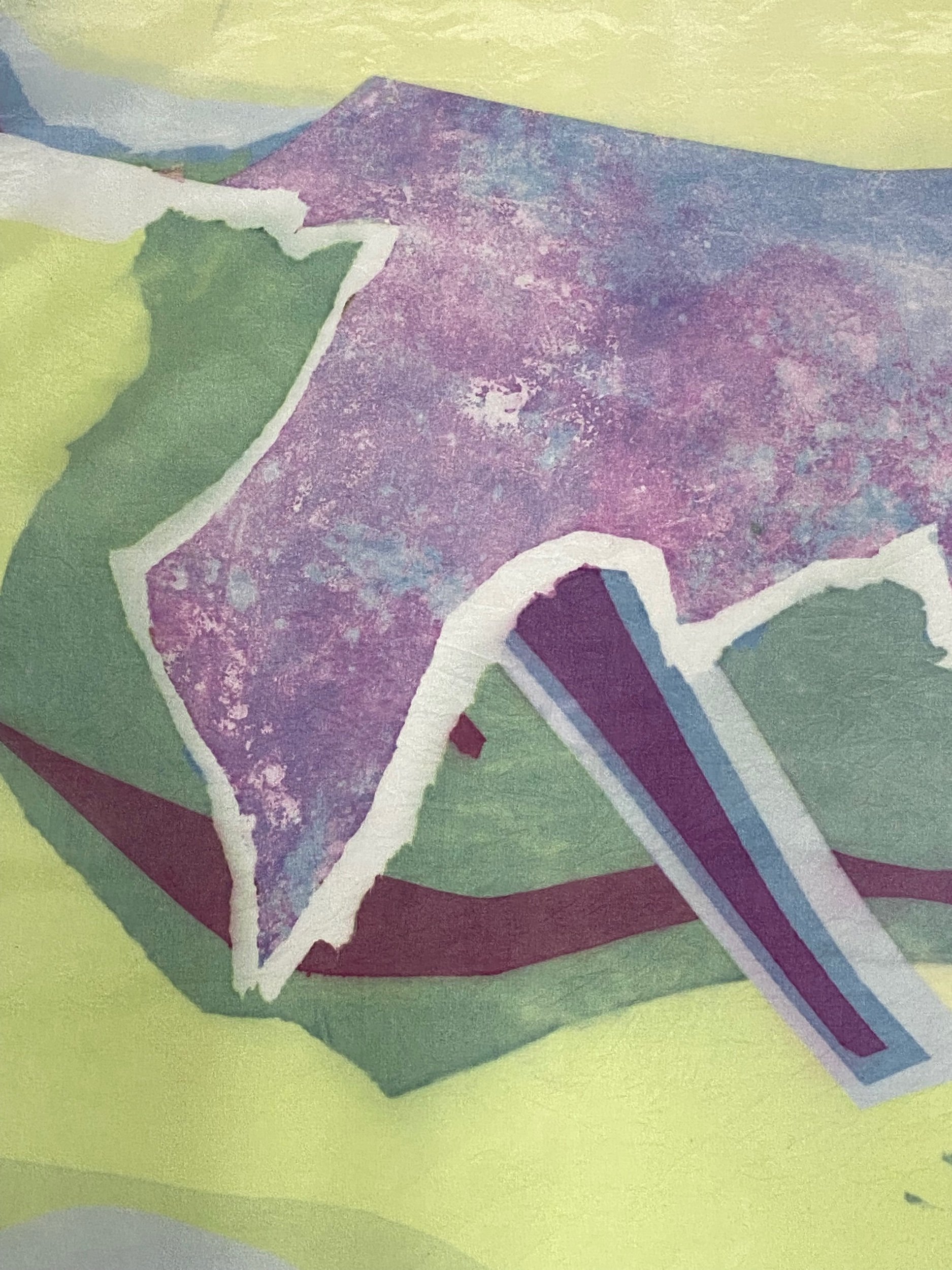
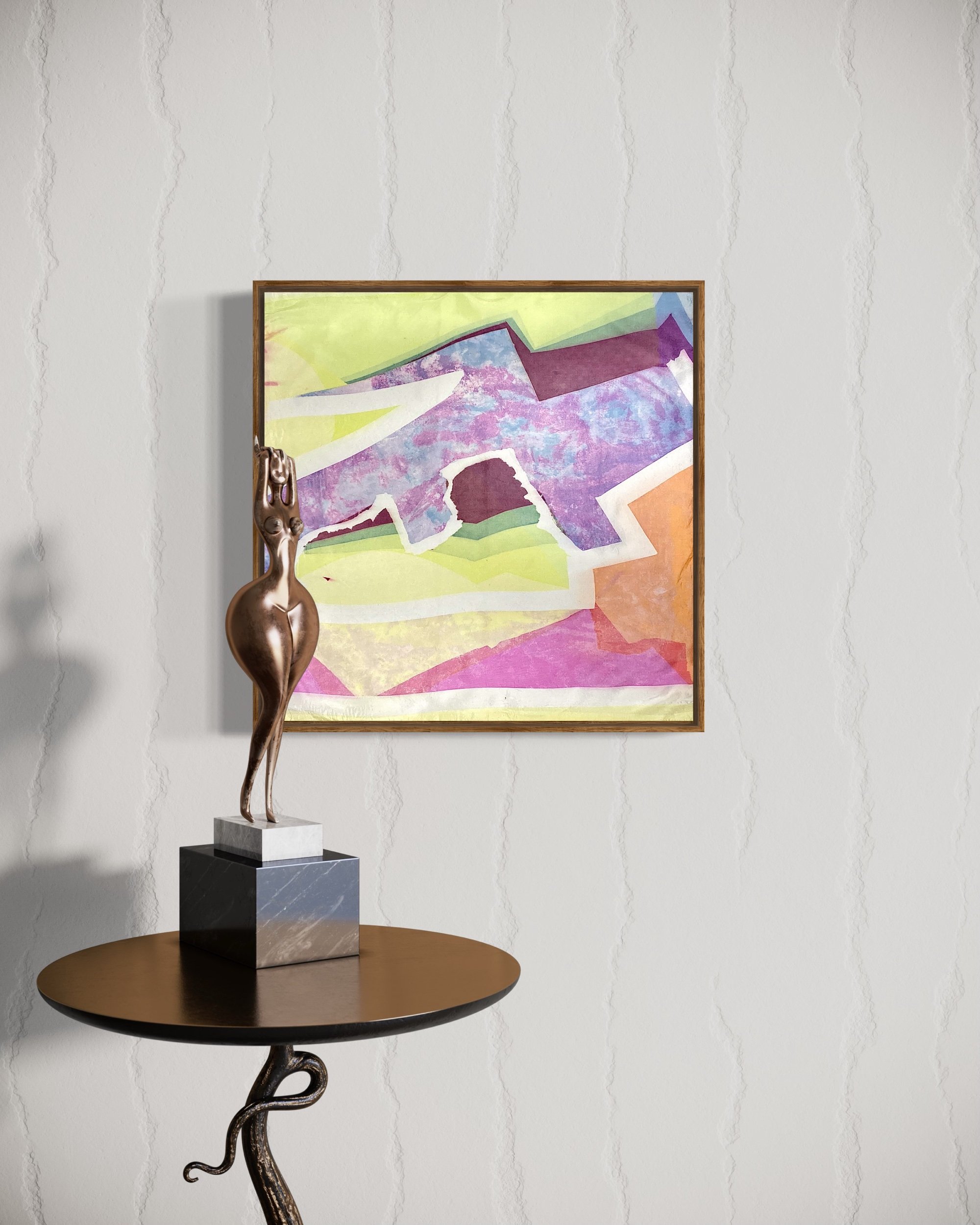
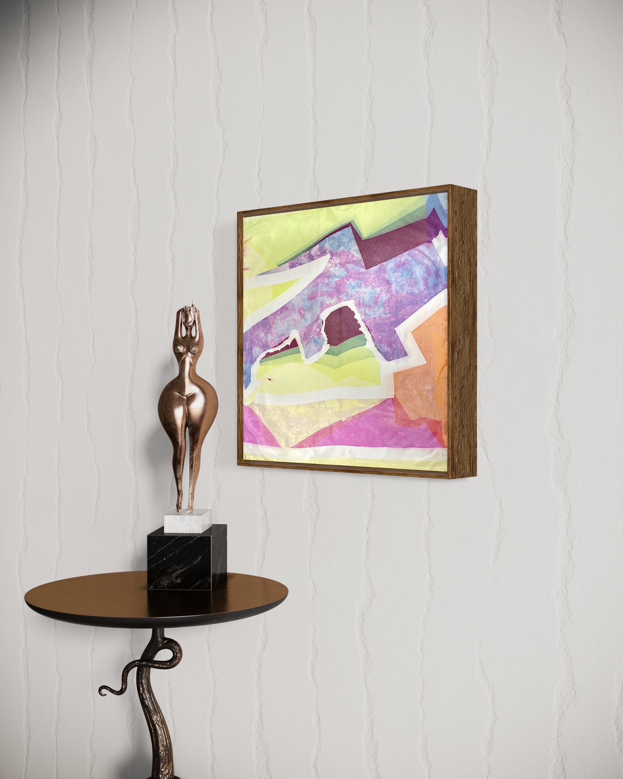
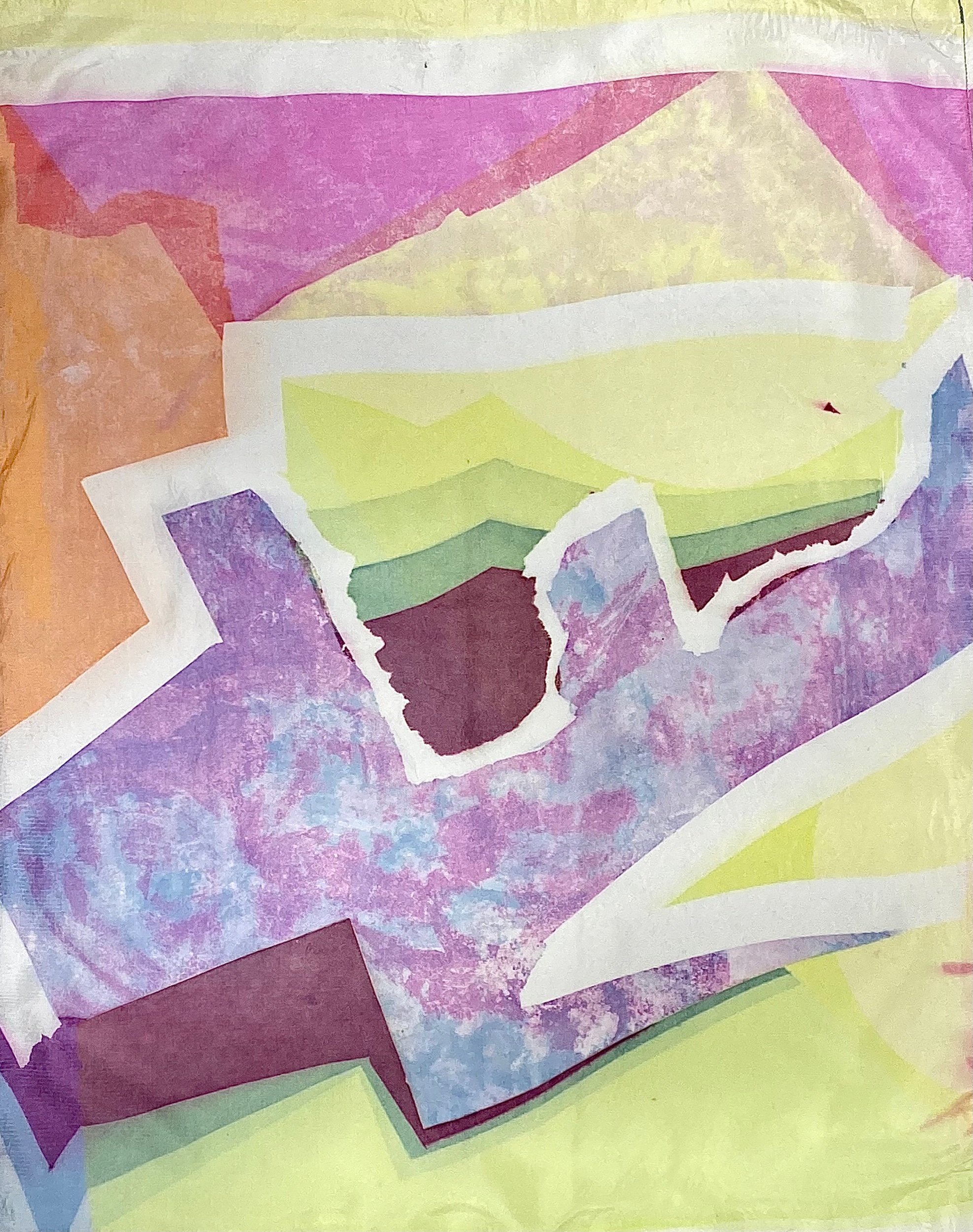
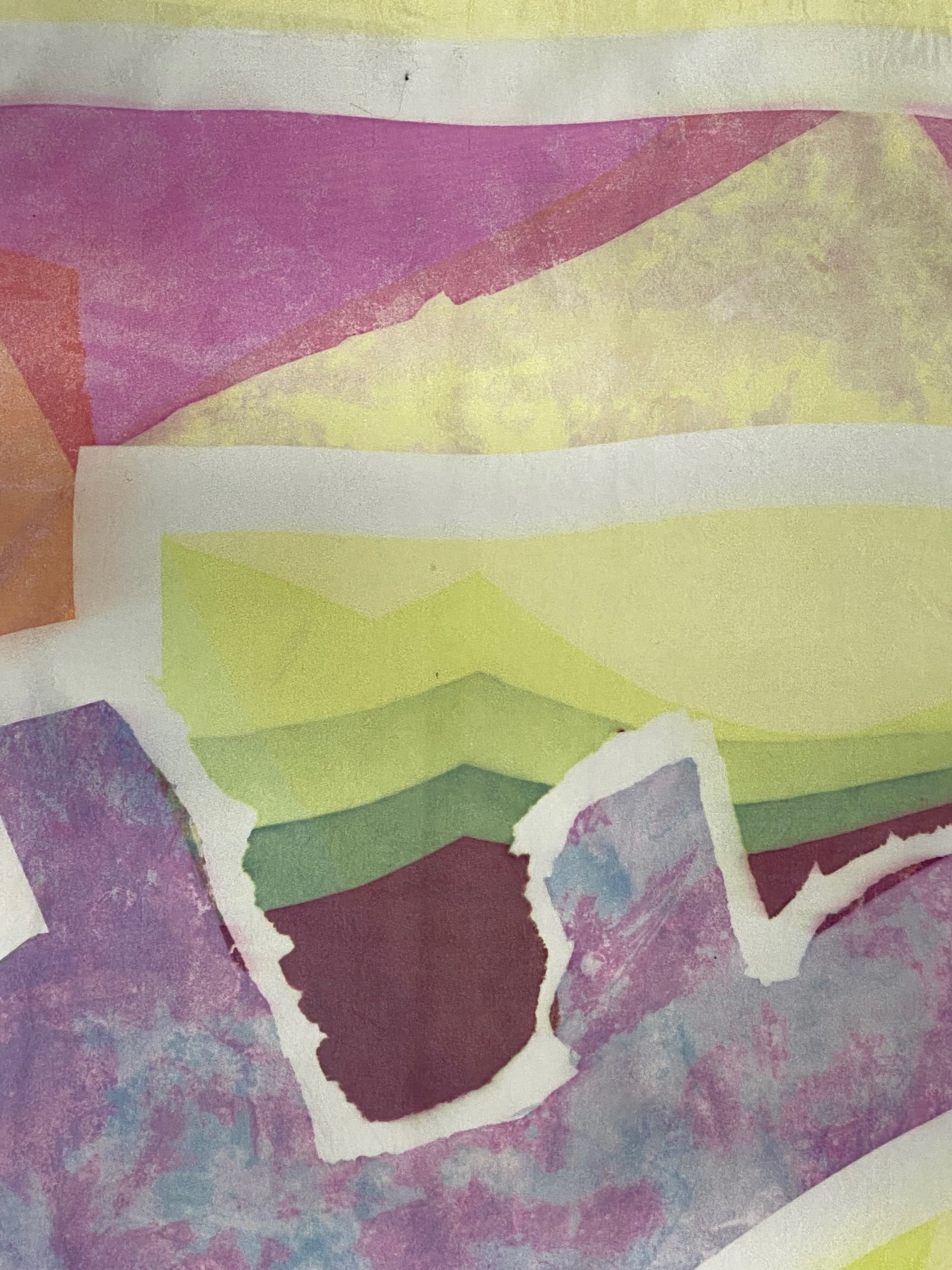
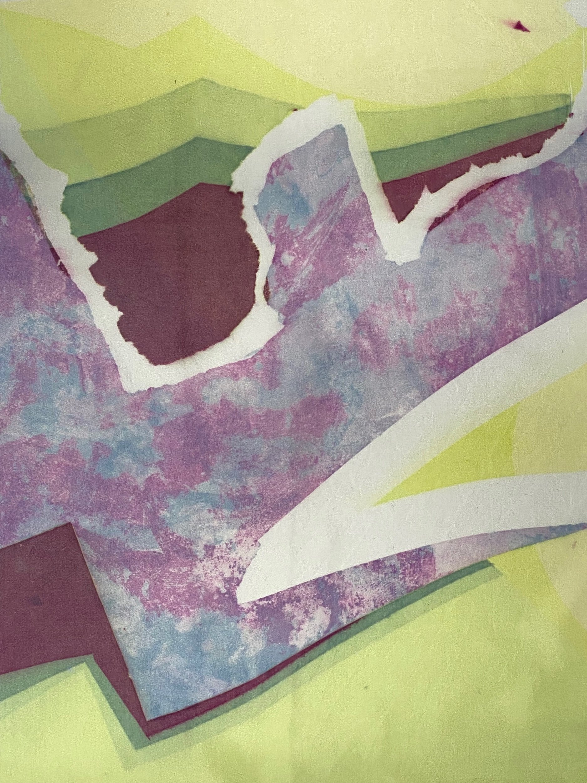
Experimental screen print on silk
Acid dye formulars used.
130 x 180cm | 50 x 70in
Icy Mountains is inspired by a reflection of nature.
Looking to landscapes as this multidimensional space where many layers and parts make up a whole mountain range, field, jungle, valley, dessert etc. These places are so packed with dimension, so much happens within them from the most tiny microscopic perspective to the widest view range. The biome is packed with animals, living entities, plants, trees, animals, fruits, people, stories, time etc that its almost incomprehensible to translate this through a visual reproduction of space.
Texture resembles all the layers, trails, lines and possibilities. Texture is a language that visually depicts how much information is in a space without taking form in a way that is conceivable to the eye. It’s an abstract way to represent space.
Developing a method that creates aggressively layered textures on soft silk fabric lightens the tone of the expression. The juxtaposition between harsh surface treatment and the delicacy in the fabric produces outcomes that represent the idea of blending two opposing ideas, to make something weighted and packed, seem light and spacious.
The argument between control and lack of control in the print process as well as this contradiction in our external world has tied together when placing the prints in homely environments to see how they behave and work within a space. Bringing calm and tranquillity in our reflections of space.
Experimental screen print on silk
Mixture of acid and procion dye formulars.
142 x 244 cm | 55 x 95in
Fish eye is an exploration of impermanence and tracing how forms change through time. Relating to the impermanence of the physical. Looking at transcendence from the physical into the metaphysical. The eye represents the idea of being able to see, in a way that we can comprehend vision. The animal is used as a way to understand form and how we can comprehend physicality.
The one thing we can guarantee in this life is change, the way we see changes, the way we experience life changes and our physical form changes. The textural identity of fish eye is to understand how the physicalities of life, even our own vessel is constantly changing, adapting, evolving, developing, holding information, history, patterns and so with this one of the laws of nature is to understand change.
Evolving into a deeper understanding of how texture mimics human and natural existence. Using textural experimentations in the screen printing process to express an idea beyond form and the intellectual mind. To see this textured trace of time and multifaceted forms as an opportunity to be open to change, taking away the fear that we naturally gravitate towards and to cultivate the idea that change is not always negative but more so a constant adaption of form and one of the only certain realities in this life.
Using fabric, colour, dimension and movement in the hope to project the idea that in a world where we attach so much permanence in people, objects and places which in turn can lead to a lot of anxieties and fears. That we can also live in a space of much more faith by detaching from the idea of permanence and seeing these interchanging patterns and forms as something bright, colourful, necessary, natural and fearless.
Experimental screen print on silk
Acid dye formula
93 x 111cm | 35 x 45in
Earthly Hand, the first silk print I made and the one that brought so much clarity to me from a conceptual space. For me texture has always been a way to explain the unexplainable, to visualise this textured and layered life. Playing with texture and its boundaries started to reveal to me also how we can play with this layered experience of life and how we can being to alchemise and understand it through experiencing it.
For me earthly hand was a way of exploring texture in a chaotic and uncontrolled way, the technique was aggressive and not contextualised. However I created small areas of controlled space. For me those small areas brought balance to the uncontrolled spaces and texture. This was a lesson and realisation into the balance of life and how far we can dive into the textures of it, how we need to create spaces for ourselves of clarity otherwise we can get lost in the texture.
In all of this experimentation what was really special for me was how the form of a hand appeared. I had no plan when it came to the composition of the texture. After the hand was revealed to me. This showed me how even when we think things are totally out of control, there is still that divine guidance that appears to bring things back into formation. A guidance. This reinstalled a level of trust in the process and deepened my understanding and quest into the boundaries between control and lack of control, being the doers or the co-creators.
Experimental screen print on silk
Acid and procion dye formula
109 x 166cm | 40 x 65in
Coral Quest, a quest into coral. Coral is a metaphor for the ocean coral which is an ecosystem of life as well as the colour coral being related to the earths core, roots and going into the ecosystems of our being. The skeleton ecosystem of our make up.
This idea of a quest is about discovering the truth of our being, a quest for truth and understanding of all these layers that overlap, connect, create pockets, windows, new shades, tones and forms. To explore these realms to understand what makes us who we are on a surface level and then to discover what makes who we are on a deeper level.
Beyond what you see at surface, to go into the cracks and crevices of our being. To find that within every experience and layer, there are many facets and they are all welcome in the experience of life. This is the strength of coral, its a bright and accepting colour like the sun.
Experimental screen print on silk
Mixture of acid and procion dye formulas used.
56 x 99cm | 22 x 39in
All proceeds went to WaterAid
Orange stripe is the pilar in the centre of the space. It’s the pilar surrounded by the textural movement and dance. He is the stability and strength that holds the centre whilst the space around moves freely exploring different avenues and pathways.
Orange stripe is the masculine figure that gives space to the feminine to freely move. He is the counterpart of Esterlinha Flourescent and also is complete within himself.
Experimental screen print on silk
Procion dye formula
47 x 50cm | 19 x 20in
Abracadabra resembles a little spark of magic. She is small and subtle, sometimes how the best magic tricks are. She is humble and a little spark of consciousness. For me the way I see magic is that the real reality is where the magic is, for me the real reality is when we recognise our spirit being.
Our spirit being is a pure spark of light. It’s our true nature, who we really are beyond the conditioned mind of the human. It’s where our true essence and purpose is. It’s the core of our being and the reality of our manifestation.
With this knowing, when we begin to move as spirit being rather than just human being, we start to experience life differently. Because the way we perceive life is through the lense of divine magic rather than the conditioned lense of society. This is why having abracadabra is a powerful reflection to remember where we really come from and who we really are.
Experimental screen print on silk
Procion dye formula
114 x 151cm | 45 x 59in
Puan One is part of a series of Apuan beings. I discovered Puan One when I was printing in the Apuan mountains in Italy. Puan One is the counterpart of Puan Two. They say that in ancient times these mountains were inhabited by the Apuan people, they were the keepers of the mountains, they took care of the forests and land. They built the caves and the infrastructure that is still present now in the Apuan region.
When printing in the Apuan mountains I was exploring how forms come into the manifested space through light. Exploring bringing the invisible into the visible. In this time I made this piece and to me he is a god of the mountains.
Puan one is a balanced warrior of the mountains, he embodies a fluid essence, having a soft yet authoritative presence. He is made up of years of earthy and cosmic wisdom in all parts of his being, he is an inclusive being, each chamber of his form holds an in-depth weaving of wisdom. He is humble and peaceful in the way he moves and continues to weave in the invisible.
Experimental screen print on silk
Mixture of acid and procion dye formular used.
55 x 96cm | 22 x 38in
All proceeds went to WaterAid
Estrelinha Flourescent resembles the stars in the sky, the cosmic dance of space, the movement of forms through spaces of dense texture to spaces of calm clarity.
She is a free mover, exploring her capabilities and potentialities in her feminine form. She moves freely through space but is held steady by her pilar counterpart Orange Stripe. His masculine essence gives her the freedom to roam and return more nourished and fulfilled in her exploration of her femininity.
Experimental screen print on silk
Acid and procion dye formula
139 x 206cm | 55 x 81in
Baby’s Beak. A beak is a useful feature for the survival of a bird, it has many functions and useful attributes. The idea of the babys beak is about the childhood essence discovering its capabilities and potentialities within its body. To see the potential that resides within them and to not be afraid to explore their unique features.
Baby’s beak was an exploration for me to created more fluid forms of isolated texture, to see how these layers would come together and how they would create a dialogue. This was an experiment done without a composition or predetermined outcome in mind.
For me this was a way to tap into that childhood essence of experimenting without the control of what I want and desire but to see what would be revealed to me in the process through my skills and practice. I feel the outcome has a very light, fluid and beautiful essence to it that really captures the mood it was made in. Discovery.
Experimental screen print on silk
Acid dye formula
78 x 164cm | 31 x 65in
Pockets of Gold. Is about finding those small pockets of gold, those golden moments, golden windows, golden perspectives within the darker shades and tones of life.
For me this piece was a really beautiful introspection. The areas perceived as black have subtle tones of green, purple and blue. Which to me shed light on the different tones and colours that we can experience in times when we feel like everything is very dark and all consuming.
These tones and colours that reveal themselves, reveal new perspectives, lessons, ideas, realisations and reasonings which give us greater understanding of why things happen in life rather than losing ourselves in the darkness, we find that rationality, the meaning and the window to help us come into a space where things seem clearer and more pure. Into the pockets of gold.
Experimental screen print on silk
Acid dye formula
140 x 249cm | 55 x 98in
Purple gaze is an introspection into the way we perceive the mind. I always heard the word gaze in context of male gaze or female gaze. A more sexualised way of perceiving life, through a man or woman, external factors. But what if we were to perceive life through the power of the mind rather than taking external world as the reference of perception we take the internal world as reference.
Purple is the colour connected to the mind. Gaze is the idea to look into something in adoration, admiration and intently. So if we begin to look to the internal world with more focus, we would be able to see ourselves more clearly and then the outside world more clearly consequently.
Purple gaze represents a dense, isolated shape of heavy texture. But it contains it, it allows the texture to take form and exist, to be seen, but it doesn’t allow it to get out of control and become all consuming. It allows the texture to be there without being the entire reference for life and negating all the clarity and space that comes in balance and harmony with and around this textured, layered experience. It uses the power and perspective of the mind to not allow the external emotional factors of life to consume and become us.
Experimental screen print on silk
140 x 244cm | 55 x 96in
Half full is a pure black and white print. I love this print so much, its very difficult to achieve a stark pure black and white print which is why this one is so unique and different for me.
It’s called half full because in simple black and white terms of how to look at things, we all know the saying, is the cup half full or half empty?
For me I like to see it as half full always, there’s always a lesson even if we cannot see it imminently. This piece and the forms are also related to movement and impermanence so it is also connected to the idea of if impermanence is half full or half empty. Again the idea will always be half full because there is always a potentiality in it somewhere even if our minds cannot comprehend it in the moment.
Our minds sometimes convince us that things are either black or white, like its an option to chose. But it’s not simple black or white it is black with white and white with black. It’s symbiotic, both are present at all times so you can find everything in all that you do and in everything that occurs.
Experimental screen print on silk
Acid and procion dye formula
99 x 131cm | 39 x 52in
Ivy is wild. She is a wild spirit in nature, she grows wherever growth is needed, she knows no boundaries, she is fierce, she facilitates rehabilitation in nature and she grows together with other plants and species. Her growth is so determined and strong that she resembles the essence of fidelity and ever-lasting locality.
Ivy represents this abstract idea of strength, change and movement through her manifested form as a plant. I find Ivy to be a teacher, a shower of the all inclusive being, a spirit unafraid of her innate natural sense of self.
To me this piece was an experiment of working with manifested forms and Ivy appeared, it was spontaneous and unrealised until her form came into the work. To me that represents the nature of Ivy, we all have this essence of ivy within us but she’s waiting to be realised and called in.
Experimental screen print on silk
96 x 72cm | 38 x 28in
Emerald migration resonates with the idea of movement, migration is about movement from one place to another. When I consider the idea of migration in nature, its a natural movement that happens through the seasons for food and survival purposes.
It’s a pattern throughout the year that is encoded into the animals for their highest potential to survive. What I find interesting about the idea of movement and pattern is that for animals this idea of change is a necessity, the pattern is their survival, sometimes their patterns will change based on the seasons and the potentiality for their survival and they change with this.
For me this piece was about recognising patterns in our lives and that sometimes we need to change from where we are, to be where we need. So this idea of emerald migration is to show the beauty in a repetitive pattern that is natural to us, but this pattern can also shift and change for our greatest good.
Experimental screen print on silk
Acid dye formula.
127 x 230cm | 50 x 91in
Angelica is an angelic being. She was created in a moment of fury, she took all the fury and transformed it into something so light and delicate. The level of texture to open space has a beautiful balance, she absorbed so much of the texture, the expression, the feeling and motivation but she didn’t become it.
She held space for it to exist but she didn’t allow it to become her. She held the integrity that those layers, textures and emotions are a part of her but not all of her and that they do not govern her.
She is a sovereign being, she moves in an angelic way, she holds space, she is balanced and she shows her true essence without letting it define her. She is many things as well as a small spark of pure light that is her spirit. Her spirit cannot be dimmed or consumed by the emotions of life.
Experimental screen print on silk
Acid dye formula
91 x 100cm | 36 x 39in
Iridescent are luminous colours that change from different perspectives. This experiment was about exploring how many different colours, tones and textures can be layered together and always experience by the eye differently every time.
No perspective is always the same, it is always changing and evolving. There are multiple perspectives that can be taken on the same idea at the same moment. From all different realities it is experienced differently.
Its like when you have a circle of people around a fire, each person will perceive the fire differently from where they are sitting. No person will have the exact same image of the fire in their head. This is a beautiful aspect of life and is worth embracing to be able to see as many possibilities as possible through the lens of others.
Experimental screen print on silk
Acid and procion dye formulas.
141 x 245cm | 55 x 96in
Boarder line explores the idea of drawing a line, creating a separation, making two spaces that a whole seem to be split. This idea is a play on the attachment to creating spaces that distinguish ourselves from one another.
Looking at how the line drawn creates an imminent separation, the spaces are inherently different, they have a different proportion of colour, texture, form but at the same time they are part of the same whole.
To me this idea is around the perception that we think we are so different to one another based on where we come from, what we look like and superficial attachments to our identity. But in essence we are all a part of a whole.
Experimental screen print on silk
Acid and procion dye formular.
141 x 246cm | 56 x 97in
The first fire represents the birth of the energy of the fire. Before fire there was nothing, fire is the element of ignition, motivation, forward movement. It’s the element that drives human and we cannot exist without it.
Many people will tell you stories around the world about where the fire was born, many people on many different mountains have told me the first fire was born in Italy, in Peru, in Mexico etc. Taken literally its a little confusing, how can the first fire be born so many times?
The essence of the first fire to me is the source of energy is that connects us to our source, our core, our energy, our heart. The rose resembles the sacred geometry of life which is the same geometry of the heart, they say the fire is the rose. So source, the fire, is the heart. It’s the place we truly move from.
Experimental screen print on silk
Procion dye formular.
48 x 88cm | 19 x 35in
Abracadabra, a mystical word for magic. Abracadabras sister is a type of magic from the same family but different. She represents the idea that although we come from the same family, same place, same time we can still preform our own unique and different magic. It may be similar, have similar inspiration or it may be completely different. It’s great in all its aspects.
We are not limited by our environments, our families we are only limited by our beliefs about them. Perspective can shape the way we see ourselves and experience reality. We are all sovereign beings, no matter where we come from, who we come from, what we look like and all our external identity that we are given.
Inside the magic that we have to offer is authentic and comes from a place not bound by the identity that we create and live by in this reality. It comes from a place that can’t be touched by the conditioned restraints put on us in the conditioned reality.
Your magic is unique and powerful no matter what circumstance you come from.
Experimental screen print on silk
Acid dye formular.
64 x 132cm | 25 x 52in
Tribal scar represents the ancestral marks that we have within us all. Representing that this life and this body is not our only life and body but it is part of a larger web of lifetimes lived and that comes with ancestral ties, history, layers and many lessons.
It’s the scar of the heritage, the marking in the dna that makes us the beings that we are and its an ode to our more native and natural selves before having lived the life in rigid conditioned spaces.
To remember where we come from and the imprint of this on our spirit.
Experimental screen print on silk
Acid dye formular.
134 x 187cm | 53 x 74in
Ocean illusion was made in the consciousness of looking into the layers of illusion that are created in our reality. Beginning to allow layers to pass and move to reveal deeper layers of truth that can be found deep down.
For me I perceive reality as a space where many things manifest and that we have a duty to look to nature to begin to decipher if what has manifested is a true reflection of nature or if it is a reflection of the human false ego. This is a thin line to tread and it is not always easy to distinguish.
For me its like the ocean, everything is there swimming around but there is so much deep down to uncover to reveal to us our true nature that we may not always find on the surface. It’s about going deeper into ourselves into the purest point we can.
Experimental screen print on silk
Acid and procion dye formulars.
138 x 222cm | 54 x 87in
Fuschia leaves is a feeling of the transient seasons. About change, when one thing beautiful leaves, it will transform into another. It’s about not holding attachment to them but allowing them to leave and welcoming in what is to arrive.
It’s the same as the seasons, they will always change and it is out of our control so whilst we may prefer one or another, we can embrace them all by trusting that they will come and they will pass. Things will continue to change and it is the choice if we decide to be miserable because something has left or if we see the potentiality in what has come.
This state is a state of acceptance and abundance in all around us. It’s a gratitude for everything that came and for everything that is here and to come. It welcomes it all in all its wonderful and weird ways.
When fuschia leaves, we see life through a different colour lens, it may not be fuschia but it will be something new, maybe a better colour, maybe a lesser colour but there will always be something new to feel and experience in a different tone and shade.
Experimental screen print on silk
Mixture of acid and procion dye formulars.
141 x 250cm | 55 x 98in
Owls eye is an exploration of impermanence and tracing how forms change through time. Relating to the impermanence of the physical. Looking at transcendence from the physical into the metaphysical. The eye represents the idea of being able to see, in a way that we can comprehend vision. The animal is used as a way to understand form and how we can comprehend physicality.
The one thing we can guarantee in this life is change, the way we see changes, the way we experience life changes and our physical form changes. The textural identity of fish eye is to understand how the physicalities of life, even our own vessel is constantly changing, adapting, evolving, developing, holding information, history, patterns and so with this one of the laws of nature is to understand change.
Evolving into a deeper understanding of how texture mimics human and natural existence. Using textural experimentations in the screen printing process to express an idea beyond form and the intellectual mind. To see this textured trace of time and multifaceted forms as an opportunity to be open to change, taking away the fear that we naturally gravitate towards and to cultivate the idea that change is not always negative but more so a constant adaption of form and one of the only certain realities in this life.
Using fabric, colour, dimension and movement in the hope to project the idea that in a world where we attach so much permanence in people, objects and places which in turn can lead to a lot of anxieties and fears. That we can also live in a space of much more faith by detaching from the idea of permanence and seeing these interchanging patterns and forms as something bright, colourful, necessary, natural and fearless.
Experimental screen print on silk in 2 parts
Acid dye formular.
87 x 110cm | 34 x 43in
86 x 94cm | 34 x 37in
Double glazed resembles for me the idea of multiple windows, multiple perspectives, multiple ways to see. The use of double is the idea of 2 which is about polarities. How things work in these polarities and opposite forces. But when you look there are 3 layers of windows divided into 2 parts.
For me this is the idea that there is more beyond what we perceive, there is more beyond the idea of polarities and opposing forces. There’s more beyond just the positive and negative. There is a space of unity, neutrality that also exists outside of this.
Sometimes we can get lost in the polarities of life but it is important to remember that there is more beyond this way of seeing. Many more ways to see and perceive life. Once we see beyond polarity, into unity we can then begin to see all the windows and different facets of life.
Experimental screen print on silk
Acid dye formular.
92 x 103cm | 36 x 41in
Back to brown is about returning back to the basics. For me brown feels like a very grounding earthing colour that takes us back to our roots, where we come from, what makes us feel safe and held.
Back to brown is about stripping it all back, all the colours, patterns, textures, layers and giving it back to the earth and starting again. It feels like a fresh slate, there are still tones and textures there because there will always be but there is more space to think. To feel safe and held in giving yourself time to ground and return to a space where you feel connected to yourself.
The pockets of gold remind me of clearing the foggy muck and coming to clarity. That unlimited earthy pure source that is within us, its stripping everything back to that space where we feel ourselves through a real connection to where we come from.
Experimental screen print on silk
Acid dye formulars used.
128 x 187cm | 50 x 74in
The Red Path is an expression of nature in its structural form. Using squares to represent a type of structure that we can perceive by eye but beyond this structure there is a weaving of many more structures. Using texture to resemble this weaving.
Within this weaving the structure is a unified whole. It’s divided into directions, into paths , 1 of 4 paths, 1 of 4 directions but in finality it is one part of a whole. Within this whole there are many ways, moves, layers and possibilities.
This is a micro way of looking at the marco universe. There are so many ways and possibilities but it is to find our way that is unique to us. The Red Path represents one unique way.
Experimental screen print on silk
Procion dye formula
115 x 148cm | 45 x 58in
Puan two is part of a series of Apuan beings. I discovered Puan two when I was printing in the Apuan mountains in Italy. They say that in ancient times the Apuan people inhabited these mountains, they were the keepers of the mountains, they took care of the forests and land. They built the caves and the infrastructure that is still present now in the Apuan region.
When printing in the Apuan mountains I was exploring how forms come into the manifested space through light and space. Exploring bringing the invisible into the visible. In this time I made this piece and to me she is a goddess of the mountains.
She has an elegance to her forms, she is experimental, she is not ashamed of the process she went through to come into fruition in the way she did. She wears her scars and marks proudly and exposes the different layers within her that makes her the being that she is. A keeper of the sacred mountains. The keeper of knowledge of how to truly be and spread her light by embodying it.
Experimental screen print on silk
Acid and procion dye formulars.
139 x 222cm | 55 x 87in
Blue bird block was a little story that manifested when making this piece. It’s about a little blue bird who grew up in blue block, where everything is blue. All the little bird knew was the colour blue.
One day little blue bird learnt how to fly and started flying around to different blocks, during this flight he realised that there were many different colour blocks, there was pink, purple, green, red, yellow and many more.
Blue bird got a shock, he only ever knew the colour blue. He went home to his mother and asked what are all these different colours. She responded…what you have seen growing up is just a small part of a bigger picture. Soon you will discover all the colours of the rainbow and know that just because you grew up on blue block doesn’t mean that blue is the only colour, the best colour or the most beautiful colour. It’s just one colour and if you look inside, you will find all the colours.
Experimental screen print on silk in 2 part
Acid and procion dye formulars.
130 x 137cm | 51 x 54in
101 x 137cm | 40 x 54in
Song of the sea depicts the idea of rhythm and music held in the layers and textures of the aquatic ocean. About the information that are in and transmitted through the marine biome that holds the greatest proportion of earth.
Making this work was feeling of there being different pockets, tunes and rhythms within the ocean space. How the sea changes, moves constantly, in a state of impermanence however always holds space on earth of tranquility and transience. I find a real beauty in the ocean, it holds so much wisdom simply in its natural being.
From moment to moment the ocean changes, sometimes its still, powerful, chaotic, calm, transient, warm, cold, rough, soft. It’s always in a state of change from one moment to another. But at the core it is always the same. There is a beautiful wisdom in this.
Song of the sea is a reminder of that beautiful spark of wisdom that our powerful oceans hold.
Experimental screen print on silk
Mixture of acid and procion dye formulars.
142 x 234cm | 56 x 92in
A monthly offering is an ode to the textural experience the feminine goes through once a month as an expression of her body cycles. I use the word texture because there are many layers beyond the visible when it comes to the monthly cycle.
The feminine is raised in an idea that the monthly cycle is a horrible experience, however as I delve into the layers of this it becomes revealed that it is a monthly offering. To honour the body and the cycles, the way the feminine shows up everyday within their cycle at whatever capacity she can is an ode and it is an offering.
It is an offering to be feminine, it is an offering to move with the cycles and it is a monthly offering to continue to show up at every part of that cycle in the version of herself that she is capable at in that moment whole heartily.
Experimental screen print on silk
Acid dye formular.
98 x 100cm | 39 x 39in
Find form is an experimental piece about finding your unique and personal formation within a field of unlimited formations. There are so many ways, directions, formations that can take shape that it is important to find the one that is particular to our own authentic experience of life.
Finding form in a directionless, chaotic field of layers and information can be challenging. It’s sometimes difficult to distinguish if the form we are finding or have found is truly ours or if it comes from the conditioning of our family, friends and environment.
Finding form is about taking the time to really find the form that feels authentic and true to our unique being. Finding the form and not getting lost in the all the textures of life.
Tasting and swimming in the textures is a joy, but at some point we have to find out where we fit and how we form within and around this textural experience.
Experimental screen print on silk
Acid and procion dye formula
138 x 180 cm I 54 x 71 in
Impermanence of the physical pt 1 is one part of a whole. This piece was originally made as one large 6 meter print. It has been divided into three sections. P1 represents the beginning of form. Which is the nativity of how our reality begins to manifest in the physical.
This is the early stages, the naive stages where we are open and explorative, more connected to our inner child and pure essence. This stage is before the conditioning of the environment around us. This is before we begin to assign ourselves a sense of self based on identity from on our environment and external factors rather than ideas from the true inner being.
P1 is the coming into being, the opening where we move from a place that resonates with our purity more. It represents heart and pockets of light finding form within the textural dynamic of space.
Experimental screen print on silk
Acid and procion dye formula
138 x 180 cm I 54 x 71 in
Impermanence of the physical pt 2 is one part of a whole. This piece was originally made as one large 6 meter print. It has been divided into three sections. P2 represents the middle part of finding form. This part is the in between phase.
The in between phase represents when things start to change, we begin to wake up from nativity and start to want to grasp a sense of reality, a sense of knowing. Its the point where things are together and spread out at the same time. In between this field of textured layers taking form where there’s points of clarity and point where things aren’t fully established, still floating.
The beauty of the middle point is that your on your way, things are changing as always but in a direction that has more intention and meaning. Things are starting to form and whilst we may not be able to see it fully, we know its happening. This time comes with a lot of emotion and experience but these are the times that we later reflect on that taught us the most.
Experimental screen print on silk
Acid and procion dye formula
138 x 180 cm I 54 x 71 in
Impermanence of the physical pt 3 is one part of a whole. This piece was originally made as one large 6 meter print. It has been divided into three sections. P3 represents the evolution of the weaving. Coming to part 3 we could assume that that is the closure, the end, the finality. But the lesson of p3 is that its never over.
The work is continues, its ongoing, p3 it just another point in the process of change but its the point where we are a little wiser and have been through a little more. Every time we enter a new phase we enter with a new sense of knowing and meaning. But it doesn’t mean that this is the phase where everything finally is perfect.
Perfection is in the contentment that everything is always perfect even when it doesn’t seem to be by the perceived eye. This point of the tapestry to me feels heavy and woven. It feels like many layers coming together, some things revealing, concealing, changing tone, texture, colour, breaking through. But this point feels to me like an advanced state of learnt experience. It represents that the weaving is always ongoing and there are lessons to always be learnt and we are not the ones to determine finality.
Experimental screen print on silk
Procion dye formula
100 x 141cm I 39 x 55.5inch
Heartfelt Spirit is part of the body of work made for Spirits of the Water series.
This body of work was inspired by taking a risk into he unknown.
This work originally was a 3 meter large scale screen print on silk however the form in which it is displayed in the primary image is the print folded and layered over itself to create transparencies and subtle tones and overlays of shapes.
The direction of this series was the concept of faith without a predetermined outcome. Discovering what is revealed when we remove limitations set by ourselves and our conditioned minds.
Seeing what it is to lead without hesitation through thought and move without doubt through faith.
Giving the human experience over to trust, allowing what is for you, to move through and with you. Discovering the calm that arises with moving in alignment.
Spirits Of The Water collection bring you back to the essence of what it is to be. To allow energy to move, shift, change, interact and transcend from state to state in its most authentic expression of itself.
Harnessing the wisdom of the water and its tranquility.
Experimental screen print on silk
Procion dye formula
100 x 141cm I 39 x 55.5inch
Spirit Minded is part of the body of work made for Spirits of the Water series. This body of work was inspired by taking a risk into he unknown.
This work originally was a 3 meter large scale screen print on silk however the form in which it is displayed in the primary image is the print folded and layered over itself to create transparencies and subtle tones and overlays of shapes.
The direction of this series was the concept of faith without a predetermined outcome. Discovering what is revealed when we remove limitations set by ourselves and our conditioned minds.
Seeing what it is to lead without hesitation through thought and move without doubt through faith.
Giving the human experience over to trust, allowing what is for you, to move through and with you. Discovering the calm that arises with moving in alignment.
Spirits Of The Water collection bring you back to the essence of what it is to be. To allow energy to move, shift, change, interact and transcend from state to state in its most authentic expression of itself.
Harnessing the wisdom of the water and its tranquility.
Experimental screen print on silk
Procion dye formula
100 x 141cm I 39 x 55.5inch
Spirited Tuition is part of the body of work made for Spirits of the Water series. This body of work was inspired by taking a risk into he unknown.
This work originally was a 3 meter large scale screen print on silk however the form in which it is displayed in the primary image is the print folded and layered over itself to create transparencies and subtle tones and overlays of shapes.
The direction of this series was the concept of faith without a predetermined outcome. Discovering what is revealed when we remove limitations set by ourselves and our conditioned minds.
Seeing what it is to lead without hesitation through thought and move without doubt through faith.
Giving the human experience over to trust, allowing what is for you, to move through and with you. Discovering the calm that arises with moving in alignment.
Spirits Of The Water collection bring you back to the essence of what it is to be. To allow energy to move, shift, change, interact and transcend from state to state in its most authentic expression of itself.
Harnessing the wisdom of the water and its tranquility.
Experimental screen print on silk
Procion dye formula
132 x 155cm I 52 x 61inch
This piece was created as one large 3 meter screen print that was inspired by the balance of the androgynous energy. Looking at how the female and the masculine counterparts are both whole and work together harmoniously whilst at the same time being one and different.
Cutting this work into two was to make the separation between the two parts to see them as individuals in terms of their language, form and what they emanate. Whilst at the same time visually seeing how they are also similar and compliment one another through the interweaving forms, colours and the central cut where the lines match and connect.
This piece is an ode to the masculine counterpart to see him in his full form whilst next to his feminine counterpart in complimentary.
Experimental screen print on silk
Procion dye formula
132 x 155cm I 52 x 61inch
This piece was created as one large 3 meter screen print that was inspired by the balance of the androgynous energy. Looking at how the female and the masculine counterparts are both whole and work together harmoniously whilst at the same time being one and different.
Cutting this work into two was to make the separation between the two parts to see them as individuals in terms of their language, form and what they emanate. Whilst at the same time visually seeing how they are also similar and compliment one another through the interweaving forms, colours and the central cut where the lines match and connect.
This piece is an ode to the feminine counterpart to see her in her full beauty whilst next to her masculine counterpart in complimentary.
50 x 50 cm | 19.68 x 19.68 inch
Screen print on silk fabric with procion dyes.
This work is part of a series of 10 small screen prints.
Janine is exploring different printing principles by using obscure shapes, textures and partitions to discover a new relationship between these elements in the printing process.
She is also using this series to discover a new way to relate to texture and form, to see how to juxtaposing shapes and arrangement can in essence work in complimentary.
Looking at the relationship between soft colours and harsh textures, fine lines and bold forms, figurative and abstract. To see how apposing ideas can find a harmony amongst each other.
No results match your search. Try removing a few filters.